Showing posts with label Ralph Lauren. Show all posts

Thursday, May 30, 2013

ORANGE IS ALRIGHT!

Hey Everyone!!!  I suppose I have been thinking a lot about the colour Orange as of late.  It is the colour in the logo of the company my Man is a part of.  When thinking about working on his office I had to keep this colour in mind....the closest colour match to the Pantone is Sharp Cheddar by Benjamin Moore:

Sharp Cheddar 2017-20

It really is an awesome Orange.  I will be posting later about his office.  So with all of this Orange on my mind I am kind of noticing it more.  I came across a few pics and wanted to share them with you all.......


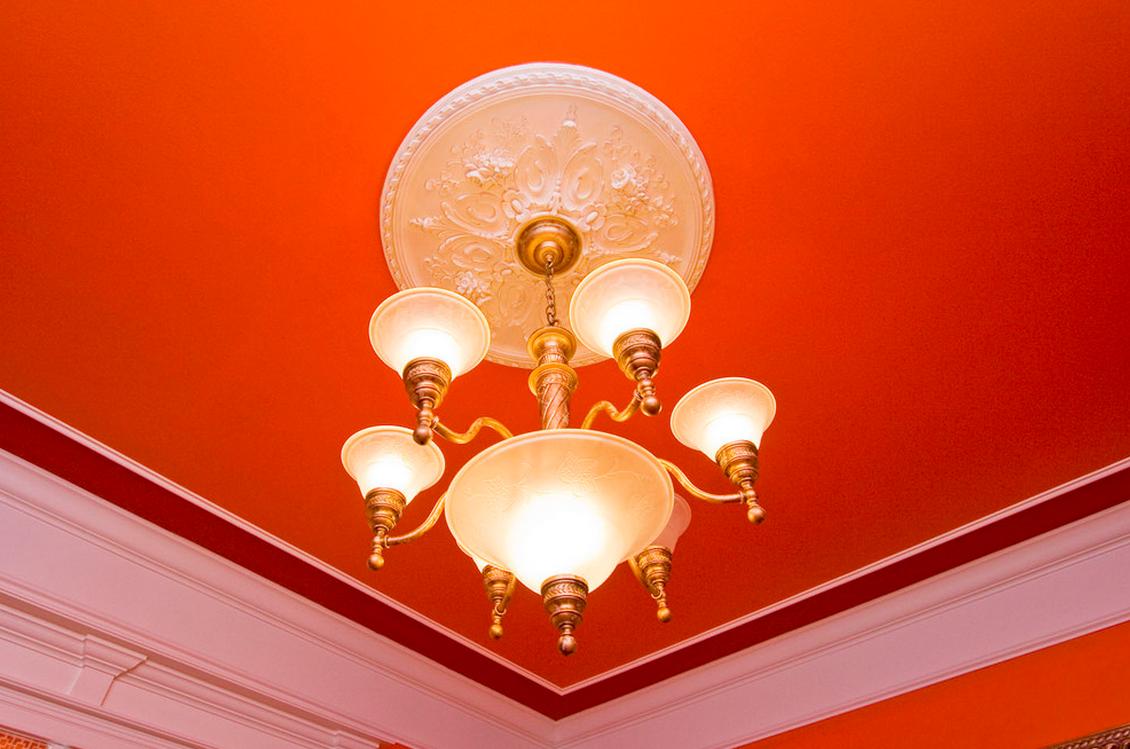
Even if a lot of colour isn't your thing, you really have to admire the full on assault this room gives.  I love this paint colour:

Orange Appeal #124 Benjamin Moore

Not only is the colour fabulous but it looks amazing with the Chiang Mai fabric by Schumacher on the chair that is just visible in the above pic.


It is one of those fabrics that I LOVE.  I know that it isn't for everyone but I adore it.  You can do so much with it.  You can pull out so many colours to work with from it.  And I love that they chose that great Orange to work with.

And if you want to see a full on Orange that will blow your mind then see the following:


I love how brave and bold this is....go big or go home.  The Orange paint colour is Bold Orange IB63 by Ralph Lauren.  I too love how it is paired with that great red: Lattice Red IB53  Ralph Lauren.  Now some may ask...why a stark white floor in the above pic or a stark white Ceiling Fan?  Well there are times when as a designer you have to make certain decisions based on many factors.  One factor being the clients wishes.  They are after all..... your client.  They have the ultimate say.  Two and this is a pretty big one..... Budget.  Sometimes budget does not allow one to change certain elements in a room.  Changing out tile is a huge cost and a huge job.  The designer has tried to tie in elements so that the white floor isn't the only white element in the room....thus a white ceiling fan and bright white trim on the fireplace.  Well that's my take on it anyways.

I am sure that I will be revisiting this amazing colour in the future.
Have a great day everyone.
Megan

Wednesday, May 1, 2013

ORGANZA vs. AQUA FROST PAINT

Hey Everyone.....As you know I have been thinking of my Master Bedroom.  I have been trying to decide on a colour.  When you are a designer the hardest thing to do is have yourself as your own client.  I see so many possiblities.  You ask any of us and we will say the same thing.  So I am undecided between Organza RLVM275 or Aqua Frost by Waverly.  What is a girl to do?

Here is both of them.

Organza RLVM275-Ralph Lauren

Aqua Frost WV35007-Waverly (Valspar)


The Aqua Frost is more intense while the Organza is more subtle.....decisions....decisions.......


Organza really is lovely and watery......


Choosing a light watery blue can be a challenge.  Blue is that type of colour that really "blues up" in a room.  What do I mean by that?  Well....when you choose a blue many times it can really intensify it's "blueness" on a wall.  I feel you have to be very restrained when picking this type of blue.  You may love it on the chip but put it on the wall and BAM!!  It turns into Baby blue.  So choose wisely if you want a watery light blue.
I did get a tester for the Aqua Frost. It is a very lovely colour, however, it really intensifies when there is a lot of it.

Will keep you posted....
Have a great day
Megan


Thursday, September 13, 2012

RALPH LAUREN ISLAND BRIGHTS

Oh how I love bright and happy colours!!  They life the spirit and evoke an emotion-either good or bad.  Lets face it most people would never use bright and happy colours.  I see it all the time.  Now to be fair a lot of the colours like those in Ralph Lauren's Island Brights are not everyone's cup of tea.  And, to be quite honest most of us do NOT have the right light conditions so that the amazing colours can truly shine.  But for those of us that LOVE colour it is awesome to dream!!

Here are some of those amazing colours:


Baltic Blue IB27 Ralph Lauren


How amazing is this colour?  I would love to do this colour in a dining room either as the colour above wainscoting or as super high gloss, almost lacquer like with mouldings painted the same colour.  Such an awesome colour!!


Bicycle Yellow IB20 Ralph Lauren


In this pic of this amazing office/craft room is the awesome Bicycle Yellow by Ralph Lauren.  You should go and check out Kristin's website.  She always has such awesome inspiration by everyday people and the paint colours they have used in their home.  This is such a bright and lovely space to create in-don't you think?  And what makes it such a great space is that it is paired with tons of white.  A room that has been done right.
It is so not for the faint of heart but it is an amazing colour!!


Mai Tai IB10 Ralph Lauren


 I so want to paint a room this colour.  It is full of life!!  And pairing it with a bright white- well look out my friends!!  Can''t get a more Nautical Red than this!


Racer Pink IB51 Ralph Lauren


This colour is not for the faint of heart.  It is a full on Pink with loads of magenta in it!  Very similar to one of the Pantone colours for fall 2012-Pink Flambe.


Big Sur Blue IB33 Ralph Lauren


Sunwashed Blue IB8 Ralph Lauren


How pretty is this colour with all the white and pink?? Love it!!


What is so amazing about these colours is that they are full on and saturated.  They truly are happy colours.


I have  a set of them myself that I collected some time ago and I am so glad that I did as you cannot get them here anymore.  And of course I made my own "fan deck" for them:


I showed how to make your own fan deck in a previous posting.  Super, duper easy.  Get yourself a hole punch and a large ring.  Easy Peazy!!  Don't you just love all those colours together- LIKE CANDY!!

Have a great day everyone
Megan

Tuesday, July 24, 2012

PREPPY-IT NEVER WENT AWAY!!

For those of us that grew up in the 80's Preppy is nothing new.  I will admit, and quite openly, that I was preppy.  I wore the rugby shirts, Ralph Lauren shirts, Madras anything, Loafers with pennys in them (from the year of my birth no less), Plaid, Tretorns,  Argyle ,  I could go on and on.......
And now it seems it is back!  Well as far as I am concerned it never went away.  I have loved and still love all that is Preppy, just ask my girlfriends, they will remember.  But I truly love everything about it.  I love the plaid, I love the oxford cloth and I love the colours.  They make me so happy.


To me there are two types of Preppy Interiors.  The first is the bright citrus colours of South Beach.  A very Lilly Pulitzer kind of world.  A world or Turquoise, Melon, Bright Yellow and Fern Green.  It is a world of gingham, floral and graphic patterns like Chevron.  Here are a few examples:


And when it comes to colourful Preppy, other than Lilly Pulitzer, the kings are Diamond and Baratta;


I mean seriously!!  Just drop me here.  I know that it is not for everyone, but for someone that loves to "pop" their collar, or where their Tretorns without socks, then this is the place for you my friend!!


Other "preppy" interiors.


Is this not a fantastic palette for Preppy South Beach colours??  So awesome!


The second style of Preppy Interiors is that Ralph Lauren English Style.  A world of Plaid, Paisley, Warm Woods, Persian Rugs, Leather and Wool Flannel.  I love, love this style.  It is warm and inviting.


This is a dorm room by Maximilian Sinsteden and has been in the bloggosphere for some time.  It is quintessential Ralph if there ever was one!  I can't even put into words how much I love this style.  The paisley, the plaid, the persian rug.......  Seriously this guy knows how to do it!!

The wall colour is Ralph Lauren Tapestry Green:


Tapestry Green by Ralph Lauren
It truly is that quintessential British Green that one would see in a great Manor Home.


So after seeing this pic it got me thinking about Leather Tufted Beds.  I have always loved and wanted a Leather Tufted Bed.  But as we all know they are VERY expensive.  Here is the one by Ralph that starts at $19,000!!  Yikes!!  But it really is lovely!


And then I got to thinking about another leather item I love;


How comfy does this look? 

I think that is one of the main ideas when it comes to the "English Style" preppy that I love. Comfy  and classic.  When you look at a quintessential English preppy Style you see Leather, Persian Rug, Warm colours, Paisley and Plaid.  And almost always you see warm toned woods and metals like gold and brass.


Take this breakfast nook for instance.  To me it is updated Preppy!  You have the warmth of the woods chosen in the round table and those woven chairs.  The chair shape is more modern but still is very traditional.  You have the plaid bench of course.  The choice of wallcovering is traditional but the motif is a modern take.  The juxtaposition of the traditional table with the more modern globe pendant.  But again the metal used here is a warm one with the addition of brass.  I love, love this little space.  It was designed by the very talented Lisa Borgnes Giramonti.


Yet when you look at this room by Tobi Fairley one can see the preppy influences here.  I love her use of Kelly Green in this space.  She also accents with a lot of white and uses warm metals.  I think of Tobi as a very Preppy designer.  I really love her use of colour in a space.  To me she designs such happy spaces.


This Living Room By Company C.  They are a great home store full of colour and inspiration.  Wish we had one here!!  Again this is very South Beach Preppy with the Bright Greena and Deep Pink.

When it comes to Preppy I feel very split personality about it.  On one hand you have the bright colours with a "South Beach/Hampton feel".  On the other you have the traditional English Country feel.  Both are preppy .  I guess it comes down to what you feel is preppy to you.  But what I think both express is a positive vibe to a room.  One cannot feel anything but happy in a Melon or Kelly Green space, the colour beckons happiness.  In a traditional English one, you feel almost wrapped in comfort.  And really there is nothing more calming and a feeling of happiness and contentment than that.  So I guess both styles of preppy give a feeling of positivity but in a completely different way.  Crazy huh???
Have a great day everyone!!
Megan