I think it is a well known fact that the if you were to ask those in North America what they think of Brits in general they may use the following words: Refined, Reserved, Quiet.... Keep Calm and all that! Well to me, if one were to look at British Shelter Mags (aka design magazines) this clearly is not the case. In fact I would have to say that the complete opposite is true. It seems that here in North America we do not embrace colour as readily as those across the pond. I want to share with you some pics to prove my point! Now I am not saying that Brit design is better. Not at all. What I am saying is that they seem to be willing to take more risks with colour, pattern and style. And the evidence couldn't be more clear-just pick up any Canadian House and Home Mag or other shelter mag from North America. Beige, White and Griege are very in here. Belgian Style is very in as well. But have you noticed that at times they have to devote an entire magazine to "the COLOUR ISSUE". Like it's a big deal! Well actually it is over here anyways. You ask any designer or paint store and they will tell you their top paint colours that are sold or requested- Whites and Beige's! Why are most people so adverse to colour? It has always baffled me!
Now I am NOT saying that there are those out there that do not embrace colour and that all whites and beige's are bad. What I am presenting is an observation on perusing the online sources and at the magazine aisle in Walmart.
I am the type of person that loves all colours: bright, muted, saturated, white and beige- I love them all. I suppose with this crazy weather we are having here, I am just craving colour. I am searching for inspiration. And I hope the following pics will give you all a little pick me up too!
I love this office. What a lovely bright place to work in. Better than battleship office gray!! The wallpaper really works here since everything else in the space is white. Such a pretty office.
This is so English Country. So soft, so floral. It fells up to date because of the green walls and gray table. The ticking of the chair and the floral of the sofa are timeless. I know this isn't for eveyone but it is quite pretty and inviting.
Having the neutral walls allow the other bright hues in the room to to not overwhelm this space.
I know that a wallpaper like this is not for everyone. But you have to hand it to those that live here. It is full of personality and is a real focal point.
To me this is quintessential English Country. All the florals, checks and stripes. But adding and modern floral rug and that pink really help to keep it fresh and up to date.
I love the mixing of patterns in this room. Since all of the big elements- the walls and the sofa are neutral-this allows the pops of colour to jump out. Yet the patterns have been mixed very tastefully.
Here is a great example of the Brits not being afraid of colour or in this case colour and pattern. It has such youthful vibe to the room yet it has traditional elements as well. I love the colour combo of Beige, Deep Coral and Burgundy. It's the kind of room that would very easily be changed with a little magic. Since they have so many neutral elements- new accent paint and textiles and you have a whole new look.
I think England is one of the few places you will find this colour combo- Black and Magenta. It is so dynamic and modern. Yet they have mixed a traditional "Chesterfield" to inject some traditional elements as well.
I can't even put into words how much I love Designer Guild's textiles. They truly know how to mix colour and pattern to create something so English, something so fresh, yet there is a tradition to it as well.
Although the colours in this room are muted in quality, it's the mix that I love here. It is such an English thing to do- Mix lots of patterns. It has been done really well in this room. Notice how the walls are a muted gray and the couch is also muted- allowing the pillows to really stand out.
I am a huge fan of Bluebellgray. Her florals are some of the most amazing ever. I love the painterly quality she of them and the bright colours. They are such happy fabrics and pillows. I also love how she chose to set them against another bold colour- Pitch Blue, Dix Blue and Oval Room Blue. She is a huge fan of Farrow and Ball paints. Her textiles go so beautifully with their paints.
What could be more British in design than using their flag? Which is veyr hot right now- what with the Olympics coming up and all. I love how the Red, White and Blue look awesome against the white and black.
I really do love the juxtaposition of the traditional room with it's traditional damask wallpaper and mouldings set as a backdrop for such Modern furniture. The choice of that acid green plays really well off of the muted turquoise wallpaper.
Bright colours such as yellow and bright pink always look awesome next to white and black- it really helps them to stand out. Very few over here would ever have such a sofa with such a prominent stripe and colour. Looks great in this Modern setting.
Amazing Gold leafed Mural. Not only that but gold leaf on such a saturated hue. That royal blue is amazing! I like that the furniture is muted so that it balances out the very vibrant wall.
Very rarely do you see purple used over here. Especially one that stands out so much. I love the hue they chose to paint that gorgeous chest. I love how they have mixed Modern in terms of the art with the traditional setting with the wall treatment and the furniture.
Here the mixing of Modern and Traditional has been so expertly done. I love the hit of pink that chair gives. And if you notice the other thing that Brits love to do and that is to paint their floors, which I love by the way. They have been doing it forever. But over here it is seen and unfinished and cheap- Weird the different perception?
Such a lovely light and bright room. You will quite often see pink used in English design. I don't think that those in North American embrace it the same way as the Brits do. If it is used here, quite often it will be in a little girls room. In here I think it adds to the overall lightness of the room.
English Cottage from the movie "the Holiday". How amazing is that velvet ottoman?? I just love all the soft colours and the mixing of patterns in this house. Couldn't you just curl up with a cup of tea and read a book in here?
This is such a great example of the use of Cath Kidston colour. It is such happy colours. Anytime I see these particular colours or anything by Cath Kidston it never fails to make me smile.
Now.... just because you love beige, this does not make you boring. Not at all. My point in all of this is to point out how different Brits can be when it comes to design. Why are they so different?? I don't know really! I guess they always have been different and marched to the beat of a different drum- I can say that because I hail from there myself. In fact my whole family lives there. So I guess I have a connection on a deeper level when it comes to their sense of design. I truly love it! Is it in my genes? Maybe! Or maybe it's because I march to the beat of a different drum too!!
Have a great day everyone.
Megan


 You don't often see a dutch door in a more modern style. Love how unique this is.


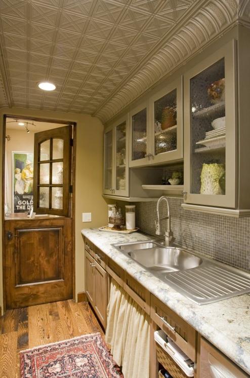
 This is one of my favourite rooms- I love Windsor Smith! And now with the addition of this dutch door to the mix I love it even more.
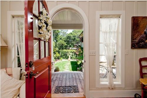
 I remember Cottage Company Harbour Springs from a few years ago from Home Planning Ideas magazine. If you love cottage style then this magazine would have been for you (miss that one). Also, if you love cottage style then Cottage Company would be for you as well. They pack a lot of detail into a small space-amazing!! I love the fact that they have put Dutch doors into their designs.


