Wednesday, October 31, 2012

NEW COWL PATTERN UPDATE

Hey Everyone!  I have been busy knitting up a new cowl pattern that will be available on Ravelry soon.  The Cowl is all Cable knitting.  BUT!!!  Don't let that scare you.  I have made the pattern in such a way that it looks way more complicated than it actually is.  You are only ever working on one kind of cable at a time in a particular row.  It is being knit up in the following......


This yarn is a worsted weight yarn and has a really nice hand or feel to it.  It is knitting up really nicely.  I have completed the 1st Cowl in the Pewter colourway and am about 1/3 of the way through in the Peacock Colour way.  I was lucky enough to buy this yarn in Michaels on a huge sale.  The downside with this yarn is that it can be a little pricey in my opinion.  It was originally being sold for $9.99/ball.  To me that is way too expensive, but I guess Martha has to get her cut!!  Any worsted weight yarn would be great for this pattern.  I would probably avoid a variegated coloured yarn, overly textured or a super dark colour.  The thing with cables is that you want to see them!!
Each Cowl takes 3 balls of yarn and is being knit on a size 5mm/8 needle.
I decided to knit 2 cowls in different colourways so that you can see how colour can affect how you perceive a particular pattern.  I love how the pewter turned out.  I am also enjoying knitting the cowl in the great teal coloured yarn as well.  I just love the name of the colour--- Peacock.
So when it is done and available, I will let you know.


Have a great day everyone.
Megan

Tuesday, October 30, 2012

BENJAMIN MOORE COLOUR TRENDS 2013.

Hey Everyone... Benjamin Moore has come out with it's Color Trends 2013.  The main colour of the year is Lemon Sorbet 2019-60.  Personally, not a favourite of mine.  However, for those that are yellow kind of people I think you will like it.

Lemon Sorbet 2019-60

It's OK as Yellow's go but I am just not a yellow kind of gal!!

However, I did like one of their picks for their trends and that colour was.....
Stratton Blue HC 142.:

Stratton Blue HC142

I Love this blue.  It has always been one of my favourites.  In their trends issue, Benjamin Moore has paired it with the following....
Simply White OC 117

I love this white and it truly is one of my favourites.  It looks especially great with Stratton Blue.

In addition they have paired it with this accent colour.....

Van Courtland Blue HC 145

This is another colour that I have loved....  I guess I love blues, always have.  Here is what they look like together....


How lovely is this office?  Love it!!

Here are some more examples of Stratton Blue-HC 145:


And here is one of favourite rooms that have been painted this amazing colour.  Photo's courtesy of Designers Viscusi Elson and House of Turquoise:


This home designed by Viscusi Elson is beyond amazing.  So full of life and colour.  I love it!!

Hope you enjoyed this little journey into Stratton Blue Heaven.
Have a great day everyone.
Megan

Thursday, October 25, 2012

GETTING WHITE RIGHT

Hey Everyone, I came across a few pics that got me thinking about white rooms.  White Rooms can be one of the hardest things to get right.  First of all, picking the right white for the walls can be a nightmare.  If you don't understand undertones then you will have a miss right from the get go.  The other thing is that there has to be interest within the room so it doesn't look boring, dull or like you stuck a bunch of furniture in a white room.
Here are some great and not so great examples of white rooms:


I absolutely adore this bedroom.  If I ever get to move to Hawaii I want it to look like this.  The wall colour is the perfect shade of white for this room- it has the right undertone. 


Now, this room kinda makes me noodles.  It looks like everything was just plumped down in there. The white chosen for the walls is way to bright and cool.   It in NO way relates to anything in this room.  All the fabrics chosen have a warm undertone and the walls have a cool undertone.  It is totally the wrong white.  This room would have been better served either painted in a warmer white like BM White Down for instance or wait for it.....  a deeper colour!   At least with White Down it would relate to the "flesh" coloured fabrics.  And do not get me started on that settee!!  Boggles the mind it does!

The same can be said for this room.  I really love all that is in this room except for the horrible wall colour above the wainscoting.  Again it bears no relation to anything else in the room.  I don't have a problem with painting white above the wainscoting but it should have been in a warmer tone.


This fantastic room is by Judith Balis.  It is one of my new room design crushes.  I Love it!!  I wouldn't change a thing.  It has it all.  The texture of the boards on the walls, texture and more texture, that gorgeous rug, that great coffee table, the sofa, the pillows..... I could go on and on.......


Gotta love a great Groin Vault.  The subtle architectural detail here makes my heart sing.  It is so pretty and uplifting.


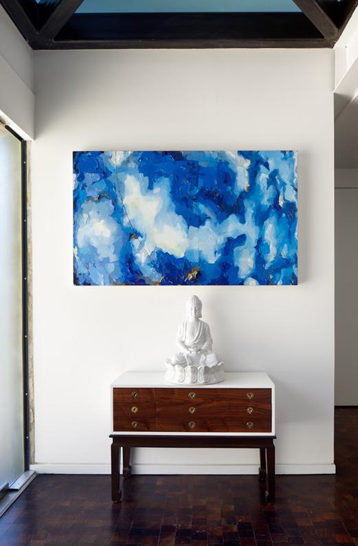
I just love all those wood tones with the white of the walls.  It is such great contrast.  But why it works has a lot to do with the undertone in the walls and how it relates to the wood.


The last 4 pics are from Sweden.  I will say this......  The Swedes really know how to do white.  You would think that living in the climate they do that having all that white would feel cold.... well not at all.  The way that they use the white with wood and stone and fabrics all makes for such a happy place to live.  I have always admired how they put white together so well.
The white that was chosen for the walls in this space has a cool undertone to it.  Why does it not feel cold and uninviting??  Well..... it has everything to do with the fact that the white chosen RELATES to everything else in the space.  If they had chosen a yellow undertoned white for the space it would have looked awful.  It would have looked dirty and everything else would have looked out of place in relation to the wall colour.
It also helps that there is a lot of natural light coming in.  There is nothing like having tons of light pouring into a room to lift it up!!


So in closing the way to do white well is the following.... it is just a little recipe......  Pick the right white for your space with the right undertone........Use texture.......Use wood.......  Use Architectural detail.  Another detail is to use contrast.  One way is to use darker wood/black/brown with all that white.  If you have an all white room then you need to use texture to create interest if you don'thave contrast..  If you have all that then you can't go wrong.  I know..... sounds daunting but it can be done.  For me the most important of the above is get the right undertone right and use detail-texture and/or contrast.  If the white you have chosen has NO relation to anything else in your room, the room will always feel off in some way.  It is how the White RELATES to everything else that matters above all.  Just my opinion for what it is worth.

Have a great day everyone.
Megan

Tuesday, October 23, 2012

SOUTHWEST STRIPE SHAWL

Well...... she is finally done.  She is finally up and running on my Ravelry page here.  I am at this moment wrapped up in my fine big shawl typing away at the computer.  I hope everyone enjoys the pattern as much as I loved designing and making it.


This shawl is definitely a keeper.  And one that is warm, stylish and a warm hug! 
As always if you have any questions about the shawl or the pattern just drop me a line here or on Ravelry.

Have a great day everyone.
Megan

Monday, October 22, 2012

SHE'S DONE!!! RL INSPIRED WRAP/SHAWL

So after much waiting and procrastinating, ends woven in, blocked in place.... She is done....


This little puppy- that's kinda funny since the wrap ended up being kinda bigger than I had originally thought.  But that's the way it goes when you are designing.  To say that I love it would be an understatement.  It is like a big hug.  I can't wait to wear it out or hanging out at the computer.  I still have to finish up the pattern and get it up on Ravelry.  I am really pleased with how the striped portion turned out.  I would love to make this puppy in a really nice heathered shetland wool, but that will have to wait for another day.  Until then here are a few more pics.....


I hope you enjoyed a little inspiration today.  When I figure out her name I will let you know.  I will have to come up with one right quick since the pattern will be loaded in the next couple of days.
Have a great day everyone.
Megan

Friday, October 19, 2012

FRIDAY UPDATE

So to start off ........  first thing this morning I was getting the boys lunches ready and I happened to look out our kitchen window.....  and what did I see way up in our huge walnut tree..... but a magnificent bird.  I am sure that we are visited many times by many birds of prey, but this time of the year when the leaves are leaving the tree, it sort of opens things up and makes things easier to see.  At first I thought it was a Peregrine Falcon.  We quite a few Peregrines in the area, but the bird I saw seemed a little bigger.  But it was hard to tell since it was way up there.  And I do mean way up there.  You see, our Walnut is probably 70-80 feet high and 100yrs old (or more).  So how lucky were we when that lovely bird sailed down and landed on our laundry post?  And this is what we saw....


This was such an amazing opportunity to be this close to a Red Tailed Hawk.  We are big geeks when it comes to this thing.  There we all stood- all 4 of us just watching this magnificent bird.  What an awesome way to start the day.......

I am currently trying to weave in the ends to my wrap.  I should have had the pattern up by now but I have kinda been dragging my heels.  I don't know why, it has sort of just been one of those unexplainable things.  I am currently fleshing out a couple of scarf patterns.

One uses Rowan 4 ply Pure Wool in the Eau de Nil colourway.  The other scarf using Patons Lace:


I can't even put into words how lovely this yarn is.  It is such a soft yarn.  I just wish I had \loads more so that I could make this amazing little sweater that I have been drooling over since last year....


When I say I love this sweater, I mean I really, really love it.

Anyways....
Have a great weekend everyone.
Megan