I think that Orange is one of those colours that is VERY polarizing. Either you love it or you don't. I happen to be one of those people that think Orange is a fantastic colour. It is energizing, it's juicy..... it's Orange!! I am sure you all know by now that Tangerine Tango is the colour of the year. And thank goodness Farrow and Ball came on board with their own Orange just before this colour was going to hit it big. They named it "Charlotte's Locks". Isn't that a great name??

I have to say that I think it is one of the best Oranges I have ever seen. It is so vibrant and warm! Love it!!
Some of my favourite colours to go with Charlotte's Locks would be White, Black, Grey, Navy, Purple, and Yellow. Of course picking the right one always depends on the lighting in your place.
Here are some great pics of interiors that have used Charlotte's Locks:

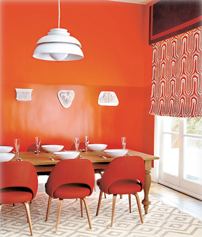
How amazing is this gallery display? The art looks awesome with that great Orange background. The thing about Charlotte's Locks is that it is such a great colour for a feature wall. If you are too timid to do a whole room then try out one wall and add art like above. Or paint the back of a bookcase for a hit of colour.

This great living room with a separate sitting area is by Judith Balis. I love her work! The colour of the feature wall of course picks up on the colour in that fabulous rug!! Would love one of those for myself!! Although it does not specifically state that it is Charlotte's Locks for certainty- it definitely looks like a similar colour. It has a similar undertone to it. Such a great colour with the ochre walls.
 Here is another shot of the same room. Look how fabulous that sofa looks against that wall!

This pic from the Farrow and Ball website really illustrates how well Charlotte's Locks goes with White, Yellow, Black or Brown. It really needs to go with other colours that allow it to be the star.
This is such a great example of allowing this great colour to be the star. By pairing it with white and brown, this allows the Orange to take center stage. I love how they have painted the wall in both eggshell and full gloss. Not only does this add interest but it really goes to show how our perception of that colour changes depending on the shininess of it.

Look how amazing this front door looks. It is such an unexpected colour to be welcomed by. It is so welcoming. Again it is allowed to take center stage since it is surrounded by neutral colours- in this case white and a french gray (maybe taupe?).

Again we can see how great white pops against this great orange!

Although Charlotte's Locks is NOT used here, it would look so great along side these colours. Jonathan Adler really knows how to mix. I know it's not for everyone but it is such an awesome and dynamic room. The one thing I will say for Mr. Adler is that he designs such happy spaces. I don't think there is a space he has designed that I haven't smiled at. The reason I put this pic here is to show how great Charlotte's Locks would look here. Instead of the wallpaper you could frame out a space around the headboard with stock moulding painted white. Inset in the 'frame" around the bed you could paint it full Charlotte's Locks or paint out some stripes. How fun would that be? The reason I think Charlotte's Locks would work here is that the brown that is painted on the walls is a warm reddy brown. It would also go well with the light blue that was chosen for this room. Makes me want to do something similar in my Master............

Again, Charlotte's Locks would look amazing in this bedroom. Why? It has a similar undertone to the colour that was chosen.

Look how fabulous it looks on this chair. If you are too timid to try it on a wall why not paint a chair, a table or a mirror- baby steps!

Here is a great example of just doing a focal wall. Just enough to give a hit of colour without overwhelming the space.

What a conversation piece this would be! Just a hit of colour! Would look great in a room painted White or a watery bluey/green.

Although this side table is some other orange- a similar side table would look great painted Charlotte's Locks.
 Again, I chose this pick to show you how great the back of a cabinet would look if painted in Charlotte's Locks.
 Look how fabulous this cabinet looks painted in Charlotte's Locks. It is such a showpiece in this dining room. I love how well it goes with the walls- a light watery green. Such a great job!!

Charlotte's Locks looks great in this mudroom. It really works well in this setting with the bead board and that great Vintage Green bench. The hit of deep Yellow and black goes really well with it too!

This is such a great example of using Charlotte's Locks as an accent colour.


I have to say that I think it is one of the best Oranges I have ever seen. It is so vibrant and warm! Love it!!
Some of my favourite colours to go with Charlotte's Locks would be White, Black, Grey, Navy, Purple, and Yellow. Of course picking the right one always depends on the lighting in your place.
Here are some great pics of interiors that have used Charlotte's Locks:

How amazing is this gallery display? The art looks awesome with that great Orange background. The thing about Charlotte's Locks is that it is such a great colour for a feature wall. If you are too timid to do a whole room then try out one wall and add art like above. Or paint the back of a bookcase for a hit of colour.

This great living room with a separate sitting area is by Judith Balis. I love her work! The colour of the feature wall of course picks up on the colour in that fabulous rug!! Would love one of those for myself!! Although it does not specifically state that it is Charlotte's Locks for certainty- it definitely looks like a similar colour. It has a similar undertone to it. Such a great colour with the ochre walls.

This pic from the Farrow and Ball website really illustrates how well Charlotte's Locks goes with White, Yellow, Black or Brown. It really needs to go with other colours that allow it to be the star.

This is such a great example of allowing this great colour to be the star. By pairing it with white and brown, this allows the Orange to take center stage. I love how they have painted the wall in both eggshell and full gloss. Not only does this add interest but it really goes to show how our perception of that colour changes depending on the shininess of it.

Look how amazing this front door looks. It is such an unexpected colour to be welcomed by. It is so welcoming. Again it is allowed to take center stage since it is surrounded by neutral colours- in this case white and a french gray (maybe taupe?).

Again we can see how great white pops against this great orange!
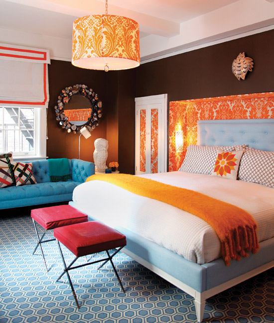
Although Charlotte's Locks is NOT used here, it would look so great along side these colours. Jonathan Adler really knows how to mix. I know it's not for everyone but it is such an awesome and dynamic room. The one thing I will say for Mr. Adler is that he designs such happy spaces. I don't think there is a space he has designed that I haven't smiled at. The reason I put this pic here is to show how great Charlotte's Locks would look here. Instead of the wallpaper you could frame out a space around the headboard with stock moulding painted white. Inset in the 'frame" around the bed you could paint it full Charlotte's Locks or paint out some stripes. How fun would that be? The reason I think Charlotte's Locks would work here is that the brown that is painted on the walls is a warm reddy brown. It would also go well with the light blue that was chosen for this room. Makes me want to do something similar in my Master............

Again, Charlotte's Locks would look amazing in this bedroom. Why? It has a similar undertone to the colour that was chosen.

Look how fabulous it looks on this chair. If you are too timid to try it on a wall why not paint a chair, a table or a mirror- baby steps!

Here is a great example of just doing a focal wall. Just enough to give a hit of colour without overwhelming the space.


Although this side table is some other orange- a similar side table would look great painted Charlotte's Locks.


Charlotte's Locks looks great in this mudroom. It really works well in this setting with the bead board and that great Vintage Green bench. The hit of deep Yellow and black goes really well with it too!


Can you imagine how great a kitchen would look painted in Charlotte's Locks?? I hope someone is brave enough to do it and then post it because I would love to see it!! I think an Orange kitchen would definitely fit well in a Modern setting.

I don't know what colour these stools have been painted, but they would look awesome painted Charlotte's Lock!!

Another great Charlotte's Locks Door. It looks great in this white setting.

This desk looks incredible painted Charlotte's Locks. It looks so vibrant against the neutral (looks either white or light grey) backdrop. That great ikat fabric looks great next to it as well with its greens, browns and turquoises.

I love how they have painted the back stairs Charlotte's Locks. It looks incredible. Without a vibrant colour it would be just an ordinary staircase- but now with painting it this vibrant Orange they have made this space extraordinary.

Charlotte's Locks looks great in this bathroom surrounded with all of it's white. It can really pop when it is against white.
The following doors are NOT Charlotte's Locks but would look awesome if they were. I am putting them here as inspiration;

Again this colour works because of all that white!

Charlotte's Locks would look great on a similar door with a great gray like the one shown above. Orange works really well when paired with a great neutral.

This is a great example of a door that Charlotte's Locks would look great painted. For me the door would look better with a deeper orange- but that's just me!
As you can see Orange really is a dynamic colour. A little bit really does go along way. That being said, painted on a wall Charlotte's Locks really does take center stage. I love this Orange! Now if only there was some way for me to work it into my home!!
Have a great day everyone.
Megan
No comments:
Post a Comment