I am thinking that it may be my mood. I think that maybe this turn in the weather has got me down a little!! We had 24C in March and today we are going to have 4C and rain/wet snow! ARGH!! So I thought in order to give me and maybe you a wee pick me up I would show something that might lift the heart a little.
Nothing says personality like having a bright front door!! It is the first thing people see when they arrive. So I thought I would show some great front doors.

Now I know that bright colours aren't for everyone but they sure can be fun to look at. Here someone is so not afraid of colour- and I LOVE IT!! Very brave to have a bright coral on the front door.
 Nothing welcomes like a Red front door. Love it!!
 Very Tropical. This is one thing you have to be careful of depending on your location. You have to remember that the "quality" of light is different depending on where you live. Those in the south have a much brighter, yellow light. Plus it's hotter in the south. So deeper and brighter colours look great down there. Here in the North our light is more blue/gray so having such a bright, tropical colour wouldn't look as good.
Sherwin Williams Navel
 I love how they have painted the interior of the front door a colour. This works especially well when the interior is a neutral colour- helps to make the painted door stand out.

 I think in life there are exceptions. I may be wrong but I think that this door may be from somewhere not in the South?? And it still looks great. I may have chosen a blue slightly less bright in intensity but I think it works for two reasons- 1. The trim surrounding the door is black. This helps to frame out the door. White would look horrible with that colour and that colour brick. 2. Orange and Blue are Complimentary colours. Meaning they go together. That brick-although people may call it "red brick"-actually has an orange tone to it.

I chose this door to this church because it isn't often you see that colour door anywhere-never mind on a church-Love it!!

I chose this because of the uniqueness of the colour and the trim work. Not sure that this pink goes with the brick but all that thick trim helps to separate the door colour from the brick colour- and it is very unique.

This acid green works really well as an accent to gray.

So tropical and fun. You would never see this combo up here where I live!! I really do love this combo of Orangey Yellow, Purple and Green.

Gotta love a door that loves all the colours of the rainbows. Love it!

When I first saw this it made me think of Paint Sticks that have stirred paint and hav dried. I love how unique this door is.

I have never seen such an acid green on a front door before-never mind that the trim is also acid green. I think it is fun and very unique. I think it works well because once again acid green has been paired with gray.

I love a red door- always have. I must say that the reds that are usually associated with Craftsman style are usually muddier in quality- a dirtier red if it were. But I really like this red paired with the yellow siding.


Nothing says personality like having a bright front door!! It is the first thing people see when they arrive. So I thought I would show some great front doors.

Now I know that bright colours aren't for everyone but they sure can be fun to look at. Here someone is so not afraid of colour- and I LOVE IT!! Very brave to have a bright coral on the front door.


Sherwin Williams Navel


I chose this door to this church because it isn't often you see that colour door anywhere-never mind on a church-Love it!!

I chose this because of the uniqueness of the colour and the trim work. Not sure that this pink goes with the brick but all that thick trim helps to separate the door colour from the brick colour- and it is very unique.

This acid green works really well as an accent to gray.

So tropical and fun. You would never see this combo up here where I live!! I really do love this combo of Orangey Yellow, Purple and Green.

Gotta love a door that loves all the colours of the rainbows. Love it!

I have never seen such an acid green on a front door before-never mind that the trim is also acid green. I think it is fun and very unique. I think it works well because once again acid green has been paired with gray.

I love a red door- always have. I must say that the reds that are usually associated with Craftsman style are usually muddier in quality- a dirtier red if it were. But I really like this red paired with the yellow siding.

Isn't this mudroom lovely? Again pairing acid green with gray. And turquoise and acid green always look so great together.

I really love the pairing of this bright turquoise with black and deep gray. Makes me think this should be on an English house near the sea!

I have never seen this shade of Orange used on a door before. I really like it.
This deeper, brighter orange looks awesome paired with the gray of this modern house. It would have been so easy and obvious to go with black but this Orange looks great. A bright Kelly Green would have looked great too.

This is an unusual yellow for a front door. Usually you see a deep yellow that is very traditional. Here they have used a yellow with a very definite green undertone to it.

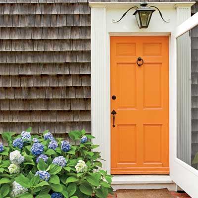
I just had to put this one in. Not only is the door unique but I loved the colour of the door with the soft gray shingle siding. Such a pretty and welcoming front door.

This is so traditional. Makes me think of Colonial America. That is one thing I loved about visiting the Boston, Mass. area. A lot of the older homes had colour on them. I especially love this combo of Turquoise, Red and White. Makes my heart smile!!
Well I hope you enjoyed all these colourful doors. Makes me rethink the colour of my own front door. Currently we have a gray/black colour. It is Behr - Poppy Seed
I like it because it isn't a black, black. It definitely is a dark graphite with a blue undertone to it. We have a "red" brick house. Which is a pain in the butt to decorate around if you ask me!! So it will stay poppy seed for now.
Have a great day everyone!
Megan
No comments:
Post a Comment