Hey Everyone.....I feel like the following post is going to be a long one.....so grab a cup of tea or your beverage of choice and sit back and hold on............
To begin.......I love the show NCIS. I have loved it for years. What does this great show have to do with design you may ask?? Well nothing really. The only correlation between that show and this posting is the title of the season opener and the title of this post. When I saw that title I nearly sprayed my Diet Coke from my mouth. How brilliant is the title?? It truly sums up the episode as well as this post. We here in the Delorme house will truly miss Ziva. I will miss her interactions with Tony. But alas they aren't meant to be....... I still love Abbey though ......she's one of my fav's!! I think secretly I want to be Abbey....She's Uber smart...Uber techy..... and a Steampunk/Goth girl. I sort of dressed like her for Halloween and loved it!! I thought....."if only I could dress like this everyday".........it was very fun. I wished I had a photo but alas I didn't get a chance to have a pick taken. Anyways.....back to design............
So...I was trolling the MLS as I always do. I love looking at houses...always have. I came across a home that is listed for almost 1.1 million CAD. From the outside it looks really lovely. And to many, the inside is perfectly fine. And it is....don't get me wrong. There are just certain things as a person as obsessed with design like myself that I just can't look past. Let me discuss......
Please....if you are looking to sell your house or if you are looking to renovate...then PLEASE call in professionals to help. Did Professionals renovate the house I am going to talk about....yes I am sure that they did. However, many times Contractors or Homeowners will pick finishes and many times they fail. They fail and then perhaps they don't realize it or they realize it and then it is too late to do anything about it. I used to watch Mike Holmes on HGTV here in Canada.....but I had to stop. I was tired of him picking Slate for EVERY bathroom reno he did. He says, "hire a professional to do the work." He is correct, however, he failed to take his own advise. He or some other trade obviously would pick the finishes and many times they were to say the least......not the best choice.
When I saw this particular house I was a little disappointed. No, let me say I was more than disappointed. That being said, I in NO way blame the real estate agent for the following. There are times when a real estate professional is called in to sell a house and they will do their utmost to sell that house. They are in the business to make money. However, if they have clients that won't listen....well...there is only so much you can do. Now if you read my blog you will know that when I present info it isn't to call out people for the sake of it. I try to present info to educate. I think over my 45 yrs on this planet that I have amassed a little wisdom. Case in point. If a client came to me and asked what they should do with a "flip" you can be darn sure I would be honest. When I see stuff that I am going to show you...well it kind of bothers my design gene. As they say, 'God is in the details". Whether you believe in a Higher Power or not.....Life really is in the details.....one of which this builder or stager has forgotten....or at least has done so in my humble opinion. Lets use the following house as a "case study".
 So let us begin......Here you can see that the reno from the outside looks quite lovely. They could have added more trim detail (you know how much I love trim), however, it is quite lovely. This house started out as a 1 or 1/2 story like a lot of the houses are in the area. It certainly has great curb appeal.
 If you are looking to sell a home then it is best NOT to choose a paint colour like this. This particular colour will only appeal to a certain type of person. It is what I like to call a "bossy" colour. The flooring too is a "bossy" colour. Why is that?? Well.... The wall colour will only appeal to a few people. It is hard to decorate around. Someone would not be able to come along and dump their stuff in place and make it work....it just isn't going to happen. For the sake of selling they should have picked something way more neutral. They may be trying to make a statement but they picked the wrong one. As I said the tile too is a strong colour choice as well. And I don't mean strong good. When picking a tile for the purpose of resell......pick something that is ultra neutral. Neutral as in Gray, Black, Taupe or cream. However, that being said you have to pick a colour with a very subtle undertone. The above tile is not subtle. Orange is NEVER subtle. Is it the worst tile ever....absolutely not. It is OK. That being said it may just look orangey in my monitor.....even if the colour of the tile isn't Orangey, I wanted to point out the value of picking the right undertone in finishes and how important it is. Pick a tile with a more subtle undertone so that it will appeal to widest range of people possible. Not to mention putting that blue with that tile.....that is a whole other story.
 What does one even say here..........Again the wall colour is horrible. Well....let me rephrase that. It is not right for this situation. Put it in a kids room or a craft room......yes you may be able to put it in a living room but not with that colour of hardwood, not with that cream damask sofa with fringe or those drapes! Furnishings aside.......the Hardwood that was chosen is all wrong. Why you ask?? I am sure that many of you out there have this colour Hardwood. Here once again we have a finish with a "bossy" undertone to it. As a Decorator it is so hard to decorate around this tone.......Orangey/Reddy wood is very hard to decorate around. There is limited options when using this colour of Hardwood. Once again you need to use a more subtle colour. Again...anything with an Orange or Red or Yellow undertone is very hard to Neutralize. Think about it....they are HOT colours, they are bossy colours, they stand there and make you take notice. It is hard to fight with that.
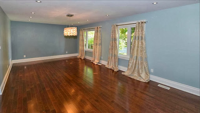 If you are staging a home, putting up drapes like this without any context looks out of place. Here we have formal drapes that are just stuck there. And I mean stuck. First of all they don't relate to anything and secondly they are hung way too low. It's not like they couldn't raise them.....there is plenty puddling on the floor. And you know how I feel about drapes and how they should "break". If you have been reading my blog you know that I like drapes to be properly hemmed. To me the above drapes look at though NO thought was put into them being hung. Too low, Too long. Once again the undertones do not relate. Most people may look and think....they look nice. However, the undertone in the drapes relate in no way to anything in the room. Yes they have the same Baby Blue in them but that's all............

As far as the kitchen is concerned it is pretty decent. However, one issue with this kitchen is the colour of the island as compared to the colour of the Hardwood. Personally I don't like the colour of the Hardwood so I wouldn't have chosen it for the island either...... they don't clash horribly.....but I did want to point it out.
 I am trying hard NOT to criticize the furnishings....if you are going to stage a home....then stage it properly. To me the way that it is done here it is "piece meal". Style of furnishings aside......everything looks kind of just stuck in place or plunked down without thought. They look out of place. And this for me is the crux of staging. There are people out there that stage quite well. I personally have an issue with a lot of staging in that they tend to completely depersonalize a home to the extreme. Taking a bunch of furniture that relates to nothing to me isn't staging. I personally think if it isn't going to be done well.....leave the rooms unfurnished.
 Like I said......The Kitchen for the most part is pretty nice....that being said let me talk about a couple of things. If you are buying Granite. And I mean Granite that is "bossy" as this Granite is...... and it is perfectly lovely Granite.....DO NOT BUY BOSSY TILE. When you have your Counter being bossy and your tile being bossy.......well.......too much going on people. Pick one but not both. Bossy tile-Quiet counter and Vice Versa!!! Personally I wouldn't have chosen a Pencil tile either as this is a trend that to be quite honest is on the way out. I never would have chosen a pencil tile anyways.....way too trendy. Again, you want to appeal to the widest market. That being said is it horrible? Absolutely not. I am just trying to get people to have the most bang for their buck. Tile is one of those finishes that is costly, long lasting and very personal. Personal in that it should reflect the personality of the home as well as be a lasting finish. You don't want to have to replace it 3 yrs from now because you bought it on a whim or bought it because Betty Sue down the block bought it to be trendy.
The Second thing that caught my eye here is the colour of Cabinetry in relation to the ceiling colour. The Cabinetry colour is definitely creamy with a yellow undertone. And the ceiling looks like a cold white. Even if the ceiling is only showing as cold in my monitor, I want to make a point here. When picking your finishes and colours.....make them relate. If the cabinetry is creamy with a yellow undertone then choose wall colours that have a warm, yellowy undertone too. That goes for the ceiling as well. Mixing Hot and Cold or Muddy and Clean is a slippery slope that many people try to navigate and in most instances fail. Make everything relate to each other.
 What does one say to this. Perhaps they lost their hammer?? Perhaps the painting fell just when the photo was taken?? Please.... Please...... Do not do this to sell. Either Hang Art everywhere. Or better yet in a flip like this....just don't hang anything at all. I am not sure what this is?? As for the drapes....again they are too long. They are hung too low.

One thing I will say for this area....the Chandelier seems to be hung at the right height. As a rule of thumb hang your chandelier anywhere from 29"-36" off the table. Most tables are 29" high. My chandelier is 34" above. Remember this is a guideline. The Chandelier Police aren't going to arrest you if you hang your Chandelier too high. As for the floor "accessories"........I don't know either.............And don't get me started on the table and chairs......not my taste but to me they do not relate in anyway to each other. But maybe that's just me............

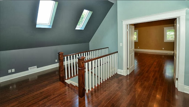
For the most part I don't usually have an issue with colour blocking, however, there are exceptions. And this room is one of them. When you have a room with vaulted lines like the one above.....it is best NOT to colour block. First of all this is very early 1990's of them.....but apart from that it is best to just PICK A COLOUR! One Colour! Once again they would have been best not to hang drapes. They aren't hemmed properly, they look overly sloppy. They are also not substantial enough for that window. They look too titchy......too small as it were. The rod is hung correctly in terms of it's placement horizontally. Many times if you want to hang drapes on a window like this it can be VERY challenging. One place to hang them is at the horizontal between the Palladian and the other window part as shown. Thank goodness there is a lot of photos out there to get inspiration from to deal with a window such as this. Although it allows for a lot of light and looks quite lovely, it is a crazy challenge to decorate around. Just ask anyone who has ever had to deal with it.

 Again the drapes don't relate in anyway to the room. To me they have a green undertone to them and therefore don't relate to any other undertone in the space. As for the other finishes and fixtures...... I personally am not a fan of Vanities that "float". That's a personal thing.... FOR ME. However, for many out there it looks great when done correctly. In this bathroom it feels like a mishmash of traditional and contemporary....it's like it doesn't know what it is......to me anyways. Is it just me or does the lighting seem like its hung too high? Or that it doesn't really go in terms of its placement over the vanity? It's like they hung the lights first and then stuck everything on afterwards. It's like the lighting was meant for a larger vanity....it just looks strange to me. And that floating vertical cabinet........Maybe I just like legs on my stuff.....again a personal thing.

Here we go again.......the drapes are hung all wrong. The drapes are NOT substantial enough at all. They are too short, and the rod isn't hung in the right place. They hung it correctly in the Master.....why isn't it hung correctly here? NEVER HANG A ROD LIKE THIS......EVER!!! To place a rod across a window like this.......why would you do this? My answer is.....I don't know...... I will say that I do like how the walls are painted out in one colour. You can see that painting it out all one colour does indeed look way better.....dealing with all those angles can be tricky. Do yourself a favour and paint it all one colour as above. I do like how they have used the eaves in a great way and added closets on either side of the window. Not only is this a great use of space but it allows for one of my favourite things.....a window seat. This space is screaming for a window seat. In a house that is selling for over a Million I expect little details like that. It shows thought.....it shows creativity and really who doesn't love a window seat??
 The colour blocking here.....I am kinda on the fence with this one. It's ok....I do like the darker blue they chose....I like it better than the lighter blue.

I do like the wall colour in here and the Marble.....they do indeed go together. I do have issue with the tub they chose. It would have looked way better with nicer skirting and perhaps a marble decking.....makes it look a little higher end. Yes....I know....budget....but again for a million dollars I have expectations..........I am the queen of trimwork afterall.
 UNDERTONE people!! The walls have an orange undertone and the carpet has a pink undertone......enough said!! Not a fan of the fireplace placement either. I don't like how the ceiling that is obviously hiding ductwork "caps" off the fireplace....just my humble opinion.

This bathroom is basic and perfectly functional......However.....for real estate picture purposes......do we really need the toilet paper stacked up on the back of the tank?. I get it....there is no holder......but you couldn't take 15 seconds and put them in the vanity?? Just saying..........

Again.....UNDERTONE. This is such a great pic to illustrate the absolute necessity of knowing how to pick the right colour for a finish. Everything you pick must relate.
 All I will say about this is that as long as this vanity is mounted at the correct height it may be a great option for wheel chair accessibility. You can have style and have a home that is "accessible". This vanity is an example of that. I know that this is slightly off topic.......When designing a home for accessibility it is a whole other ball game.....definitely bring in professionals that deal with that. But for me, I am not a fan of the vanity...again a personal thing. I like symmetry. To me it feels off balance...again personal.
So there you have it. Why such a long post? It certainly wasn't intended to be critical for critical sake. I thought it was a great learning opportunity. You see.....there are a lot of contractors and others out there that are great at what they do. There are others that don't have a sweet clue what they are doing in terms of picking finishes. You have to have a fundamental understanding of undertones to pick finishes. They are expensive. They are meant to last. So you better choose wisely. Is anyone going to die because something doesn't go together. NO. I just wanted to show the importance of picking the right finishes. Especially when a lot of money is involved.
Have an awesome weekend everyone.
Megan
To begin.......I love the show NCIS. I have loved it for years. What does this great show have to do with design you may ask?? Well nothing really. The only correlation between that show and this posting is the title of the season opener and the title of this post. When I saw that title I nearly sprayed my Diet Coke from my mouth. How brilliant is the title?? It truly sums up the episode as well as this post. We here in the Delorme house will truly miss Ziva. I will miss her interactions with Tony. But alas they aren't meant to be....... I still love Abbey though ......she's one of my fav's!! I think secretly I want to be Abbey....She's Uber smart...Uber techy..... and a Steampunk/Goth girl. I sort of dressed like her for Halloween and loved it!! I thought....."if only I could dress like this everyday".........it was very fun. I wished I had a photo but alas I didn't get a chance to have a pick taken. Anyways.....back to design............
So...I was trolling the MLS as I always do. I love looking at houses...always have. I came across a home that is listed for almost 1.1 million CAD. From the outside it looks really lovely. And to many, the inside is perfectly fine. And it is....don't get me wrong. There are just certain things as a person as obsessed with design like myself that I just can't look past. Let me discuss......
Please....if you are looking to sell your house or if you are looking to renovate...then PLEASE call in professionals to help. Did Professionals renovate the house I am going to talk about....yes I am sure that they did. However, many times Contractors or Homeowners will pick finishes and many times they fail. They fail and then perhaps they don't realize it or they realize it and then it is too late to do anything about it. I used to watch Mike Holmes on HGTV here in Canada.....but I had to stop. I was tired of him picking Slate for EVERY bathroom reno he did. He says, "hire a professional to do the work." He is correct, however, he failed to take his own advise. He or some other trade obviously would pick the finishes and many times they were to say the least......not the best choice.
When I saw this particular house I was a little disappointed. No, let me say I was more than disappointed. That being said, I in NO way blame the real estate agent for the following. There are times when a real estate professional is called in to sell a house and they will do their utmost to sell that house. They are in the business to make money. However, if they have clients that won't listen....well...there is only so much you can do. Now if you read my blog you will know that when I present info it isn't to call out people for the sake of it. I try to present info to educate. I think over my 45 yrs on this planet that I have amassed a little wisdom. Case in point. If a client came to me and asked what they should do with a "flip" you can be darn sure I would be honest. When I see stuff that I am going to show you...well it kind of bothers my design gene. As they say, 'God is in the details". Whether you believe in a Higher Power or not.....Life really is in the details.....one of which this builder or stager has forgotten....or at least has done so in my humble opinion. Lets use the following house as a "case study".


The Second thing that caught my eye here is the colour of Cabinetry in relation to the ceiling colour. The Cabinetry colour is definitely creamy with a yellow undertone. And the ceiling looks like a cold white. Even if the ceiling is only showing as cold in my monitor, I want to make a point here. When picking your finishes and colours.....make them relate. If the cabinetry is creamy with a yellow undertone then choose wall colours that have a warm, yellowy undertone too. That goes for the ceiling as well. Mixing Hot and Cold or Muddy and Clean is a slippery slope that many people try to navigate and in most instances fail. Make everything relate to each other.


For the most part I don't usually have an issue with colour blocking, however, there are exceptions. And this room is one of them. When you have a room with vaulted lines like the one above.....it is best NOT to colour block. First of all this is very early 1990's of them.....but apart from that it is best to just PICK A COLOUR! One Colour! Once again they would have been best not to hang drapes. They aren't hemmed properly, they look overly sloppy. They are also not substantial enough for that window. They look too titchy......too small as it were. The rod is hung correctly in terms of it's placement horizontally. Many times if you want to hang drapes on a window like this it can be VERY challenging. One place to hang them is at the horizontal between the Palladian and the other window part as shown. Thank goodness there is a lot of photos out there to get inspiration from to deal with a window such as this. Although it allows for a lot of light and looks quite lovely, it is a crazy challenge to decorate around. Just ask anyone who has ever had to deal with it.


Here we go again.......the drapes are hung all wrong. The drapes are NOT substantial enough at all. They are too short, and the rod isn't hung in the right place. They hung it correctly in the Master.....why isn't it hung correctly here? NEVER HANG A ROD LIKE THIS......EVER!!! To place a rod across a window like this.......why would you do this? My answer is.....I don't know...... I will say that I do like how the walls are painted out in one colour. You can see that painting it out all one colour does indeed look way better.....dealing with all those angles can be tricky. Do yourself a favour and paint it all one colour as above. I do like how they have used the eaves in a great way and added closets on either side of the window. Not only is this a great use of space but it allows for one of my favourite things.....a window seat. This space is screaming for a window seat. In a house that is selling for over a Million I expect little details like that. It shows thought.....it shows creativity and really who doesn't love a window seat??


I do like the wall colour in here and the Marble.....they do indeed go together. I do have issue with the tub they chose. It would have looked way better with nicer skirting and perhaps a marble decking.....makes it look a little higher end. Yes....I know....budget....but again for a million dollars I have expectations..........I am the queen of trimwork afterall.


So there you have it. Why such a long post? It certainly wasn't intended to be critical for critical sake. I thought it was a great learning opportunity. You see.....there are a lot of contractors and others out there that are great at what they do. There are others that don't have a sweet clue what they are doing in terms of picking finishes. You have to have a fundamental understanding of undertones to pick finishes. They are expensive. They are meant to last. So you better choose wisely. Is anyone going to die because something doesn't go together. NO. I just wanted to show the importance of picking the right finishes. Especially when a lot of money is involved.
Have an awesome weekend everyone.
Megan
No comments:
Post a Comment