Showing posts with label Benjamin Moore. Show all posts

Thursday, January 2, 2014

LEGO HEAVEN!!


Happy New Year everyone!  It is very cold and very snowy here at the moment.  Did I mention IT IS VERY COLD.  It is -15C here at the moment.  For many people that isn't very cold.  However, for those of us in Southern Ontario.  It is downright frigid!!  And you all know how much I love the cold!!
Anyways.......in the interest of getting organzied for the new year I found this amazing home and wanted to share it with you all.  What I most wanted to share was the way in which they store Lego.  Yes Lego-notice how I didn't say Legos.  Like I always tell people- Lego is a toy, Lagos is a country.  Just think of it like the word Moose, or Mice.  It works for both the single and the plural. Now the actual Lego storage doesn't come into nearly the end of the posting....but it is oh so worth it for you Legoites out there.  I know that when we have the money to do so I want to do just like they did.  It is amazing!!   Anyways........here it is:


Even if you don't like the actual colours chosen for the outside of the house, you can really appreciate that they went for it and chose colour.  I know I did.  Instead of the deep pink I would have done turquoise-but that's just me.  I still think it looks amazing.


 Adding a heat lamp to the roof will really add to the time that can be spent out on this amazing porch.  If you have the means it really is a great little detail to add!!


The counter tops in this kitchen is Ceasarstone 4030 H (honed).  Love them here in this space.
The Wall Colour is Techno Gray SW6170 Sherwin Williams.  It is used throughout the main floor and used in the basement as well.


The red used in this space is Fireworks SW6867 by Sherwin Williams.
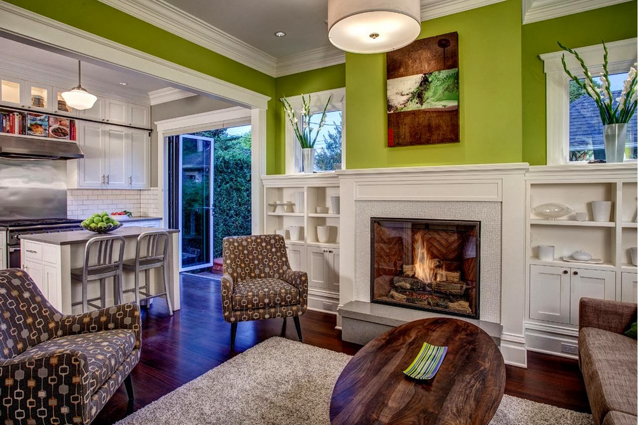
I am not sure what green was used in this space. However, you would definitely want one with a brighter yellow undertone to it like Pear Green 2028-40 BM.  I do have another green in mind but I can't find my smaller Sherwin Williams fan deck and I can't remember the name...Lemongrass maybe- ARGH!!


 The darker gray used throughout the space is Kendall Gray HC-166 by Benjamin Moore.  It really looks amazing against that great orangey red-LOVE IT!!


 This colour may be Moderne White 6168 SW but don't hold me to it!!


 The blue in this space is Georgian Bay SW6509 by Sherwin Williams.  I love this Blue-such a great colour for an Office or Bedroom.  I also think it would be great painted at the back of a bookshelf/wall unit for a splash of colour.


And now the most amazing Lego storage EVER!!!


 Kendall Gray HC-166 BM and Techno Gray 6170 SW


How incredible!!  All that Lego!!   And it could definitely be a DIY project.  Just use loads of Ikea bins!!  I love too how they used cork in the main part of the Lego area.  Cork is very comfy to be on, warm to the touch and would have the added bonus for our Lego afficiando's to build directly on the floor- which is something I am sure they thought of when choosing for this space!!  If you have Lego or know of someone who does then you may have heard of the stories of Lego and carpet.  Using cork here is a great solution to a "Lego problem".  You can easily scoop it up, it doesn't get "lost" in the carpet, and as mentioned before you can build deirectly on it- BONUS all around.
And I thought we had a load of Lego!!

So there you have it....my dream room for Lego.  Oh how I hope I can build something like this for my guys before they are too old to appreciate it.  Then again, any Lego afficiando will tell you that you ARE NEVER TOO OLD TO PLAY WITH LEGO!!

Have an amazing day everyone.
Megan

Wednesday, August 28, 2013

CALIENTE RED DOOR!

Hey Everyone.....Just a very quick posting today.  Usually I am not a fan of White Siding on a house.  However, there are instances when it really works.  This is just one case........


I LOVE a Red Door....and I mean love it!!  There is just something so amazing about a red door.  It catches your attention, yet at the same time it is so welcoming.  If you have always wanted to add a little Red to your life....then adding it to the front door is such a great place to start.......As long as it is the right Red that is.  This particular one is Caliente by Benjamin Moore.  It is an amazing Red.  One of my fav's in fact.

Caliente AF-290 Benjamin Moore

It is one of those Reds that is almost perfection.  It isn't too bright, to brown, too light or too dark.  It has such a richness to it.  If you are looking for a red that is a classic then this just may be your starting place.

Have a great day everyone.
Megan

Tuesday, May 28, 2013

GRAY OFFICE

Hey Everyone!  Hope all is well in your Universe. Sorry for the absence but things have been quite busy around here as of late.  I am currently helping my Man out with painting the board room of his office.  Let me just start by saying that the current colour of that said office is quite the "eye opener".  If he and his cronies aren't awake when they get to work in the morning, they certainly will be once they go through their office doors.  To say that the walls are 'bright" would be an understatement!!  I have used my fan deck to try and figure out the current colour...the closest I can get is........

Key Lime 2031-50 Benjamin Moore

Spring Meadow Green 2031-40 Benjamin Moore

Now...looking at these colours you might think, "they don't look so bright".  Well you should see them on the paint chip never mind on the walls!!!!! I am hoping that in time that we will be able to tone down the colour!  So as for the board room..... I wanted to stay neutral for the a couple of reasons.... One being the dark mottled gray carpet i there and the "neon green" everywhere else.  In fact I had to pick the colours for the board room so that they would go with the green in the office as well as the "orange" in their logo....

That colour is very similar to if not bang on with:

Sharp Cheddar 2017-20 Benjamin Moore

As you can see it is a full on Orange.  It is quite a stunning orange really.....so I wanted to make sure that the Grays that we chose would go with all of the above.
In the board room the guys have a big flat screen tv on one of the short walls.  I wanted to help "disguise" the big monstrosity of a tv.... so I suggested that we paint out that wall a darker colour to help with that.  I originally wanted to paint the two shorter walls (in length) Iron Mountain:
Iron Mountain 2134-30 Benjamin Moore

As you can see it is a gray with a warm browny undertone to it.  The carpet too has a warmer undertone to it.  However, we were afraid that Iron Mountain was reading too brown in the Board Room so I picked:

Gray 2121-10 Benjamin Moore

It reads more as a true gray in that room yet does not read as a gray with a blue undertone to it.

So today I painted the two long walls the following gray:
Gull Wing Gray 2134-50 Benjamin Moore

It really looks great in there.  And it especially looks great looking through the doorway and seeing that crazy neon green with it.  In fact it makes that crazy green look better.  I can't wait until I get the darker gray in there....that is tomorrow's job!  This really was a lesson in picking the right colour with the right undertone for a space.  Like I said ....... I think that the Iron Mountain was the best "colour match" with the rug, however, the gray that we picked best suited the whole overall space.  Tricky stuff!!

On one of the shorter (in length) walls we also painted a "stripe" of  writable paint.  When you are writing code for programs, the guys love to be able to write out ideas on a "white board".  Well a 4'x8' white board will set you back around $800.00!!!   So my Man did some poking around on the interwebs and found this great paint called Idea Paint: Create.  It is a Dry Earase Whiteboard Paint.  How fabulous it that?  It cost around $150.00 and did a swath of 5'x16'.  Plus we did up a separate board that will be hung in my Hubs own little office area.  You just mix the two parts together and roller it on.  It ends up being very shiny when it has dried.  You can use it 4 days later.  I know that they are chomping at the bit to try it but they are being good boys and are not....they want to make sure that it has cured properly.  On that wall will be the Dry Erase Paint area and a border top and bottom of the Gray.  I can't wait until everything is done and I can show some pics.  Here is an example of what can be done with this great paint:


I will let you know how well it holds up for them.  The guys were recently in Toronto at a consultants office and they had the same paint.  Den said it was awesome to see the walls covered in this stuff and to see how it helped with the creative process.  People would just stop and write, have impromptu meetings....he loved seeing that.  Being creative without restraints can be such a freeing thing!!

So now you know what I have been up too......
Will keep you up to date.

Have a great day everyone.
Megan

Wednesday, April 24, 2013

BLUE AND YELLOW

Hey Everyone.....Is it spring where you are yet??  It is trying to be spring here.  Trying is the key word!  Is there anything more sunny than the combo of Blue and Yellow.  I have always loved this combo.  There is just something about these two colours that always puts a smile on my face.  No matter what the colour of the month or year is, I always seem to come back to the classics.
Here are some great examples of this amazing classic combo:


I LOVE that dresser-such an amazing colour.  And love the hardware too.


Now....the next set of pics is from one house.  When I saw these-they truly took my breath away.  The way in which the designer has interpreted the "traditional" blue and yellow colour scheme is so fresh and modern- I just LOVE IT....enjoy;


Just look at those amazing stools!!  You can't get sunnier and happier than those.  And that Pendant over the island- AMAZING!!  You can find a similar one at Restoration Hardware.
The cabinet colour is Benjamin Moore Hazy Skies OC-48.  The Tolix Marais Stool can be purchased at DWR.

 The Counter Top is Calcutta Oro-honed.  How gorgeous is this??


The wall colour in this foyer is Benjamin Moore- Sea Star 2123-30.  It is such a great Bluey greeny colour without being overly saturated.


I suppose that I could go on and on.....Blue and Yellow is such a great combo.  It really does fit well in either a traditional or a contemporary setting...or anywhere in between.

Some great yellows for walls you may like are:  In no particular order.

Benjamin Moore-Weston Flax HC-5


Benjamin Moore-Hepplewhite Ivory HC-36


Benjamin Moore-Hawthorne Yellow HC-4


Benjamin Moore-Vellum CC-200


Benjamin Moore- Goldtone OC-112
I would have to say that Goldtone is one of my all time favourite Yellows- it is a lovely sunny yellow without being overwhelmingly yellow.  That is the thing with yellow-you have to choose cautiously or you will end up with your walls looking like Big Bird or a School Bus!

An even more subtle yellow than Goldtone would be;

Benjamin Moore-Milkyway OC-110


Now for a front door or a piece of furniture it would be fantastic to go all out.  Some examples would be

Benjamin Moore-York Harbour Yellow 2154-40


Benjamin Moore-Dijon-CC 210


Laura Ashley- Cowslip 3  LA803


Farrow & Ball-Babouche No.223


Farrow & Ball-Citron No.74

There isn't anything wrong in using these full on yellows, it is just that they will be a big "WOW" in the room- which if that is what you are looking for then by all means go for it.  These full on yellows are great as accent pieces.

That's all for now folks I really have to stop myself as I could find thousands of examples of Blue and Yellow.  I will probably revisit this amazing combo in the future.
Have a great day everyone.
Megan