Thursday, February 28, 2013

BUSY, BUSY, BUSY.......

Sorry I haven't posted for a few days!  I have been busy and not so busy.  Will do better-promise.  I have been working very hard at a couple of projects ie: knitting stuff, thinking of doing the upstairs/back hall and of course our Master- which was supposed to have been started this time last year-ARGH!!!!!

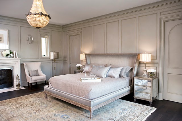
So here are a few pics of bedrooms that are inspiring me:  I have no bloody idea which way I will go.  It is SO MUCH HARDER WORKING FOR ONESELF THAN WORKING FOR ANOTHER PERSON.  I am sure that those of you out there that look at many blogs have heard this before.  I can tell a client exactly what they should do in their space.  When it comes to my space-UGH!!  I think it is because I see SO MANY possibilities that I can do.  JUST PICK ONE!!!!

Anyways.........


This is soooo pretty.......


I am really loving all the gray right now.  I didn't think those words would come out of my mouth!!


Hope this gives a little inspiration.
Have a great day everyone.  And I promise to be back to my old self soon.... although my youngest one would say to that...."your not old Mama".  I love him so!

Megan

Monday, February 25, 2013

SILK HEADBOARD AND WHAT NOT TA! MAYBE??

Hey Everyone..... I came across an amazing house at Home Bunch.  It is very visually stunning.  And WAY out of my snack bracket!  What I wanted to share with you all is this bed:


Although very lovely and very riche.  It is so NOT practical.  Most of us live in the real world and I just wanted to bring a little of my experience with fabrics to you all so that you will not make a mistake if you too want this look.
The fabric used on the bed headboard is 100% Silk.  So very luxurious and so amazing.  It is from Kravet and is called Serenity.  It is presented in the Graystone Colourway.  Absolutely STUNNING fabric.  However.....This fabric is best suited to VERY and I mean VERY light use. Use such as pillows and drapes that would be lined and interlined within an inch of its life!  I don't know about you but my headboard takes a beating.  Some people and my husband is one of them tends to sleep with his hands above his head-as does his father.  This would cause pulls and picks in this fabric.  In addition, he tends to have a little extra sebum in his hair.  That sebum tends to cause yellowing of pillow cases and the headboard.  I know some will think Ewwww...but really it is REAL LIFE.  Therefore, when we chose a headboard we have to keep that in mind.  So I hope that this will make a few of you out there think before you leap.  Yes this bed is GORGEOUS but will it fit into your lifestyle.  A lot of the time we really have to think with our head and not our hearts.  Reality really sucks sometimes.
Please head over to Home Bunch to see the rest of this amazing home as well as some other incredible homes and interiors.

If it were me I would always cover a headboard in a very hard wearing fabric such as Velvet or a Heavy Cotton.  I live in a very "washable" world so could NEVER imagine having a Silk Headboard.  I know that people do all the time- has anyone had one and did it stand up to the tests of time?  One note about silk bedding too.... again one has to think about the practically of a duvet cover or blanket.  These items will have to be cleaned.  IF and I stress IF you don't mind Dry Cleaning these items then by all means buy away.  I am one of those people that hasn't used a Dry Cleaner in like.... I can't remember the last time I did!  I need to have Cotton myself.  If your lovely Silk Duvet accidentally gets machine washed and I know someone this happened too be prepared to have thrown a lot of money away.  Life happens all the time and you have to think will this Silk Duvet fit into that life...just a little advise.

Have a great day everyone.
Megan


Friday, February 22, 2013

CRAFTSMAN STYLE HOME & WYTHE BLUE HC-143

Hey Everyone...A while back I did a posting on Bookcase Dividers here.  One of those amazing Bookcase Dividers was part of an incredible house.  The house both inside and out is all Craftsman Inspired.  Now originally a true Craftsman house was very dark and full of wood.  The now updated version of this style includes a lot of White Trim as well.  I think this really helps to lighten up the "true" classic Craftsman style.

I wanted to share with you some pics of an amazing house. It was built by Moore Architects. Here is the rest of that house:


The Exterior Colours are as follows- all Sherwin Williams:

Trim including Eaves:

Downing Sand SW 2822 (Semi Gloss)

Cedar Shingles:

Downing Earth SW 2820 (Flat)


Stucco:

Downing Earth SW 2820 (Semi Gloss)


Windows:

Polished Mahogany SW 2838 (Semi Gloss)


Paint Colour for Kitchen and Hallway:
Benjamin Moore; Adam's Gold HC-18


Paint Colour for Living Room and Office:

Benjamin Moore Wythe Blue HC-143


Sorry I don't have any info on the paint for this bathroom.  But if I do find it out I will update.  As well I do not know what colour they used for the trim.  If it were me I would probably use either White Dove or Simply White.  But maybe in the future we can find out what colour they used.

You can see why I was smitten with this house.

One source you may want to try to buy Craftsman style lighting is:

1.  Rejuvenation:

$185.00


1.  Rejuvenation:

$205.00


1.  Rejuvenation:

$355.00


So there you have it a little inspiration for Fri.

Have a great weekend everyone.

Megan


Thursday, February 21, 2013

RED WHITE AND BLUE KITCHEN & WHAT NOT TA!!

Hey Everyone!  We are getting closer to Spring!!  Although we here in Southern Ontario we are still very firmly entrenched in Winter.....But a girl can dream.......
Quite awhile ago I came across a kitchen that I adore.  However, there is a little problem with it.  Nothing that couldn't be fixed with a little money, a trip to the store and a little common sense.

Here is that lovely kitchen reno'ed by TreHus Architects & Interiors....


Now let me first start off by saying I really LOVE this kitchen.  And I do hope that by now you all know that I don't moan and cause a stir just for the sake of it.  That is just NOT ME.  Can you see what is wrong with the kitchen........  Can you see it????

There is no FAN!!  I don't know about you but I actually cook in my kitchen.  And for those of you who do cook know that a Fan is a necessity, never mind it NOT being to code.  If you look at the comments someone chimed in that there isn't actually a code.... I don't know about them but here in Ontario that kitchen would NOT have passed.  And even for the sake of argument there was no code....isn't it just common sense?  Have you ever tried to boil water without the fan on?  Have you ever tried to fry something on the stove without the fan on??  I could go on and on......To me it is just common sense.  However, if a fan was installed it certainly would interfere with the "pretty" open shelves.  But that begs the question once again...Do these people not cook??  How insanely grimy would those shelves get without a fan. Never mind the fact they would get pretty grimy with a fan.

Why do I bring this up?  Well it is for purposes of enlightening.  For those of you that are in the market for a reno'ed kitchen, you probably troll the web for inspiration. And why not?  It is such an awesome place for it.  But for those that are naive about renovating a kitchen they may not even think of the ramifications of implementing such a design flaw.  I just wanted to point it out so others do not follow in the same footsteps.

As I said....I really do love this kitchen except for the fan issue and that is very easily fixed.  Here is some further info on this kitchen.
The hutch has been painted Benjamin Moore- Van Courtland Blue.  The side room has been painted Pratt & Lambert Terra Cotta.  The Tongue and Grove treatment on the walls is made of Alder.

I really cannot stress how much I adore the colour scheme and finishes picked in this kitchen- kind of a dream kitchen for me.... Oh... the white cabinets, marble counter tops, breadboard cabinets, red stools, blue hutch...... I could go on and on.

You should check Out TreHus' other projects they are pretty amazing.

Well that's it for now everyone...I hope you all learned just a little something today and were inspired by the Red White and Blue loveliness.

Have a great day everyone.
Megan

Monday, February 18, 2013

RED HOUSE LOVE!!

Hey Everyone!  I came across this amazing home and had to share it.  If I ever get the opportunity to build a house I hope I am brave enough to use RED!  As you may know I love me some red!!  So without further ado here is an amazing build that got me thinking in this direction.  Enjoy:


Wall Colour- Benjamin Moore Beach Glass 1564.  Which should NOT be confused with another Benjamin Moore Colour also called Beach Glass CC-606.


Pretty amazing!!  What caught my eye was that incredible red on the exterior.  You can see more pics at
Mac Custom Homes.

One other pic that is inspiring the "red" in me is this one:


I can't even put into words how much I love their renos.  Check them out.

Have a great day everyone.
Megan

ROUND WINDOW-WASTED OPPORTUNITY??

Hey Everyone!  Today is Family Day here in Ontario and soon the Boys and I will be heading off to the movies.  Hope everyone else decides to go to the Science Center. I came across this amazing pic and just wanted to share it with you all.  First of all I am a sucker for round or oval windows.  But I must say that I feel how it has been presenting is a wasted opportunity.  Why O' why would anyone block such an amazing area??  Get me closer to that window is what I say.  Doesn't this space SCREAM for a banquette/built in??  Wouldn't you want to hang out here and read if that space had a great built in with tons of pillows??


Wasted space??  Yes or No??

Here is a pic of the exterior of this amazing house:


And this incredible home can be yours if A. you have 3.7million lying around or B. live in the Vancouver BC area.  You can see the full listing here

Have a great day everyone.
Megan.

Friday, February 15, 2013

FLOWER POWER FRIDAY

Happy Friday Everyone!  Just a quick little image today..... received some lovely flowers yesterday.  It is always nice to get flowers.  That is the one thing that bothers me about our cold Canadian Winters is the lack of foliage outside.  By the time the end of Feb. rolls around I am hungering for colour outside.  So here is a little bit of colour to brighten the day.......


Have a great Weekend Everyone.
Megan

Thursday, February 14, 2013

KATE SPADE - GARDNER COLLECTION

Hey Everyone! Happy Valentines Day!  I came across an add in the March 2013 House Beautiful that caught my eye right away.  It was kind of like...Oh...shiny thing. I tried to find a pic of it online but couldn't find it anywhere.  So I took a Pic of the Pic to share.

Kate Spade Gardner Collection


How fabulous is this??  I was so struck by the Peony's, the colour of the table cloth and of course the back round greeney blue.  The back round colour is much more green in the ad.  Amazing!!  Oh and of course the dishes are gorgeous as well.  This would be such a great table for Valentines.  My hub's may not think so but I LOVE IT!!!

So I got to thinking about the colours themselves.  So here are some paint colours I would pullout:

Rosy Blush BM 2086-30

Rose Parade BM 2086-20

Shore House Green BM 2047-50


How lovely are these colours??  I think I have a new colour crush with these.

Have a great day everyone.
Megan