Friday, August 31, 2012

END OF SUMMER UPDATE 2


So.... like I stated previously..... I have been mulling different patterns around in my head for awhile.  A shrug and two scarves.
You know...... the design process is very organic, I never know where I am going to take myself.  It can be quite a journey.  But one that I love to take. Sometimes like any journey, you like where you have ended up and sometimes..... not so much.  Knitting is very much that way.  Especially when you are designing.  But I love it!!!
Here is what I have been working on:


1.  A shruggy kind of thing!  I wanted to knit with 100% Acrylic to see how it would hold up to what I wanted to create.  Usually I am a wool kinda girl, but, I have friends that are not, as you know.  So I wanted to create a simple yet visually interesting shrug that was (somewhat) easy to make. This is where I hear my friends laughing and saying... "easy for YOU!!!"   It has ribbing, seed stitch and cables.  And I have to say I am slightly impressed with the way the 100% Acrylic is coming out.  I chose a Red Heart yarn and it is quite lovely to knit with.


I am nearing the end of it.... I started it during the Olympics and was just flying along but came to a halt when life got in the way.... cottage, kids, stuff!!  So when it is done I will make sure to let you all know when the pattern is up and on Ravelry.


2.  I have a scarf pattern that has been mulling around in my head for sometime.  I have tried a few gauges and I think that a finer gauge suits the pattern better.  I have tried worsted, dk and now sock weight.  I do think that the sock weight (28sts) is working best.  I have been knitting it in some yarn I had lying around- a Bernat Sock Yarn that is 100% Acrylic. It is quite nice.  But I am going to be looking for a yarn that is mostly wool.  Would love to do Cashmere but the budget just won't allow.  Anyone out there with sock weight 28sts Cashmere they want to donate..........  Always glad to accept yarn :)  It is at times like this that I yearn for my own yarn store.  Or the very least input into creating yarn.... Oh the artistic freedom!!
But maybe I will order some yarn from Quince & Co.  They have such lovely yarn!  Maybe one of the following:

Finch is a lovely 100% Wool that has 28-32sts/4".


Chickadee is also 100% Wool but is slightly heavier in gauge than Finch.  It is 24-26sts/4".


Tern is 75% Wool/25% Silk.  How lovely would my scarf be in this??  It has a gauge of 28-32sts/4".


Here it is knit in the yarn I eventually used for my Easy Peazy Shawl 2.0 that can be found here & here.
It is knit here in a DK weight yarn.  But I felt that I needed a finer yarn for what I was going for.
Again, stay tuned......

The last thing that has been on my mind has been a fair isle scarf with the colours similar to a sweater in yesterday's posting.  I was really inspired by the palette.  It is one of those things that has been stuck in my brain so I had to put it to paper to help get it out of my head. 
Here is a sneak peek:


I tend to work on the computer a lot when I am designing.  I work in Corel Draw.  I learned it for work donkeys years ago and it kind of stuck with me. I use that program for everything.  I am sure that there are programs out there for knitters but this is what I have for now.
So there you have it...... Knitting, knitting and more knitting........
Have a great day everyone.
Megan

Thursday, August 30, 2012

END OF SUMMER UPDATE

OK........So I haven't painted upstairs yet!!  ARGH!!!  Normally I am very quick at doing these things but summer and the boys have gotten in the way.  In a good way of course!!  When they go back to school I am going to tuck in and get the upstairs done, the main bath, continue on with my knitting patterns.  I have no less than 3 patterns on the go.

Here is the colour I am thinking for the main bath:

Aqua Frost WV35007  Waverly Valspar


So this past week I had put up a bunch of paint chips in the bathroom and independently my hubs and myself picked the same chip.  So.... since it was quite unanimous.... Aqua Frost it shall be.  It is a great clean aquaeey blue.  It is by Waverly for Valspar. So I am going to be putting accents of navy and red in there with it.  Stay tuned for that.


Here is what the Bathroom looks like currently- not professional shots or anything.  Just Real Life!!


It is really small.  But it works!  We renovated it ourselves 8 years ago when we moved in.  Took it right down to the studs.  What a HOT MESS that was.  Ever have a brown toilet, sink and tub?  I mean, even in it's day it wouldn't have looked good!!  Makes you think, "What were they thinking?"  We have our Master upstairs that is a 3 piece.  That will be next on the list-Budget allowing of course!!  Do you see my Chenille Shower Curtain?  I have had that thing for 12 years!!  Crazy I know!  I bought it at Winner's (like a Marshall's).  It has washed amazingly well, held up to abuse and generally just looks as awesome as the day I bought it.  I will be keeping it but I may be trying a navy and white one in there.  Will have to wait and see.
I am currently working a a few knitting patterns as well.  More to follow tomorrow!!
Have a great day everyone.
Megan


Wednesday, August 29, 2012

FAIR ISLE INSPIRATIONAL COLOUR

Hey everyone.... here is a quick posting on inspirational colour from Fair Isle,  although it did take me a little while to put it together so it looked all pretty like!!
As you know I am a huge fan of yarn that is wool or derivatives there of.  Here are some things that I am thinking of and being inspired by.  I love the colour that is found in Fair Isle:


I would love to get a hold of some of this.  I would imagine how lovely it would be to knit with.  So soft.  And the colours are amazing!!
I have been wanting to come up with a pattern where I can use this colour combo.  Have to put the old thinking cap on.  These colours would look awesome in a blanket or a poncho...... Hmmmm..........


 If you have never knit with any of Debbie's Cashmerino lines then you have to go out NOW  and get yourself some.  It is one of my favourite yarns ever.  I have made many wristwarmers in the Aran weight:


These lovelies are "Fetching" and can be found at Knitty.  Click on the above link.  Knitting with the Cashmerino line whether Aran or Baby is like a dream.  I cannot stress enough how wonderful this yarn is to knit with.  I will be making many more of these in the future.  The only thing that I do differently is that I do NOT do the Picot edge bind off.  I find that it makes the top to gaping.  I just do a regular bind off.


I just Love the earthy colours found in this sweater. It is definitely on my to do list.  I have such a large to do list for knitting.  But those of us that knit avidly have a huge to do list- don't we??

Well that's it for today.  I hope you can garner a little inspiration from the colours I talked about.
Have a great day everyone.
Megan

Tuesday, August 28, 2012

PANTONE FALL 2012 PART 4

Hey everyone in today's post I will be taking about Rhapsody.  It truly is a lovely mid toned Purple.  You know..... purple is one of those very polarizing colours.  It really does pull out a lot of opinions.  Either people love Purple or they hate it.  I happen to be one of those people that love purple-always have.  Now my Dad on the other hand....  well that man HATED purple.  I mean he truly had a hate on for that one!  He was exceedingly vocal about it!!
Rhapsody is the type of purple that is a mid toned to deep toned purple.  It isn't full of Magenta like some purples.  It isn't super bright either.  It is quite a complex colour when you really look at it.  So keep that in mind when I try to present rooms that are Rhapsody like!!
Here is Rhapsody:


Isn't it lovely??


 So..... like I said, finding just the right purple can be quite the challenge.  One may be too gray, too bright or too blue!!  So we are going to go on a purple journey and hopefully find the perfect purple for Rhapsody!


Here is a great example of how great Purple looks with Tangerine Tango.  And of course it is paired with a ton of white- LOVE IT!!!  However it isn't quite the right purple to be Rhapsody- slightly too much magenta in it me thinks!!


This one is way too saturated in hue.  It looks absolutely fabulous in this amazing bathroom.  But it is way too intense to be a good match for Rhapsody.  Purple is one of those colours that really does look great with wood, steel and marble.


This is such a lovely bedroom.  I love how moody it is.  And this is such a great example of how great purple goes with wood.  Now, in this case the purple for the walls is way too dark and full of "Navy" to be right for Rhapsody.  The duvet has way too much Magenta in it to be right as well.  But it is still such an amazing contemporary bedroom.


Now.... this great kids bedroom is awash in many purples.  I think I counted 5 in all.  And to me the only one that comes close to Rhapsody would be the bed.  That duvet isn't quite right but it comes close.  The walls have too much red in the purple.  The drape over the bed is too saturated.  The stripe with the flowers on the wall aren't right either.  But it does add up to a great visual room for a young lady!!


 I love this room by Rachel Reider.  She always has such great use of colour.  In his room I wanted to talk about the wall colour.  Again not Rhapsody, but,  it is a really great purple.  What a great room to hang out in!!  This purple is much deeper than Rhapsody.


 This is such a great example of how great this type of purple goes with marble.  This is such a great modern space.  I love the addition of the rough hewned table.  Such a great touch!  This is a close second as far a purples go if I were to pick it.  But it is slightly darker than the one we are looking for.


This one too comes pretty close.  The fabric used on the chairs and the striped pillows are quite close to Rhapsody.  They maybe slightly too bright, but I think it may be close enough for government work!!  This is such a great room.  And it looks fabulous with that Tangerine Tango!!  And could I please have that grass cloth???  Yes please!!!!


In this pic this is a great example of how to use purple as an accent.  Great choice for the chairs.  And I think it is the closest I have been able to find as far as rooms go.


If I were to pick a purple paint that would be Rhapsody, it would have to be:


Brave Purple SW6823  Sherwin Williams

Now... I really struggled with this one.  Trying to find a purple that matches was quite hard but I think this would do the trick if you were looking for a paint to emulate Rhapsody for your walls. 
Again, trying to find the right purple that has the right balance of saturation and undertone can be a challenge.  Look in a fan deck.  There are a ton of blacks, whites or even beige's.  But purple is a challenge.  Some have more Magenta.  Some are very grayed down.  Some are bright as all get out.  But either way you find purple, I love them all.

Have a great day everyone
Megan


Monday, August 27, 2012

SAGE ADVICE 5

So...... the other day when we were at the cottage my Mum-in-Law and I were talking about pillowcases and how, if a person can have overly oily hair, then pillowcases, baseball hats or even headboards can tend to yellow.  Ewww... I know.  But it is a fact of life.  I happen to be married to such a person, so it can be an issue with our linens and such.  What is one to do about it??  Well you can try the following method here.  I have to say if you think you should use bleach- DON'T!!!  Bleach will Yellow cotton fabric.  Even if you dilute it, Bleach will yellow or damage your fabric.  Bleach definitely helps in certain instances but I try really hard to NEVER put bleach on any fabric.  I use Oxygen Bleach instead,  it is completely different from regular bleach.  It will not damage fabric the way the regular bleach will. 
One other thing you may try to use is Shampoo.  Just think about it.  You are trying to remove hair oil and that is what Shampoo is for.  I wash all my baseball hats in Shampoo.
So this discussion of yellowing linen's led me to thinking about Headboards.  What makes a great headboard and what does not.

1.  IF YOU LOVE TO READ IN BED THEN A METAL HEADBOARD MAY NOT BE FOR YOU!  Just think about it.  When you are in bed and propping up those pillows, you will most likely fall through one of those slotted metal rods.  I LOVE the way a metal headboard looks, but I would never buy one because I love to read and knit in bed. You may want to think of another headboard.


2.  IF YOU TEND HAVE AN OILY HEAD, BEWARE OF WHAT YOU PICK FOR A HEADBOARD!!  I love a tufted headboard,  I love a leather headboard, I just don't think they will work for us.  If you do tend to have oily hair then listen up.  If you get a tufted headboard you may not be able to clean it well enough.  If you get a leather headboard you may discolour the leather.  I have seen it happen.  This can also happen to leather sofa's as well.  I have seen sofa's where it is quite obvious that someone with oily hair sat there a lot.  Again... Ewwww... but that's life!  The only advice I can give for the leather is if you are bent on getting one, then spray it with leather protector.  That is the only advice I can give.


How gorgeous is this?  My only issue is-How do I clean this??  I suppose the only way is to have it professionally cleaned.  And if it is Silk- then look out!!


A great alternative to "fabric" is to use Vinyl like Michelle did:

Vinyl is such a great option if staining is an issue.  All you have to do is wipe it clean.  LOVE IT!!


Like I said before the only way to protect leather is to take care of it.  It has to be cared for just like your skin, it is skin after all.  And if you buy cheap then you get what you payed for.  If you buy any piece of leather furniture that is cheap then it probably is (cheap that is)  and is most likely Bonded Leather.  Horrible, horrible stuff.   It will crack, peel and rip.  Just a warning is all.  I could go into my own description but here is an excellent one already done for you- "There are different types of bonded leather, but the type being used on upholstered furniture today is a polyurethane or vinyl product, backed with fabric and then a layer of latex or other material mixed with a small percentage of leather fibers in the product's backing material. The actual leather content of bonded leather varies depending on the manufacturer and the quality level they are selling. The polyurethane surface is stamped to give it a leather-like texture. In the home furnishings industry there is much debate and controversy over the ethics of using the term "bonded leather" to describe a vinyl upholstery product. Nick Cory of the Leather Research Laboratory said that calling this product "bonded leather" is "deceptive because it does not represent its true nature. It's a vinyl, or a polyurethane laminate or a composite, but it's not leather-- Wikipedia.  I don't usually hold Wiki in high honour, but in this instance the definition is right on.  Bonded leather is NOT Leather.  I don't care what the salesperson says- IT IS NOT REAL LEATHER!  Enough said........


So what is a person to do if you want a fabric headboard.  Well.... in our instance we have a slipcover headboard.  That way I can whip that sucker off and pop it in the washing machine.  I am a huge fan of slipcovers of all kinds.  I know that they are not for everyone but they work for our lifestyle. 


And that is the true crux of the problem isn't it.  How do YOU live YOUR life.  If you have oily hair there is NO WAY ON GOD'S GREEN EARTH YOU SHOULD EVER HAVE SILK AS A HEADBOARD.  I see amazing headboards all the time.  But I think to myself..... How do they live with it???


Now.... just look at this lovely.  Gorgeous colour, great lines and....COMPLETELY IMPRACTICAL!!  How are you going to clean it??  You can't!!  PLUS.....  even if you do not have issue with oily hair it will still stain, pull and Pill.  It is inherent in the type of weave and fabric it is made of.  Do I think it looks lovely? Absolutely!!  But in no time flat it will start to not look so lovely.  And then what???


I remember seeing this lovely a while back in Country Living (I think).  Is it gorgeous? Absolutely!  But again, think about your lifestyle and whether it will suit it.  There are so many times that people get caught up in a look and don't stop to think if this will suit there life.  Remember everyone- you do not live in a magazine vignette.  Life is life.  Sometimes that life gets in the way of your ideal perfection.  I personally gave up on perfection awhile ago!  Now I just do my best with what I have everyday.  And that means that I will NEVER have a silk headboard due to certain constraints we have with our lifestyle.  If you can live by this then you will make wiser decisions and maybe, just maybe save yourself some heartache and some money!!

So there you have it.  Some thoughts on headboards and your hair.   
Have a great day everyone!
Megan

Friday, August 24, 2012

FAVOURITE KITCHENS OF ALL TIME!!

Hey everyone! We are just back from being at the cottage for a few days.... so I don't have too much prepared but I thought I would do a quick posting of my favourite kitchens of all time.  So without further ado and much fanfare.....here they are:


I have loved this small but mighty kitchen forever!! It packs a whole lot into a small space.  Can't say enough about it!! STUNNING!


This amazing kitchen is in the home of the amazing designer Michelle Hanna.  I LOVE everything about it.  Just plunk me down in here.  For reference the cabinets are painted Benjamin Moore- Old Prairie OC-42, the counters ar Nero Asolutto-honed granite.  I know that it says marble on the House and Home website but they are WRONG.  Nero is not a marble but a granite.


LOVE IT!!  All that white and black.  And that star!!!


I think I actually gasped when I saw this a couple of years ago.  One of my favourite colours of all time is Wythe Blue HC-143  Benjamin Moore.  And of course gotta love that white cabinetry!!


If I ever move to the Hampton's then this will be my Kitchen!!


Tommy Smythe

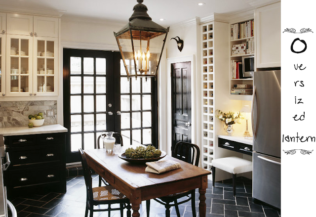
What can I even say about this but complete perfection?  I don't even know what I love more.... the slate floor, the black doors/windows, the lantern, the white and black cabinetry or the marble counter!  OYYY!!!


The last one I am showing I have two shots of it and all I can say is YES PLEASE!!


This kitchen is definitely in my top 3 if not my top pick.  What does it for me?  THAT BANQUETTE!!!  All that trim.  All that chalky white and turquoise........  The marble, the white cabinetry......  LOVE, LOVE IT!!


Hope you enjoyed.  Have a great day and a great weekend everyone!
Megan

Thursday, August 23, 2012

CATH KIDSTON INSPIRED BLANKET

So.......  I think that I have been mildly obsessing about Cath Kidston colours as of late.  You know the colours I mean don't you??


Cath Kidston Colours


They are such happy colours.  So, between staring at these colours for hours on end and some of her other little goodies I have been hatching a plan for a blanket.
Here is some of the images that have been inspiring me onwards:


Source Unknown


So you can see that I am mildly obsessed with the colours and the designs.  So I am thinking of knitting a small blanket with the colours that I have shown.  Plus..... I want to add some texture and I think it will be striped like in the bedding in the above pic.  So when I find the yarn and sort it all out I will let you all know.

Have a great day everyone.
Megan