Showing posts with label Inspiration Board. Show all posts

Thursday, February 2, 2012

OH AMY!!

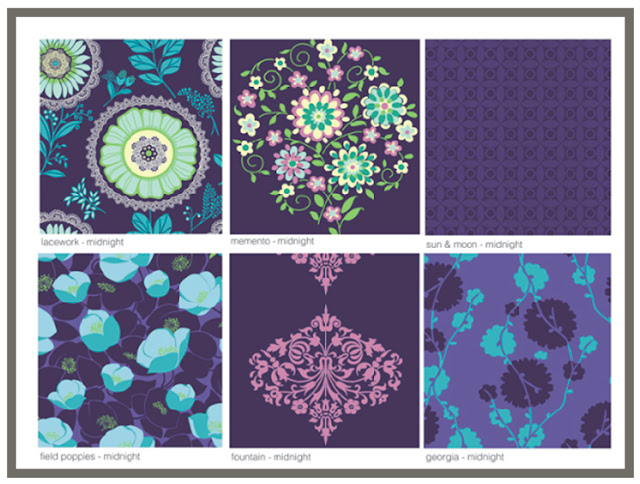
I LOVE Amy Butler designs.  I love her fabric, designs and wallpaper.  Came across some of her wallpaper today and it made me think of what I would do with this lovely gorgeousness.  Besides the designs themselves the colours are to die for:


I can't even put into words how happy this wallpaper makes me feel.  I especially liked the "Stone" and "Moss" colourways.
I thought that the wallpaper- "Fountain" in the Stone Colourway would look really great in my master bath!  Don't know if I can convince Hubs to go along- we'll see.  Here is a small mock up of what it may look like:


I am still getting used to photoshopping using GIMP, so bear with me until I get really good at it!  I LOVE this colourway and pattern.  What is so great about a pattern like this one is that it isn't too feminine and the colourway is really quite masculine.  Maybe that's why I love it!

I also fell for 2 other wallpapers that would look great in a room together:


Ceiling:


Wall:

I am especially inspired by the above wallpaper.  The colours are so fresh and alive.  Brings a little sunshine to my gray Canadian day!  I would love to use both of those in  my bedroom.  Don't think it will fly though!!  Can't blame a girl for trying!
Thats all for now everyone.  Have a great day.
Megan


Thursday, January 26, 2012

WINE LABEL ROOM DESIGN 2

First of all, I think the Australian Open (tennis) is going to kill me!  This 16hr time difference is killer!  Might have to get up at 3:30am tomorrow morning if I want to watch the 2nd semi-final.  I LOVE TENNIS.  Always have loved tennis.  It is my goal in life to go to all 4 major tournaments in my lifetime!  I have not been to any yet!  Only been to tournaments in Toronto.  I have been lucky enough to see some great players in my life: Lendl, Courier, Rafter, Agassi, Nadal, Federer.  I really love the current 4 top players. Besides the fact these guys can really play, they are such great sportsman.   They have the utmost respect for one another.  They are such great role models for their sport.
Anyways, back to design........Here is another Wine label that intrigued me at the Liquor Store.  I have to be honest- one of my friends happened to see it first!  She definitely has a great eye for things!  The wine I am talking about is:


Again, I am not a wine expert but I do know what I like.  And I must say that this Chardonnay is really great!  It was very smooth and not acidic at all.  It also had lovely flavour!  So another winner for picking wine because of it's label.  How crazy is that??  I guess this is an example of Marketing at work!

There is something so French Country about the label.  Could be the colours used: Bright Yellow and Navy.  But I think that it has something to do with the graphics as well.
If I were to design a room around the label it might look something like this:


Sofa: Ballards
Chair: Ballards
Side Table:  Restoration Hardware
Ottoman:  Ballards
Fabric: Tonic Living
Paint:  Walls: Benjamin Moore - Wickham Gray HC 171
          Trim: Benjamin Moore-  Decorators White CC 20
Area Rug: To be grayer than sample shown.

This is my take on a Modern French Country theme.  I can just see this bottle of wine sitting (opened of course) in this room.
Well must try to get a nap today so that I can get up early to see my semi final!!
Hope you enjoyed.  Have a great day!
Megan

Wednesday, January 25, 2012

TO DYE FOR!!!


Now, first of all I think Sarah Michelle Gellar is so lovely!  I have enjoyed watching her since she was on All My Children and Buffy the Vampire Slayer.   I mean, you cannot say anything mean about this girl, she is and will forever be "Buffy".   I don't know her personally but she has always seemed very sweet and nice.  I know a lot has been said about the dress she wore to the 2012 Golden Globes .  Personally, I think it took a lot of guts to wear a gown like that because it was so different- Heaven forbid someone is different out there!!  What I am going to talk about is that amazing fabric it was made with. It is not for me to judge whether she made a good choice or not on the gown she chose--   I love the fabric.  Personally I would have used the fabric in other ways but that is just me.  I wish I had the confidence to wear a dress like that....... granted I would have to have somewhere to where such a dress......... but that's a whole other topic.  The blue and the white makes me think of oceans and breezes and tropical islands. I just want to take that dress and use the fabric for pillows or whatever!  I love how the fabric has been dyed.  I love me some good blue and white tie-dye. 


Roost (batik)

 Whether you are talking about traditional Tie dye or Dip dye or Batik - it doesn't matter to me, I love it all.  I will talk about Batik on its own another time.  I think what I love the most about these techniques is how "free" they are.  I love how the dye "bleeds" outwards on the fabric, it really is beautiful.  The Curtains in the 2nd pic would be very easy to do.  Just acquire good quality blue dye, add to a bucket of water as per instructions and dip your curtain/fabric up to the height that you want.  I know it sounds easy- and it is.  The only key to this is make sure that the fabric you use is a natural one.  The best being Cotton or Linen.  Silk can be dyed but Cotton really does dye very easily.  The other key thing is to wash your item before you dye it- this is imperative that you do so.  When fabric or finished items reach your doorstep they will almost always have a coating or a substance in or on the fibre.  So it is an absolute must you wash it before dyeing so that you start with a clean fibre so that the dye will be absorbed by your item.  One last thing to remember is that if you buy ready made curtains say from Ikea, the stitching used may be Polyester or a Cotton/Poly mix.  Even if the fabric content states it is Cotton, the Stitching thread may not be.  If you dye the item, the thread will take up the dye differently than the fabric, if at all.  If the thread is Polyester it will NOT absorb the dye.  Thus your curtains will be dyed a beautiful hue and you will be left with white stitching.  You may use this to your advantage and have it as a design detail but if this is not the look you were going for you may not get what you envisioned.


As beautiful and perfect the two above rooms are they would still be quite sensational with an injection of a little tie dye.  Just a pillow or two would do it.  I feel that when dealing with a "pattern" such as tie dye "a little goes a long way".

Have you had the chance to catch this issue of House Beautiful.  They have a Makeover segment that really hit the mark this time for me.  Here is some great eye candy!


Just look at that RUG!!  I can't even put into words how much I adore it.  Besides the pillows, I think my favorite thing in this room would have to be the rug.  To find one similar you could try:

You could also check places like Pottery Barn Teen, they used to carry this:


I Love this rug from Pottery Barn Teen but I think it is discontinued- please bring back this pretty rug!!
For some reason I think the combination of Blue and White suits this pattern the best.  I know I am biased since I love the combination of Blue and White.  What do you think?  Is Blue and White your favourite colours for tie dye home items??

If I was to do a room this is what I would put in it:


All Bedding: Serena and Lily
Rug:  Weisshouse
Curtains: Custom  (Ikea Merete with Custom Banding)
Pendants: 2 over bedside tables- Union Lighting
Bedside Tables: West Elm
Art: Art.Com
Wall Paint:  Benjamin Moore- New York State of Mind 805
Trim Paint: Benjamin Moore- White Dove OC-17

I wanted to add just a little tie dye to this room- I thought the rug would be great here.
Hope you enjoyed!  Have a great day!
Megan

Thursday, January 19, 2012

FABRIC THAT MAKES ME HAPPY!!

Have you seen the new fabric from Designers Guild.  When I mean new I mean new for this last fall.  It is called Amrapali fabric.  All I can say is how happy it makes my heart.  And how it makes my heart smile.  I see fabric like this and I want to dance:

This one is called Lotus Flower printed on Linen and comes in 4 Colourways:


Another is Ottelia which is printed on Cotton:  also available in 4 colourways:


Another Fabric is Jacaranda and is printed on Silk: also in 4 colourways:


In addition here is another linen fabric called Adjuna printed on Linen:


Here is another Cotton fabric, it is called Anchala: available in the following:


And the final one is Amrapali printed on Linen:  available in 3 colourways:


I Love how vibrant these fabrics are.  They help to lift the mood of a girl stuck in a Canadian Winter.  The funny thing is our winter hasn't really been all that bad. Sigh!!!
Anyways.......  back to the eye candy!  These lovely patterns are also available in wallpaper!  Now I know it isn't for everyone but if you love pattern and colour, this is the company for you.  If you love to make a statement, these would sit up and say "HELLO PEOPLE".
Here is a room I "threw" together.  It was just really a chance for me to play with the computer to get used to photoshopping!  So here it is:


Hope you enjoyed a little eye candy.  Have a great day!
Megan

Tuesday, January 17, 2012

WINE LABEL ROOM DESIGN

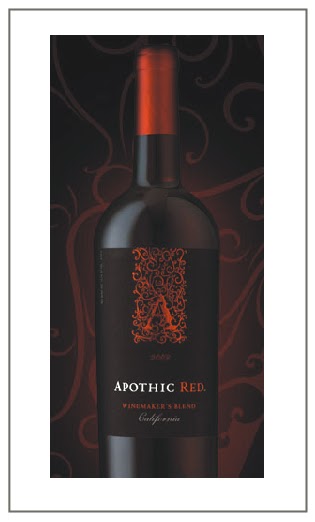
Wine Labels are a great place for inspiration.   They are like little packets of design with big punch.  Over Christmas I had the great pleasure of trying a new wine.  To be quite honest I had never seen or heard of this particular wine.  I had chosen a couple of bottles that I had gone in for and made my way to the cash.  While standing in line I noticed a wine that the store was showcasing on the cash counter.  I saw the label and fell for it immediately.  Yes my friends I said it- I bought a bottle of wine because I loved the label!!  That wine was:


I mean, look at that label!  Look at the scrolly (is that a word?) "A".  I just loved the colour combination as well.  So I bought the wine that went with that lovely label.  I will have to say that it is one of the most flavourful wines I have ever had.  I loved it!  Now, I am no wine expert but I do know what I like and I what I don't like.  And I really liked this wine! 
Anyways, I got to thinking about wine labels in general and how amazing a lot of them are.  So I thought what a great way to have them inspire the design of a room.  Here is what I would put together for a room that was inspired by "Apothic Red":


Sofa:  Mitchell Gold & Bob Williams
Chair:Ralph Lauren
Console: Elte
Fabric: Robert Allen
            Fabric 1
            Fabric 2
            Fabric 3
 Side Table: Elte
Table Lamps: DWR
Chandelier: DWR
Framed Black & White Prints:  Art.com
Rug:  Mitchell Gold & Bob Williams
Coffee Table:  Ethan Allen
Sconces:  Union Lighting and Furnishings
Wallpaper for Coffered Ceiling:  Graham and Brown
Paint: Wall/Coffered Ceiling- High Gloss, Benjamin Moore 2120-30 Witching Hour
           Trim- High Gloss, Benjamin  Moore OC 17 White Dove
Ottoman:   Urban Home
Stars:  DWR

I am sure that I could have gone in the direction of "Vampire Chic".  That would be the obvious choice what with the black and red.  It would have had a "Bordello" feel to it!  However I wanted to do something a little more sophisticated and masculine feeling in the room. 
I have always wanted to coffer a ceiling and have wallpaper inset.  I think the combination of the wallpaper chosen and the dark paint colour really helps to set the mood.
Hope you enjoyed.  Have a great day.
Megan