Showing posts with label Bedroom. Show all posts

Thursday, October 3, 2013

NAUTICAL BUNK BEDS

Hey Everyone......just a quick posting today.  I wanted to share some Nautical love with you all.  You know how much I love Molding, Navy and White, or just about anything Nautical.  Well this bedroom has it all.  Not only is this bedroom really functional,but has one of the best bunk beds I have seen.  I love all the trim work and of course all that Navy and White.  Enjoy:


Isn't it great??  I would love to have this if I needed bunk beds.  So well trimmed out!!  And of course Red,White and Blue!!
This amazing bunk bed was made by Dempsey Hodges Construction.  You can also check out other projects here.

Have a great day everyone.

Megan

Wednesday, April 17, 2013

NAUTICAL AND IKAT BEDROOM

Hey Everyone....I know that I had this post up for about an hour before I pulled it.  As you can see by yesterdays posting....well I just wanted to send a little love Boston's way.
Today is just a little posting about my thoughts about our bedroom.......  far too long in the making!!
I picked up some pillows from Home Sense that I couldn't resist.  I knew that I still wanted some form of Navy in the bedroom and a Nautical feel as well.  I wanted to stray from the usual Red, White and Blue.  So.... when I found these lovely pillows I knew I had a winner.


You can see why I couldn't resist the pillows.  They are by Cynthia Rowley.  I paid $24.99 a piece and they have feather inserts..so I think they were quite the bargain.  Yes I probably could have made something similar but I really loved that pattern on these.
The paint chips in order of appearance is:
Terra Rosa MSL018, Hummingbird Blue MSL135, Wrought Iron MSL168 all Martha Stewart.
Aqua Frost WV35007- Waverly Classics.

I am pretty sure that the wall colour will be the Aqua Frost and I will have the other colours as accents.

So as usual I will keep you informed as to the progress.......
Have a great day everyone.
Megan

Wednesday, March 6, 2013

THE GRAYS!

Hey Everyone!  As I talked about a little while ago it is time for me to get my butt in gear and freshen up my Master Bedroom!  Only been talking about it for a year!! ARGH!!  At first I had wanted to paint the walls Light Blue by Farrow and Ball.  But now I want to go in a slightly different direction and do a very pale gray.  It will look really nice with all the navy I want to work with!

I have a couple of grays in mind:

Benjamin Moore: Intense White OC-51

Benjamin Moore: Paper White OC-55

Benjamin Moore: Wickham Gray HC-171


I love Intense White- for me it is that perfect gray without a green, purple, overly blue or pink undertone to it.   Paper White is so lovely and light as well but with a bluer undertone.  Wickham Gray is also a great neutral gray in that it does not have a green, or brown undertone to it.  To me it would tend to go towards more of a blue if I had to pick an undertone-but it is still very neutral.

Here is some examples of these great grays.

Wickham Gray HC-171


Wickham Gray HC-171


Wickham Gray HC-171


Benjamin Moore: Paper White OC-55


Benjamin Moore: Paper White OC-55


Benjamin Moore: Intense White OC-51


Benjamin Moore: Intense White OC-51


Benjamin Moore: Intense White OC-51


So there you have it.  I am going to get testers so that I can be sure that I am picking the right gray with the right undertone to it.
Will keep you all posted.
Have a great day everyone!
Megan

Thursday, February 28, 2013

BUSY, BUSY, BUSY.......

Sorry I haven't posted for a few days!  I have been busy and not so busy.  Will do better-promise.  I have been working very hard at a couple of projects ie: knitting stuff, thinking of doing the upstairs/back hall and of course our Master- which was supposed to have been started this time last year-ARGH!!!!!

So here are a few pics of bedrooms that are inspiring me:  I have no bloody idea which way I will go.  It is SO MUCH HARDER WORKING FOR ONESELF THAN WORKING FOR ANOTHER PERSON.  I am sure that those of you out there that look at many blogs have heard this before.  I can tell a client exactly what they should do in their space.  When it comes to my space-UGH!!  I think it is because I see SO MANY possibilities that I can do.  JUST PICK ONE!!!!

Anyways.........


This is soooo pretty.......


I am really loving all the gray right now.  I didn't think those words would come out of my mouth!!


Hope this gives a little inspiration.
Have a great day everyone.  And I promise to be back to my old self soon.... although my youngest one would say to that...."your not old Mama".  I love him so!

Megan

Monday, February 25, 2013

SILK HEADBOARD AND WHAT NOT TA! MAYBE??

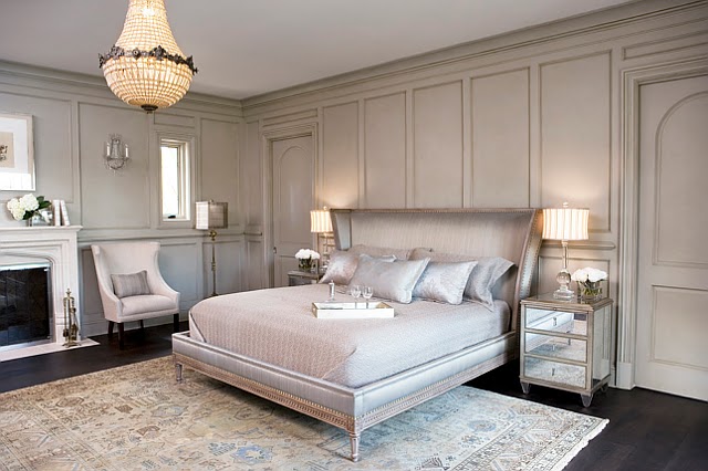
Hey Everyone..... I came across an amazing house at Home Bunch.  It is very visually stunning.  And WAY out of my snack bracket!  What I wanted to share with you all is this bed:


Although very lovely and very riche.  It is so NOT practical.  Most of us live in the real world and I just wanted to bring a little of my experience with fabrics to you all so that you will not make a mistake if you too want this look.
The fabric used on the bed headboard is 100% Silk.  So very luxurious and so amazing.  It is from Kravet and is called Serenity.  It is presented in the Graystone Colourway.  Absolutely STUNNING fabric.  However.....This fabric is best suited to VERY and I mean VERY light use. Use such as pillows and drapes that would be lined and interlined within an inch of its life!  I don't know about you but my headboard takes a beating.  Some people and my husband is one of them tends to sleep with his hands above his head-as does his father.  This would cause pulls and picks in this fabric.  In addition, he tends to have a little extra sebum in his hair.  That sebum tends to cause yellowing of pillow cases and the headboard.  I know some will think Ewwww...but really it is REAL LIFE.  Therefore, when we chose a headboard we have to keep that in mind.  So I hope that this will make a few of you out there think before you leap.  Yes this bed is GORGEOUS but will it fit into your lifestyle.  A lot of the time we really have to think with our head and not our hearts.  Reality really sucks sometimes.
Please head over to Home Bunch to see the rest of this amazing home as well as some other incredible homes and interiors.

If it were me I would always cover a headboard in a very hard wearing fabric such as Velvet or a Heavy Cotton.  I live in a very "washable" world so could NEVER imagine having a Silk Headboard.  I know that people do all the time- has anyone had one and did it stand up to the tests of time?  One note about silk bedding too.... again one has to think about the practically of a duvet cover or blanket.  These items will have to be cleaned.  IF and I stress IF you don't mind Dry Cleaning these items then by all means buy away.  I am one of those people that hasn't used a Dry Cleaner in like.... I can't remember the last time I did!  I need to have Cotton myself.  If your lovely Silk Duvet accidentally gets machine washed and I know someone this happened too be prepared to have thrown a lot of money away.  Life happens all the time and you have to think will this Silk Duvet fit into that life...just a little advise.

Have a great day everyone.
Megan


Friday, February 1, 2013

PRETTY BEDROOMS

Hey Everyone!  Just a quick post today.  I have been dreaming of a new  bedroom lately.  So here is a little inspiration for the weekend.  Enjoy;


The wall colour for this room is ICI Silver Cloud.


ICI- Silver Cloud
This colour is way more green in real life.  The above photo looks way more silvery blue on my monitor.


Such a calm and serene space.  Benjamin Moore Willow Creek.


Benjamin Moore- Willow Creek 1468


Soft and Lovely.  Benjamin Moore-Hampshire Taupe.


Benjamin Moore- Hampshire Taupe 990


How pretty is this bedroom with sitting room??  I don't even know where to begin. Wall colour:  Farrow & Ball Lulworth Blue, Trim: White Tie.  Love, love that colour!


This is a case where the photo really does not look like the colour it is.  To me the colour in the photo has way too much green in it to be Lulworth Blue.  To me it looks more like:

Farrow & Ball Green Blue
Or:

Farrow & Ball Dix Blue


What do you think??


This lovely bedroom is such a nice mix of masculine and feminine. Love it!!  The wall colour used is Ralph Lauren Barn Owl White.


Ralph Lauren- Barn Owl White NA-01


That's all for now folks have an amazing weekend.

Megan

Thursday, January 24, 2013

HOPEFULLY NOT OUT FOR LONG!!

Hey Everyone!  Hope all is well in your Universe!  It seems that I am having a bit of an issue with my back. So sitting at the computer for hours is definitely out.  Hopefully all will be well soon.  Until then I wanted to share with you all a great idea for shelves in a kids room or an office or family room even. Enjoy:


Not only is that shelving a fantastic idea but that ceiling is pretty awesome too.

Take care everyone. Have a great day.

Megan

Monday, April 16, 2012

POTTERY BARN KIDS SPRING 2012

Hey everyone!  I know that there may be some haters out there for Pottery Barn.  I just don't happen to be one of them.  Surprised??  Well....  the reason I love Pottery Barn and especially Pottery Barn Kids is the accessibility for everyone.  I know that some things can be on the pricey side for a lot of people but you can wait for it to go on sale (which I do) or you can use their design sense for inspiration.  I am the type of person that feels that you should decorate YOUR house with YOU in mind.  I am SO NOT interested in people who are self important imposing what THEY think how your house should look.  I'm not the "it's my way or the highway" kind of gal.  I really like working with people to bring the best of THEM out in their HOME.
I think that's why I like Pottery Barn in general- you can buy a pillow or a glass or a whole new bedroom.  I mean, what they are selling isn't product (well they do) but instead they are selling a LIFESTYLE.  And for the most part I think that lifestyle is appealing and accessible to a lot of people.  And that lifestyle can be integrated into a lot of people's homes.
I think Pottery Barn Kids is such a great resource for inspiration.  Have you seen the new Spring 2012 online catalogue?  I just love all the colours.  They really know how to put it together.  They are such Happy Spaces!  A little pricey for some stuff? -wait for a sale.  Take what they have presented and make it your own. 

What I also like is how they have presented.  They even give you the paint colours.  Because you know how you (and me) love to know what a particular room is painted in a pretty photo!!  But you have to always remember- GET THAT PAINT TESTER!  Just because it looks awesome in that photo does  not mean that is how it will look in your room.  I have said it before and I will say it again-LIGHTING CHANGES EVERYTHING!!!  Like I have said before due to the orientation of my house and the porch overhang- paint in my house tends to go green or gray!  Very frustrating but I know this so I work with it!
Anyways........Here are just a few of my fav's from Spring 2012 Pottery Barn's Catalogue:


How great are these colours together.  All that pink and bright blue.  It is definitely a girls room without being too "girly".  And the great thing is that this room will grow with her.  I tried to find out the paint colour used- I think it is B/M Sapphireberry 2063-60.  Such a great bright blue without blowing you away with it's blueness!!!


 How amazing is this nursery??  I would love to have this translated into a room for me!  I have always loved Chocolate and pink together-there is just something so yummy about it.  And the way they have done it here is amazing! This is the type of room that any girl could grow up in.  It isn't babyish at all yet is still playful and full of fun.  I love the stencil they have applied to the walls.  Wainscoting always lends an air of sophistication to any room.  The paint colour for this room is B/M Middlebury Brown.


I adore this nursery.  It is fun, it's dynamic and it's down right on trend.  But that being said I don't think it is too trendy.  I LOVE that area rug- I have always been partial to zigzags anyways!  My only disagreement with this room is the golden grass cloth above the wainscoting- personally I would have put the same colour gray that is in the rug- but that's just me!  I don't have issue with the grass cloth- just the colour.  The paint colour for this room is B/M  785 Morning Glory.  It is so lovely in this space- it just has an amazing glow and feel about it.


This Room- I LOVE!!  Red and Brown- is a great combination.  How often do you see Red on the ceiling and with bead board no less??  Sign me up!  This room is fun and inviting.  All that bead board!!  The wall colour is B/M CC-20 Decorators White and the Red for the ceiling is 1322 Ladybug Red.  Don't you just love the name of that red?? So cute!!


This is such a great example of how to cram a bunch of kids into a room and still make it look great.  High wainscoting is always a winner in my books and it looks great here-especially with that great blue above it.  And it' such a great way to showcase family pictures as well on that great plate rail.  The blue used here is B/M 2064-10 Bold Blue.  It really is a great deep blue.  And it looks fabulous against all that white- probably Decorator's White- just a guess!  But I think they tend to be consistent with their paint choice when it comes to panelling.


Even though the wall colour is white- could be Decorators White??  But whatever the white is it allows the colours in the bedding and the matting of the frames to really pop.  Such a bright room to be in!!


The combination of Pink, Yellow and Gray is so beautiful.  It is such a great colour combo.  I wish they had listed what gray they have used.  It is so hard for me to pick one because of the lighting in the room and my monitor.....  And it is hard to get a really great look at it.  But it definitely isn't a gray with a green undertone to it.  Or one with a pink undertone.


 This is the type of room any little man can grow up in.  I am such a sucker for gingham.  And I love gingham on the walls.  It adds so much interest to a room.  Red, White and Blue is always a great combo for a boys room.


Again Red, White and Blue are used here- but in a very different way.  They have chosen to place a light blue over red- different and interesting!  Again this is the type of room that can grow with any little man.  And it's the type that YOU can put your own stamp on it.

I could probably put many, many more rooms but wanted to share a few rooms of inspiration if your budget doesn't allow you to buy it as is.  Because lets face it- a lot of us have to take these pics and use them for inspiration- and I know we do.
Have a great day everyone.
Megan

Friday, March 23, 2012

COLOUR STORIES 6

I guess with all of this great weather we have been having here in Southern Ontario has gotten me thinking about spring and colour- lots of it.  So here is a Colour Story that is inspired by colour-LOTS OF IT!!!


Photo courtesy of BHG


And for those who think I only work in Benjamin Moore and Farrow and Ball the above is proof  that I don't.  In fact I own many, many fandecks.  In fact in an earlier posting I showed how I make my own fandecks when I can't get the real ones.
Have a great day everyone.
Megan

Sunday, February 5, 2012

SILK -THE SHORT AND SWEET VERSION!

As I have stated in a previous post, my first passion is Fabrics. And one of my absolute favourites is SILK!! I won't go into a detailed Textile Class right now about Silk, but I just wanted to arm you with a little info on this fabulous fibre.


There is nothing as beautiful as Silk Draperies. 


Especially those that have been done just right!  To me Silk Drapes are like a ballgown for the windows- a little overly dramatic, maybe,  but that's how I think of it.  The way that silk hangs:

the way the light catches on the fabric, the way it feels.........  Can you tell how much I LOVE it?  Silk has been highly prized for thousands of years.  Really, do we have to wonder why?  A little silk worm spins a very fine thread, that thread is collected and processed and Voila- Fabric!  So amazing!!  Not that Simple but so very amazing!

When Silk Drapes are done correctly there is nothing like it on the planet!  And when I mean done right I mean the following: Style, Cut and Construction.  Here is an awesome example of just that:


   Here is a close up of those gorgeous drapes:


Just from the photo (especially the close up), I can see the level of detail that went into these drapes.  When a Silk Drape is constructed correctly they will ALWAYS be lined.  Not only does this help the drape to hang correctly, but it also protects the drape (somewhat) to sunlight, protects it  from heat (somewhat), gives a consistent colour when observed from the outside (all draperies should look consistent when viewed from outside), and helps to give the drape "body".  When I say body I mean it gives the fabric a bit more "beef", be a little more sturdy if you will.  One of Silk Draperies' worst enemies is the sun.  The UV rays and the heat produced can completely destroy the fibre.  Hang an unlined silk drapery in a very bright location and within a year it will have faded and will have fallen apart.  Sad but true.  YOU SHOULD NEVER, NEVER hang Silk Drapes in a South facing window.  This includes Southwest.  This is due to the fact that this type of sun is the most intense and damaging.  The only way to slow the ravages of the sun is to use Blackout Lining, and Interlining.  Only by this, will this slow the progression.  If it were me, I wouldn't hang Silk in a harsh lighted window- you have spent so much money and you don't want to ruin your investment.  Even when you line and interline the drape, the leading edge of the drape will still be visible to the suns rays, your edging will take a beating!
When I talk of Interlining I mean this is an extra layer between the main fabric and the Lining.  Think of it as a Fabric Sandwich: Fabric, Interlining, and then Lining.  Why would you want to line and interline your Drapes?  Well to begin, it helps to further protect the drapes from heat and UV.  Another reason is to add "body" to the drape.  In the close up in the above pics, I can tell that Interlining was used.  This is why the drapes look so "plump".  Interlining gives drapes the "ballgown" look they can achieve.  In addition, interlining helps the drapes to hang beautifully.  A good Interlining will also provide added protection from heat and UV.  Most Interlinings used to achieve this "ballgown" look is called "bump cloth". 
Bump Cloth is a very lofty fabric much like heavy Flannel.  It really gives a lovely weight to drapes:


So for those of you out there brave enough to make your own Silk Drapes- PLEASE......  Use Lining and if you can Interlining.  It will be completely worth it in the end.  I know it is a little more effort but you have already spent a small fortune on the Silk fabric-  you might as well go all the way.  If you do, they will last for years to come.
For those that wish to purchase custom drapes, I hope that this little bit of knowledge I have given will do you well in the future.  By knowing just the few things I have spoken of it will help you make better decisions: 
1. Always have Lined Silk Drapes.  If you can get Blackout Lining that's even better.
2.  Do not put Silk Drapes in a South facing window -if possible!
3.  If at all possible, buy interlined Silk Drapes ( I know it can be expensive).  They can be Interlined with a special Interlining Fabric or use Bump Cloth for an even better look and better protection.

If you are going to buy Silk Drapes at a store or online then please make sure they are at least Cotton lined- Cotton holds up well.

Here are some places you may want to look at for inspiration and purchasing:


InVu (Canada)


You can always go the route of Custom Drapes but I realize that for the majority of consumers this is way out of range- I too am on a tight budget!  You may be able to find cheaper alternatives to Silk such as Faux Silk- which most likely will be made of Polyester- most times they are more than 1/2-3/4 of what you would pay for real silk.
 Here is a little inspiration and eye candy.  Enjoy:


DecorPad


I believe that the Wall colour for the above photo is BM Amherst Gray HC 167


This above photo is just like a ballgown- I know that this kind of "puddling" is not for everyone- but boy is it beautiful to look at!


Miles Redd- Elle Decor


One last thing- I may have mentioned in a previous post- REMEMBER:  Drapes are lined, Curtains are unlined.

I hope this has enlightened and been helpful.  Happy shopping!
Have a great day!
Megan