Hey Everyone....well the Olympics are on and I am one happy camper. I cannot even convey how much I love the Olympics. I become rather obsessed. I always joke to my friends....don't call me, don't look at me, don't ANYTHING! I just love how people try to bring their best- ya know? Coming from a "winter" country we really do embrace the Winter Olympics. I know that the majority of the country will be all about the hockey- not us....don't get me wrong...we'll probably watch a game or two, however, it isn't ALL ABOUT HOCKEY FOR US IN THIS FAMILY!! I know....being Canadian and even thinking that is sacreligious! I would seriously sit there for 14hrs and watch it all.
Anyways.......back to some business of design........I suppose this is going to be a bit of a rant....so hang on!
I know that in the past I have talked about colour and how colour should be YOUR story. I have talked about how a colour on a monitor or even in a magazine or even in Betty Sue's Living Room down the street will not neccessarily translate to what is in YOUR house. I CAN'T STRESS THIS ENOUGH!! I suppose that I will continue to hammer this home until the last person on the planet gets this concept. I can't even tell you how crazy it makes me when people get so hung up on finding out a particular colour in a particular room when seen online. Don't get me wrong I like to know what a designer has used in a room. I won't completely rehash everything I have said in the past, however, as you know I have a STRONG opinion on this very subject. See here! You can also see the thread on Houzz here.
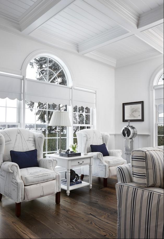
This is the room in question:

I can't even tell you all the mileage I have gotten out of this one issue or photo! I went back and tried to hammer home my point. Of course it fell on deaf ears! I was told to chill out etc.....Someone even today asked once again what the paint colour was. I MEAN COME ON PEOPLE!! I know that for me it has hammered home the idea that the majority of people can't see what is beyond their own nose. It was stated by the designer that it is Sherwin Williams Sea Salt. However, people were questioning it! This is an incredible example of what a particular colour looks like on YOUR screen. It may not look like Sea Salt since it does look a little more blue than what Sea Salt truly looks like. But this is where I loose it! Like I have said in the past....I don't care what colour it says, looks like or isn't.......Take what is stated...that it is Sea Salt and USE IT AS A STARTING POINT!! People get so hung up on using something verbatum. It may look amazing in this pic but look absolutely horrible in your room. STOP BEING SHEEPLE!!
I know that I have hammered at this issue but it is one that I am UBER passionate about.
Most people don't understand the nuiances of colour. How lighting in one place will make a colour look completely different in another place. That same colour will look completely different say in daylight as opposed to under halogen lighting. I think what has bugged me the most about this thread on Houzz is the shear lack of common sense that I have been seening. For me when a colour is stated....I don't care what it looks like on the monitor....take it at face value and move on. FULL STOP! Again, take that info and apply it to your own experience. Make it your story. Make it about you. I know I didn't make any friends over there but that's not my intention here. My intension is to impart my experience to others, to help them the best way I know how. If you don't like what I have said....well I can't help that...the truth is the truth. I won't walk away from that....it's just not my style. I can't sugar coat stuff like this. To me it is as plain as the nose on my face....my very ample nose!! I just don't understand how people get so hung up on getting the exact colour. Like I said use it as a starting point, MAKE IT YOUR OWN!!
Just to show you what I mean I will show you different pics of rooms that use the same colour: Sea Salt by Sherwin Williams- which I love by the way:
 In this pic you can see how "green" the colour looks.

In this pic we can see that there is a definite green undertone like the first pic, however, the wall colour looks less saturated than in the first pic. This is such a lovely soft dining room- I really like it!

In this pic the wall colour has a slightly "bluer" tinge to the grayish green of Sea Salt as compared to the other 2 pics. It is always relative....you have to compare a colour to another one. When looking at paint chips you have to compare them to each other in order to make them understandable. One white will look more yellow as compared to another white-they are both white but the undertone changes the story or the way in which you will percieve it.
To me this room really is a close representation of what Sea Salt truly looks like- but then again that is what it looks like on MY MONITOR. Another monitor may make the room look slightly grayer than if you were to see it on my monitor.

Just look how gray Sea Salt looks in this room. It looks amazing, however, it really takes on a grayer tone in this setting.

If this doesn't highlight was I have being saying all along I don't know what will. Same colour but different lighting, fixtures, furniture etc.......everything plays into...especially the lighting.
So until this obsession about "what colour is in that room" is used only as a starting point, I will have many more postings on this very subject.
Don't get me wrong I too love to know what a particular designer used in a room, however, when they state what it is I take it for what they say. But then if I were to use it I would use it as a starting point.
Thanks for letting me rant!!
I wish you happy Olympics. I wish you happy competition. I wish you great rivalries. I hope you are witness to some greatness that we will be a part of-even if we are sitting on our couches and just cheering along.
Have a great day everyone.
Megan
Anyways.......back to some business of design........I suppose this is going to be a bit of a rant....so hang on!
I know that in the past I have talked about colour and how colour should be YOUR story. I have talked about how a colour on a monitor or even in a magazine or even in Betty Sue's Living Room down the street will not neccessarily translate to what is in YOUR house. I CAN'T STRESS THIS ENOUGH!! I suppose that I will continue to hammer this home until the last person on the planet gets this concept. I can't even tell you how crazy it makes me when people get so hung up on finding out a particular colour in a particular room when seen online. Don't get me wrong I like to know what a designer has used in a room. I won't completely rehash everything I have said in the past, however, as you know I have a STRONG opinion on this very subject. See here! You can also see the thread on Houzz here.
This is the room in question:
I can't even tell you all the mileage I have gotten out of this one issue or photo! I went back and tried to hammer home my point. Of course it fell on deaf ears! I was told to chill out etc.....Someone even today asked once again what the paint colour was. I MEAN COME ON PEOPLE!! I know that for me it has hammered home the idea that the majority of people can't see what is beyond their own nose. It was stated by the designer that it is Sherwin Williams Sea Salt. However, people were questioning it! This is an incredible example of what a particular colour looks like on YOUR screen. It may not look like Sea Salt since it does look a little more blue than what Sea Salt truly looks like. But this is where I loose it! Like I have said in the past....I don't care what colour it says, looks like or isn't.......Take what is stated...that it is Sea Salt and USE IT AS A STARTING POINT!! People get so hung up on using something verbatum. It may look amazing in this pic but look absolutely horrible in your room. STOP BEING SHEEPLE!!
I know that I have hammered at this issue but it is one that I am UBER passionate about.
Most people don't understand the nuiances of colour. How lighting in one place will make a colour look completely different in another place. That same colour will look completely different say in daylight as opposed to under halogen lighting. I think what has bugged me the most about this thread on Houzz is the shear lack of common sense that I have been seening. For me when a colour is stated....I don't care what it looks like on the monitor....take it at face value and move on. FULL STOP! Again, take that info and apply it to your own experience. Make it your story. Make it about you. I know I didn't make any friends over there but that's not my intention here. My intension is to impart my experience to others, to help them the best way I know how. If you don't like what I have said....well I can't help that...the truth is the truth. I won't walk away from that....it's just not my style. I can't sugar coat stuff like this. To me it is as plain as the nose on my face....my very ample nose!! I just don't understand how people get so hung up on getting the exact colour. Like I said use it as a starting point, MAKE IT YOUR OWN!!
Just to show you what I mean I will show you different pics of rooms that use the same colour: Sea Salt by Sherwin Williams- which I love by the way:
In this pic we can see that there is a definite green undertone like the first pic, however, the wall colour looks less saturated than in the first pic. This is such a lovely soft dining room- I really like it!
In this pic the wall colour has a slightly "bluer" tinge to the grayish green of Sea Salt as compared to the other 2 pics. It is always relative....you have to compare a colour to another one. When looking at paint chips you have to compare them to each other in order to make them understandable. One white will look more yellow as compared to another white-they are both white but the undertone changes the story or the way in which you will percieve it.
To me this room really is a close representation of what Sea Salt truly looks like- but then again that is what it looks like on MY MONITOR. Another monitor may make the room look slightly grayer than if you were to see it on my monitor.
Just look how gray Sea Salt looks in this room. It looks amazing, however, it really takes on a grayer tone in this setting.
If this doesn't highlight was I have being saying all along I don't know what will. Same colour but different lighting, fixtures, furniture etc.......everything plays into...especially the lighting.
So until this obsession about "what colour is in that room" is used only as a starting point, I will have many more postings on this very subject.
Don't get me wrong I too love to know what a particular designer used in a room, however, when they state what it is I take it for what they say. But then if I were to use it I would use it as a starting point.
Thanks for letting me rant!!
I wish you happy Olympics. I wish you happy competition. I wish you great rivalries. I hope you are witness to some greatness that we will be a part of-even if we are sitting on our couches and just cheering along.
Have a great day everyone.
Megan