Showing posts with label Wine Label Room Design. Show all posts

Thursday, May 3, 2012

WINE LABEL ROOM DESIGN 5

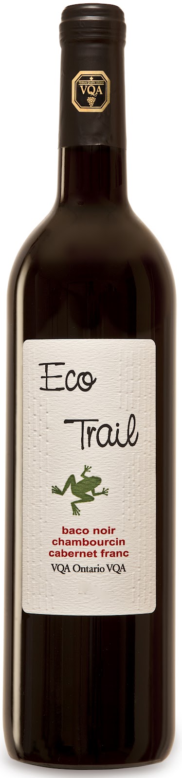
Here is another room inspired by a wine label.  That wine is.....


As you can see by the label it is a blend of Baco Noir, Chambourcin and Cabernet Franc.  I have to say I really enjoyed this wine.  It wasn't too dry and not too sweet .  I think on the label in the store it said that it is a 1 or 2 for sweetness.  It had really nice flavour.  So 2 thumbs up from me on this one. It sold for around $10.45-which is pretty decent for a bottle of Red.  What caught my eye was the little frog on the label- gotta love frogs!  So I thought I would design a bathroom with that little frog in mind.


I envision striping the green tile behind 2 vanities like the above pic using the green mosaic time and the subway tile.  The Subway tile would be mounted vertically in a brick pattern behind the vanity wall only.  I would use the green mosaic tile as a stripe in the shower wall area along with the subway tile.  The subway tile would be mounted in a brick pattern here.
I found the most amazing website for all things bath-fixtures, lighting etc...  here at Urban Archeology.  What an incredible storehouse of stuff-check it out.

Well that's it for now everyone, hope you got a little inspiration today.
Have a great day!
Megan
Tuesday, April 10, 2012

WINE LABEL ROOM DESIGN 4

Well.......  It's been awhile since I did this little segment.  Over the weekend I tried a new wine-well it was new for me.  It is called FLOURISH.  It is a local wine from the Niagara Region.  It is a blend of Merlot and Pinot Noir.  I did like this wine.  Usually I like a heavier tasting red but this one had a lighter taste and feel to it.  As I have said I am no wine expert but this was a very light, fruity wine.  I also loved the label-very feminine and full of colour:


I just loved the pink flower on the label.  It looks as though the flower was x-rayed then colour was added in after-a really cool shot.  I love the Pink, Purple and Silver that is on the label.  I thought this would be a good label to design a room around.


Crystal Balloon Chandelier-Shades of Light
Mirrored Sconce- Shades of Light
X-Ray photography-Allposters
Magnolia art-Allposters
Louis Ghost Chair-DWR
Bedside Table- Ethan Allen
Bed/Bedding-Layla Grace
Pouf- Importsfrommarrekesh
Bedside Lamp- Layla Grace
Desk- Elte
Fabric for Pillow- Designer Fabrics
Fabric for Drapes- Inverted Pinch Pleat- Designer Fabrics
Paint:
Walls: Amherst Gray HC 167
Trim: Simply White: OC 117
Ceiling: Wickham Gray HC 171- half strength


When I started thinking about this space I thought of a young woman living alone- a very feminine room with lots of classic details yet the main furniture isn't too feminine.

Well that's it for now- I hope you got a little inspiration from my mood board.
Have a great day everyone.
Megan

Friday, March 9, 2012

WINE LABEL ROOM DESIGN 3


This is Peter Lehmann Weighbridge 2009 Shiraz.  When I was in the Liquor Store this label caught my eye.  Graphically speaking I just liked it!  I especially liked that it had a vintage feel to it.  Now as far as taste goes......  I really didn't like it.  Which really surprised me since I tend to really like Shiraz'.  And I do mean LIKE!!!  As I have stated in the past I am NOT a wine expert but I do know what I do and don't like.  I think the main reason I did not like this wine was it had a strange metallic undertone to it.  In fact it had a faint metallic nose to it as well.  So I don't think that I will be buying this one in the future.  I however did use it for inspiration for the room I created.  Enjoy:


Sources:
Sofa: Restoration Hardware
Coffee Table (Trunk): Restoration Hardware
Pendant Fixture: Barn Light Electric Company
Floor Lamp: Restoration Hardware
2 Shelving Units:  Restoration Hardware
Aviation Black and White Photography: Allposters
Vintage Paris map: Ballards
Teak Stool (2): DWR
Rug: Ballards
Throw: Pottery Barn
Pillow: Pottery Barn
Pillow: Restoration Hardware
Paint: Benjamin Moore: Whale Gray 2134-40
Paint trim: Benjamin Moore: White Heron OC-57


I hope you are enjoying this series as much as I am.  I love finding something unusual to inspire me.
Have a great day everyone.
Megan

Thursday, January 26, 2012

WINE LABEL ROOM DESIGN 2

First of all, I think the Australian Open (tennis) is going to kill me!  This 16hr time difference is killer!  Might have to get up at 3:30am tomorrow morning if I want to watch the 2nd semi-final.  I LOVE TENNIS.  Always have loved tennis.  It is my goal in life to go to all 4 major tournaments in my lifetime!  I have not been to any yet!  Only been to tournaments in Toronto.  I have been lucky enough to see some great players in my life: Lendl, Courier, Rafter, Agassi, Nadal, Federer.  I really love the current 4 top players. Besides the fact these guys can really play, they are such great sportsman.   They have the utmost respect for one another.  They are such great role models for their sport.
Anyways, back to design........Here is another Wine label that intrigued me at the Liquor Store.  I have to be honest- one of my friends happened to see it first!  She definitely has a great eye for things!  The wine I am talking about is:


Again, I am not a wine expert but I do know what I like.  And I must say that this Chardonnay is really great!  It was very smooth and not acidic at all.  It also had lovely flavour!  So another winner for picking wine because of it's label.  How crazy is that??  I guess this is an example of Marketing at work!

There is something so French Country about the label.  Could be the colours used: Bright Yellow and Navy.  But I think that it has something to do with the graphics as well.
If I were to design a room around the label it might look something like this:


Sofa: Ballards
Chair: Ballards
Side Table:  Restoration Hardware
Ottoman:  Ballards
Fabric: Tonic Living
Paint:  Walls: Benjamin Moore - Wickham Gray HC 171
          Trim: Benjamin Moore-  Decorators White CC 20
Area Rug: To be grayer than sample shown.

This is my take on a Modern French Country theme.  I can just see this bottle of wine sitting (opened of course) in this room.
Well must try to get a nap today so that I can get up early to see my semi final!!
Hope you enjoyed.  Have a great day!
Megan

Tuesday, January 17, 2012

WINE LABEL ROOM DESIGN

Wine Labels are a great place for inspiration.   They are like little packets of design with big punch.  Over Christmas I had the great pleasure of trying a new wine.  To be quite honest I had never seen or heard of this particular wine.  I had chosen a couple of bottles that I had gone in for and made my way to the cash.  While standing in line I noticed a wine that the store was showcasing on the cash counter.  I saw the label and fell for it immediately.  Yes my friends I said it- I bought a bottle of wine because I loved the label!!  That wine was:


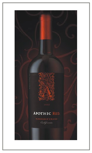
I mean, look at that label!  Look at the scrolly (is that a word?) "A".  I just loved the colour combination as well.  So I bought the wine that went with that lovely label.  I will have to say that it is one of the most flavourful wines I have ever had.  I loved it!  Now, I am no wine expert but I do know what I like and I what I don't like.  And I really liked this wine! 
Anyways, I got to thinking about wine labels in general and how amazing a lot of them are.  So I thought what a great way to have them inspire the design of a room.  Here is what I would put together for a room that was inspired by "Apothic Red":


Sofa:  Mitchell Gold & Bob Williams
Chair:Ralph Lauren
Console: Elte
Fabric: Robert Allen
            Fabric 1
            Fabric 2
            Fabric 3
 Side Table: Elte
Table Lamps: DWR
Chandelier: DWR
Framed Black & White Prints:  Art.com
Rug:  Mitchell Gold & Bob Williams
Coffee Table:  Ethan Allen
Sconces:  Union Lighting and Furnishings
Wallpaper for Coffered Ceiling:  Graham and Brown
Paint: Wall/Coffered Ceiling- High Gloss, Benjamin Moore 2120-30 Witching Hour
           Trim- High Gloss, Benjamin  Moore OC 17 White Dove
Ottoman:   Urban Home
Stars:  DWR

I am sure that I could have gone in the direction of "Vampire Chic".  That would be the obvious choice what with the black and red.  It would have had a "Bordello" feel to it!  However I wanted to do something a little more sophisticated and masculine feeling in the room. 
I have always wanted to coffer a ceiling and have wallpaper inset.  I think the combination of the wallpaper chosen and the dark paint colour really helps to set the mood.
Hope you enjoyed.  Have a great day.
Megan