Thursday, October 31, 2013

WHERE O' WHERE.....

Yes Everyone.....I have been here.  Just been a strange week.  Head is muddled....life getting in the way and all that!  Please stay tuned as I will be back very soon.......
In the meantime please enjoy this amazing image from Allsorts:


Have a great day everyone!
Megan

Friday, October 25, 2013

POTTERY BARN COMES THROUGH!

Hey Everyone....a really quick post today......So my last post I talked about that "Seed Stitch Pillow" from Pottery Barn and that it really is a Garter Stitch pillow.....well...... I emailed them to let them know the error of their ways and NEVER thought in a million years that I would get a response!!!  Well, wonders never cease...I got an email back:


Hello Megan,

Thank you for contacting Pottery Barn.
We appreciate your keen eye and knowledge of you knitting stitches. I have forwarded your request to our management team to investigate and update our website.

Wholly Toledo!!  I was completely blown away!  So THANK YOU POTTERY BARN.  And thank you Marion for getting back to me so quickly.  As I stated in my return email to Marion, my intent was just to let them know and that I was just trying to be helpful.  So we shall see if this helps them in some little way.

I am despartely trying to finish up my poncho.....
Have a great day everyone.
Megan

Tuesday, October 22, 2013

KNIT PICKING.......POTTERY BARN

Hey everyone,  Just a very quick posting.  I came across this pillow at Pottery Barn:


First of all....love knit accessories for the home.  I really love this colour combo, always have.  I do however, have a few of issues with this particular pillow.  Maybe not the actual pillow however...let me explain. My first issue with this is the "naming" of the pillow.  They have named it "Seed Stitch Knit Pillow".  Which would be fine if IT WERE SEED STITCH!!!!    See this is one area where I kind of loose my nut.  If you are going to use a "technical" naming term, then at least call it by it's proper name.  For those of you unfamiliar with knitting this particular stitch is known as GARTER STITCH.  Which in knitting terms is the easiest kntting stitch by far.  All you have to do to achieve this lovely stitch pattern is to knit (K) every row- thus giving you the ever popular GARTER STITCH.  Seed stitch is made quite differently and gives a completely different look.  I know this may be just a little detail, however, I am a detail kinda gal!
Secondly, there is NO way on God's green earth I would  pay $65.00 US for this pillow.  That doesn't even include the insert!! It doesn't even cost them much to make this.  It probably cost them all of $3.00 to make- no I am totally serious!  Even if it cost them $10.00 they are still overcharging by far.  Any person who is able to just knit, and I mean know how to do the "knit" stitch could whip this up in no time flat.  I know, I know.....those of you out there are saying....all well and good for you since you know how to knit.  Well folks, I am here to tell you that making something just like this pillow is NOT ROCKET SCIENCE.  It is created using the simplist knit stitch there is.  That and it is knit in a heavy gauge-say on a 6mm needle with Aran or Chunky yarn.  Easy Peazy!!  You can make this for less than $20.00.....Yarn, needles and form.  I am serious......I think I have just set a challenge for myself and I will share it with you all.......Oh I love a challenge.
Thirdly, they are using ACRYLIC yarn.  I have no issue with Acrylic yarn.  In fact I intend to do a post real soon on defending this workhorse of a yarn.  However, for $65.00 I expect a little something more...just saying.

I just had to have my say on this one.......I suppose I wouldn't have had such an issue with this lovely pillow if and I mean if they had named it right and offered it up at a reasonable price.  Just my opnion is all.

Have a great day everyone.
Megan

P.S.
I emailed Pottery Barn.  Here it is;

Hi- just wanted to let you know that someone in your design dept. has misnamed an item.  The item is named as "Seed Stitch Knit Pillow".  To those that understand knitwear know that the pillow was NOT made with a Seed Stitch but was actually knit with a GARTER STITCH.  Just a small detail.  However, when it's wrong it's wrong. If a technical name for a product is to be used then perhaps using the right one is in order. Thought I would pass this along.

Hopefully it will make a point.  But somehow I doubt it!!

Friday, October 18, 2013

SNEAK PEAK-PONCHO

Hey Everyone.....just a quick posting today.  Here is a sneak peek at my next project:


This little one is working up really quickly-all things considering!  I wanted to knit it in a pure wool- I chose Paton's Classic Wool.  I have always wanted to do a poncho with a rectangular shape- it always looks so amazing on people.  There is a classic, sophistication to someone who throws on a poncho.  It always looks so good on so many body types.

Have a great weekend everyone.

Megan

Thursday, October 17, 2013

WHAT COLOUR IS THAT?

Hey Everyone.......do you remember the other day when I spoke of a Bedroom that was on Houzz?


It was asked what colour is this room.  As I stated in that entry, sometimes the designer will answer the questions posed and sometimes they don't.  The designer had not answered what colour it was and someone had suggested to print this pic and take it to their nearest paint store and have it colour matched.  And as I stated in the previous post, I gave my opinion on that one!!  I ended up having a conversation on Houzz with the person who suggested to print the pic.  Lets just say it wasn't overly positive on her end.  I made the point that everyone's printer is different, as is everyone's monitor.  Your paint store may indeed be able to colour match what has been printed, however, it will NOT be what the actual colour is in the room.  Most average printers aren't that accurate when it comes to colour.  Most print great, but not necessarily accurate.  I stated that even if that printed pic was bang on, how that colour looks in this incredible bedroom won't necessarily look great in your room.  That is why it is so important to test colours out in YOUR space.  You may find you might need a colour with a little more green in it, or one that is a little more saturated etc...... My point was lost on this individual.  So it made me think......Ok you print a pic and then have it colour matched.  But wait.......I will tell you right now......don't do that.....here is why.

As an experiment I downloaded onto my computer  paint colours that I picked at random.  I then printed them out and compared them to the ones in my fandeck:  See below:


Benjamin Moore-Summer Shower 2135-60

Benjamin Moore-Bird's Egg 2051-60

Benjamin Moore-Rapture CC-66

Although they are not the greatest pics in the world you can see my point.  Your printer will NOT print out an accurate enough colour match.  I don't care how good your printer is.  BUT....just say you have the worlds best printer and it is accurate beyond anything.  Well great! Colour match it and then go from there.  I would give the same advice as if you knew exactly what colour the designer used in a particular room.  Great, get that colour.....BUT USE IT AS A STARTING POINT!  What looks great in one room can look horrible in another.  The same can be said for even a particular colour in a room.  That is why it is so important to look at the colour in the room that you will be painting.  AND TO LOOK AT IT AT DIFFERENT TIMES OF THE DAY.  Years ago when I was going to repaint my living room I loved a particular khaki colour.  Loved it in the daytime, HATED it at night.  It took on a horrible yellowy greeny tone at night.  
There are so many variables at work in everyone's own individual room.  The lighting, which direction does it face, what are the undertones in the rug, undertones in the furniture, etc..............It all conspires together. And I do mean conspire.  There are times that I so desperately would love to have a particular colour but everything in the room 'conspires" against me being able to pick that colour.

If I were you....if you love the colour in a room in a magazine or online-take it to the paint store.  Get the advice of the salesperson or get your favourite decorator to help.  A self printed pic will be less accurate than what you see onscreen, even though everyone's monitor's show colours differently.  Take your lap top or I-Pad to the paint store and use it as your starting point.
Don't get me wrong I love to know the colour a designer used in a particular room.  However, it should always just be a starting point or an inspiration for YOUR room.

Have a great day everyone.
Megan

Wednesday, October 16, 2013

MODERN NURSERY & BIRD'S EGG 2051-60

Hey everyone.....back from the turkey coma from the weekend.....well actually it was more like a coma from all the pies that I made.  The hubs and I decided that our contribution to the dinner would be dessert....so we made 2 apple pies, 2 pumpkin pies and 1 cherry pie.  The only pic I have was taken quickly by a camera phone uploaded by someone else:


My Mum-In-Law thought I was crazy to make so many....however, there were 15 of us.  And I knew that the next day people would want to take some home....like my nephew that lives on his own not too far from here. He is always open to free food!!  I figured like in "Field of Dreams".....if you make them they will eat it!

Anyways......I wanted to share this adorable nursery from Hong Kong.  I think what struck me most about the room was the wall colour and the beautiful modern built ins.......not to mention that great Eames Hanger!


Now......I can't tell if this is a shared space or a nursery with a bed in it.  As space is at a premium in Hong Kong I would imagine that this is a shared space with Mum and Dad.  I really love the wall colour....really love it!  I have no idea what it is.  A similar wall colour could be:

Benjamin Moore-Bird's Egg 2051-60

I adore that colour.  Just enough blue, just enough green, just enough of everything.  It isn't too saturated  colour and  it has loads of life.

To get the Eames Hanger try;


A great place to get all things modern is at Design Within Reach.  This lovely Eames Hang-it-All can be yours at DWR for $199.99 US.  It is fun, it is funky and who doesn't love little balls of colour??  It is just one of those objects that just makes me happy whenever I see it.

Normally I am a traditional kinda girl, however, I love this space.  There is such a calm and serene vibe about it.  Yet it is young and fresh.

Have a great day everyone.
Megan

Friday, October 11, 2013

DESIGN CRUSH-FRANCESCA OWINGS INTERIOR DESIGN

Hey Everyone...hope all is well.  This will be it for a few days......here at the blog.  I won't be posting until next week.  This weekend is Thanksgiving for us in Canada and it's going to be a busy one.  A weekend filled with food, sunshine, great family and wine........ NOT necessarily in that order!  I came across a great Designer that I really like. Her name is Francesca Owings.  She is based out of Grand Rapids, Michigan . I like her for many reasons;  not the least being her easy going, beachy inspired interiors.  So sit back and enjoy some inspiration;


To me this is how you use "pickled" wood flooring now.  It certainly is not the "whitewashed" oak that was so popular in the late 80's early 90's.  Now....that type of pickled/whitewashed oak tended to have a pinky undertone to it----ugh!!  Why ugh?  Well.....it can be really difficult to decorate around.  Kudos to those out there that have this wood and have been able to make it work.  Here, it has a Vintage feel to it.  Like it was found somewhere in a beach shed or something.  I love it!!!  I will admit that I am more of a white trim girl, however, I love the use of the wood here.   It has such a natural quality.  And that Pendant!!!  LOVE IT!!


 I really love the colour scheme in here. It is so warm.  So comfortable.


 I am a huge fan of bookcase's on landings.  If you have the space I highly recommend it.  It is such a great use of otherwise blank space.  I really feel that staircases and hallways are the forgotten space.  If I had the space in my own home you can be darn sure I would be putting one of these puppies there!!


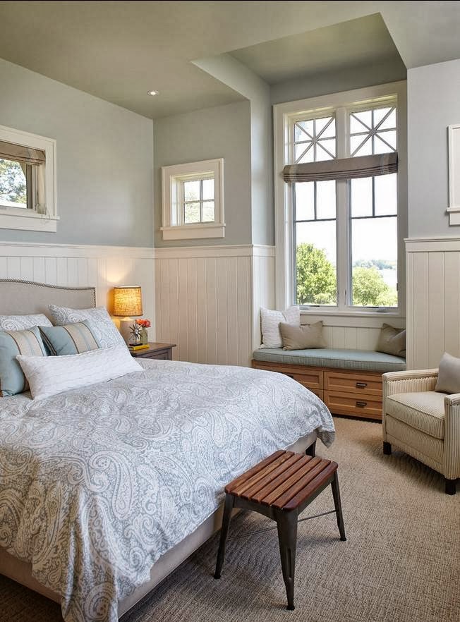
Such a lovely and serene space.  And of course- love that beadboard!!  If you go to this pic on Houzz there are comments on the side.  I have to chime in on one of the questions......It was asked what colour this room is painted.  Sometimes the designers will answer the questions other times not.  In this case the designer hasn't. So someone said that the person should print off a copy of this room and take it to the paint store and have them colour match it!! WHOA!!  Do not pass go do not turn that printer on.  Unless you have the Uber printer of all time.  Then DO NOT do this.  Even then I would either find out from the designer or take your lap top/i phone to the store.  Then consult with the salesperson and get a couple of different samples.  WHY you ask??  First of all everyone's monitors are different.  It may not even reflect what the real colour is.  What looks blue to me may in fact look greeney blue to you.  Only ever use a picture as a starting point.  What looks fab in this room may look absolutely horrible in your room due to the quality of the light.  I have talked about this fact many times on this blog and I cannot stress it enough.  The same thing with having Betty Sue down the block having Bleeker Beige in her Family Room and then everyone has to have that colour.......it may look awesome in her space but look horrible in yours.  Only ever use a colour in a magazine,online or in someone else's space as a starting point.  Don't be a sheeple people.......be your own person.


 Love those lockers......And.....if you look closely.....the undertone in the carpet and the wood are the same!!  Hallelujah!!  Someone who understands undertones-I LOVE THAT!!


For me.....this bathroom is as close to perfection as I could ever want.  It has everything I love.  The Trellis Wallpaper (Kelly Wearstler), beadboard, Marble counter, widespread faucet, the sconces (Restoration Hardware??), Subway Tile, Free Standing Tub, and of course that Hundi lantern......Honestly you could just take this as is and ship it to me as is!!! PERECTION!!


The Craftsman inspired Sconces look fabulous here.  As does the coour of stain and the colour green used in the trim.


I cannot recommend that harvest table enough.  I have this table myself and still love it 9 years later.  It has been loved and abused.  We use it everyday.  I highly recommend it.  You can get it at Ethan Allen.


This is such a great example of being bold and letting yourself have a little fun in a small space.  A powder room is such a great space to let your boldness fly.  Again, the Trellis wallpaper by Kelly Wearstler was used but in a bright sunny yellow.  Normally I am not a yellow kinda gal but I love it here.  You could never not smile in this room!!  And that Victorian Freestanding Vanity!!!! Lovely......


So there you have it everyone.  Some Inspiration!  I know it makes me want to change a couple of things in my own space.........
To my Canadian friends out there.....Have a safe and Happy Thanksgiving Weekend.

Megan


T

Wednesday, October 9, 2013

MAKING TRACKS BLANKET

Hey Everyone.....I have had this one in the works for awhile........


Reverse side


When I took the pics, it really looks pinkish red on the back deck.  Inside the blanket takes on a more brick red colour.......crazy, crazy.............

I knit it up in Loops & Threads Impeccible-more on that tomorrow............

I have the pattern up and running, you can get it here.  And it's a FREEBIE!!!  Naming my little creations is sometimes such a difficult thing.  There are times when it pops in my brain so quickly and then other times it's like pulling teeth.  I guess it's just one of those things .
Have a great day everyone.
Megan

Tuesday, October 8, 2013

LADY TAMSIN 2....

Hey Everyone....just a really quick posting today.  I had a question asked about what the back side of the scarf looks like.  It's funny.....I don't usually give the back side a second thought when it comes to this style of scarf.  When it comes to Guernsey/Aran patterns the front face of the fabric is what really captures the eye.  Usually the backside isn't really much to look at.  The backside of this pattern is interesting, however, the showstopper really is the front.  I am posting a couple of pics to show the back side.


Back of Scarf


Back of Scarf

Front of Scarf

As you can see from the pics the front and back really do look different.  I am hoping to come up with a pattern sometime in the future that truly is reversible.  When doing reversible cables.....let me just say it tends to use A LOT of yarn.....way more than even regular cables do.

Hope this helps those out there that were wondering what the backside looks like.

Have a great day everyone.
Megan