Tuesday, May 8, 2012

FABRIC LOVE!

I was looking online at some fabrics at one of my favourite online sources- Designer Fabrics-  I have mentioned them before.  So I thought I would share some of those fabrics with you.  I am a complete sucker for floral fabrics, I always have been.  So when I saw this fabric it got me thinking....  what would I put with it?


Now if I had to pick a paint colour to go in the room....  I am thinking that the room has wainscoting so I would pick:


Wall Colour:
Farrow And Ball Lamp Room Gray #88


Trim:

Benjamin Moore White Dove OC-17


After picking the fabrics and the possible paint colour the whole room starts to form in my head.  I am so visual that way.  I can see the room with the wainscoting, the sofa and chairs etc.....  It's like a snapshot in my head!
So check out Designer Fabrics. You can borrow up to 8 fabrics to see if it will be the right one.  You should always get samples or "memos" so that you can put your fabrics together.  I would do the same thing.  After picking the above fabrics I probably would pick a few more and then order the "memos" just so that I could put something together.  It's one thing to pick online but you should really have the real thing in your hands-it's the only true way really!

I hope this gave a little inspiration today.
Have a great day everyone.
Megan

Monday, May 7, 2012

BLOOMIN' MAY!

Well Spring is definitely under way here in Southern Ontario.  Although we did have a very mild winter and an early spring things cooled down a bit to slow things down just slightly.  The lilacs are blooming and so are the ornamental trees.  I wish you all had Smellovision-it smells just amazing!
I thought I would share with you all some of the things that are blooming in my garden along with some paint colours that I pulled out of them:


I love Irises!  They are just so amazing!  I received these from a friend of my Mum-in-Laws a couple of years ago.  Now that they have established, they are going to bloom really well this year.  This is the first bloom and it is gorgeous!!


Lemon Freeze 2025-50 (BM)

Vintage Wine 2116-20 (BM)


The Yellow chosen is much more of a yellowy green in real life.  And it has a brightness to it as well.  The Purpley brown is a great contrast to the yellow.


And of course the violets are blooming.  I do think that they are great-to point.  They can tend to be a little invasive.  But their little purple flower is really quite lovely!  I really love the combo of the bright green with the purple.

Something similar in paint may be.....


Scandinavian Blue 2068-30 (BM)

Gassy Fields 2034-30  (BM)

The Scandinavian Blue is much more purple in real life. They look pretty sweet together!


Bleeding Hearts are such a magical flower.  They almost look unreal!  The shape is just crazy.  And the pink!  Love it!  Pink is my favourite flower colour.


Raspberry Mousse 2076-40 (BM)

Fresh Lime 2032-30 (BM)

 Doesn't it sound like these two would be good enough to eat together?? Raspberry Mousse and Fresh Lime  I just love the colours of pink that are in Bleeding Hearts.  There is a white version of Bleeding Heart but the pink is by far my favourite.


Gotta love Lilac not only for how they look but for how they smell.  The scent that they are pumping out right now is just amazing!  I tried to get a better pic but the blooms are quite high up in the tree.  One tip for lilacs is that when pruning them make sure that the main tree has around 7 or 8 good arms.  If you get suckers of smaller ones growing-trim them off.  This helps to keep the shape and to make it put all it's energy into those 7 or 8 branches.


Lavender Lipstick 2072-50 (BM)

Beach Plum 2072-60 (BM)

When it comes to my Lilac tree, Mother Nature sure knew the right colours to pick.  It is such a lovely Lavender colour.


The last item in my garden that is blooming besides the weeds, is my Viburnum.  I must say that I am not very fond of it's scent but it sure is pretty.  The flowers are such a nice shape.

Well that's it for now.  Other things in the garden are growing like the Hosta's and Dayliliies but they aren't quite there yet.

Have a great day everyone.
Megan

Friday, May 4, 2012

WHAT THE HECK HAVE I BEEN DOING? A SNEEK PEAK

Well.....  This week has been fairly busy. I have had all sorts of ideas in my head for knitting.  I am currently thinking of a summer top that I am going to start to pattern probably next week.  It will be based upon my French Stripe Dishcloth!  Strange I know.  But inspiration comes in all ways!

I am also working on a scarf pattern.  I know it's May.  But once again when inspiration hits... well you just have to go with it.  This is what I have so far:


The yarn is Patons Classic Wool.  The colour is magenta.  I love this colour.  I think at some point in the future I will have to design a shrug in this!  Hmmm........


I have also been patterning a cape from a Banana Republic cape I bought about 4 years ago.  I love it so much- and it shows.  One of the buttonholes is putting a hole in the fabric of the cape.  Anyways, I have wanted to make a pattern of it for some time.  So I started working on that at the beginning of the week. So stay tuned for that one.

We have made progress on the Dining Room.  A little anyways.  My man has been very busy with work as I stated in a previous post.  I am hoping that between today and the weekend we will get a little more done.
Here is a pic:


We still have to get the plate rail with the cove on.  But we are making progress.  Now I would love to scrape my popcorn ceiling.....  But that will have to wait for another day.  I HATE popcorn ceilings.  I know, there are those of you out there that would beg to differ.  But really in what Universe does a popcorn ceiling EVER look good??  People say that it hides seams and a wonky ceilings- poppycock I say!  I may not be able to scrape it now- but I will- Oh yes I will my friends!!

Now I would be remiss if I did not say;


MAY THE 4TH BE WITH YOU ALL!


Have a great day everyone!
Megan

Thursday, May 3, 2012

WINE LABEL ROOM DESIGN 5

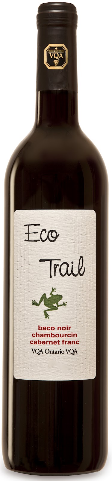
Here is another room inspired by a wine label.  That wine is.....


As you can see by the label it is a blend of Baco Noir, Chambourcin and Cabernet Franc.  I have to say I really enjoyed this wine.  It wasn't too dry and not too sweet .  I think on the label in the store it said that it is a 1 or 2 for sweetness.  It had really nice flavour.  So 2 thumbs up from me on this one. It sold for around $10.45-which is pretty decent for a bottle of Red.  What caught my eye was the little frog on the label- gotta love frogs!  So I thought I would design a bathroom with that little frog in mind.


I envision striping the green tile behind 2 vanities like the above pic using the green mosaic time and the subway tile.  The Subway tile would be mounted vertically in a brick pattern behind the vanity wall only.  I would use the green mosaic tile as a stripe in the shower wall area along with the subway tile.  The subway tile would be mounted in a brick pattern here.
I found the most amazing website for all things bath-fixtures, lighting etc...  here at Urban Archeology.  What an incredible storehouse of stuff-check it out.

Well that's it for now everyone, hope you got a little inspiration today.
Have a great day!
Megan

Wednesday, May 2, 2012

FABRIC INSPIRATION 2

I found this fabric at Designer Fabrics.  It is such a great online fabric store.  They have loads of fabrics to chose from at great prices.  They are located here in Canada.  They also have a regular store that is located in Toronto which has an even bigger selection of fabric. 
I especially liked this fabric for many reasons.  One being the colours-all those blues, smoky blues and grays.  Two, I loved the motif-a very organic Jacobean style floral fabric.  And three, I love linen.  Linen is one of my all time favourite fabrics.  So here is that fabric I chose:


Remember when I am picking out colours for this I am doing so from my computer.  I so wish I had the actual fabric.  Hmmm.....  perhaps a purchase in the future is in order!

Have a great day everyone!!
Megan

Tuesday, May 1, 2012

RENEGING ON POCKET WATCH WHITE

So here's the deal.... I take back what I said about Pocket Watch White in a previous post.  The post where I talk about my favourite whites.  Now you may ask why??  Well......
In life we make our decisions on what we know and our own experiences- well at least that's how it sometimes works. 

For years I have used what I "thought" was Ralph Lauren's Pocket Watch White.  Well...... apparently not.
As you all know we are giving our Dining Room a face lift and doing High Wainscoting.  In order for the trim paint colour to be consistent throughout I wanted to use Pocket Watch White.  Since I had very little left in my can I went off to my local Home Depot to get more.  They don't carry Ralph Lauren anymore-Boo hoo...  but they will mix it up in Behr or CIL.  So I asked the paint assistant to mix me up Pocket Watch White.  I get home and opened it up and I thought to myself, "that looks awfully yellowish white".  So I painted a little swatch on a board with a swatch of my left over paint and low and behold they look NOTHING alike.  What the heck is going on??  So I go and get my chip from my old Ralph Lauren chips (I kept them all), and guess what.  The new paint I had mixed matches exactly to what the chip?  Huh??  And what I thought was Pocket Watch White is less yellow???  What is going on??  It turns out that all this time I have been using what I thought was Pocket Watch White but haven't!!!  Yikes.  So here is where life experience has coloured my judgement. For years I have said- Pocket Watch White is the perfect white- not too yellow and creamy, not too stark!  I take it all back.  If you want a very creamy white then Pocket Watch White is for you.  It is one of these moments where one has to own up to ones mistakes.  But in all fairness it was my experience that made me talk the way I did.


So..... what was a girl to do?  Off to Home Depot my husband went.  Did he come home with the paint we wanted?  HE DID NOT!!!  The guy in the paint department said he wouldn't be able to help because of 2 reasons:
1. They have changed the tints since the last time I got Pocket Watch White so it wasn't just as easy as reading the formula off the lid-apparently that wouldn't work!!
2.  He wouldn't be able to colour match since there colour matcher was broken!  Probably wouldn't be fixed for some time!!  Well that's just great!
So what did the fine paint clerk do for us--- NOTHING!!!  Now in all fairness, it wasn't his fault that my original paint wasn't mixed properly and that they couldn't mix it now.  However, the colour I wanted wasn't correct.  So to make a customer happy do you think maybe  I could get my money back- you know that whole "keep the customer happy thing"!  I am the type of person that does NOT make themselves a pain in the tuckas at stores- I may have wanted too on many occaison!  But I have not.  I think the least they could have done since they couldn't fix the situation was given me a store credit for the amount of the paint- apparently not.

So now I have a can of Semi Gloss Pocket Watch White- anyone want it??  But I still have to paint my Dining Room.  So.......off to my favourite place to get paint- my local Home Hardware.  They have (in my opinion) really great paint- I especially like the Beauti-Tone Paint.  You cannot beat it for it's price point.  And I must say they are really great at my local store.  Fran fixed me up really good and I have my modified version of Pocket Watch White- I think I will call it "Megan's White"!!

Home Depot I will NOT be coming to you for paint and Home Hardware thanks you for not trying to find a solution to my problem!!

In addition to mixing up my colour, Home Hardware can mix up any colour- They do Ralph, Benjamin Moore, CIL.....  If you have a swatch they can match it.  So give them a try, I think you will be surprised at how great the paint is.  And they have great friendly staff too- Thanks Fran!!

Beauti-Tone also has some great colours too!  Years ago when Canadian Home and Country magazine was still around (oh I miss that mag!)! they had a colour line called the "Canadian Home and Country Collection".  Well, Erin McLaughlin who used to be the editor at that mag is now the editor at Style at Home.  Style at Home has reintroduced those same colours.  They really are great colours.  I had to scan them of all things!!  I could not find any info anywhere about them-can you imagine??  Launching something like this and not talking, advertising or even blogging about it- come on Style at Home and Home Hardware!!  Here are the scans- I apologize for the quality.  I hope at some point I will find better pics:


Aren't they lovely colours?  They basically reprinted the same colours (which are still great) and then added up to date photos to go along with them.  If you are lucky enough to be here in Canada, go check them out. The front and back photos are really nice- gotta love peonies!!  The Beuadalaire section is my favourite- maybe it's because of "Mary's Lipstick".  What an awesome red that is.  Very similar to what I put in my dining room above the Wainscoting.


They also have the Style at Home Colour Collection:


All of the colours can be found here at Home Hardware.

They also carry a collection of colours by Canadian Design great Simon Chang.  They are called  Trend Colour Collection. Here are those colours:


I added the paint colours from Home Hardware so that this little posting wouldn't just be me complaining about my paint!  I also wanted to say that we can all be wrong from time to time and shouldn't be afraid to admit it  They say we learn a lot from our mistakes- I learned that I don't like Pocket Watch White (the true one) as much as I thought and that I should go to Home Hardware from now on for my paint!!

Have a great day everyone.
Megan