Wednesday, April 24, 2013

BLUE AND YELLOW

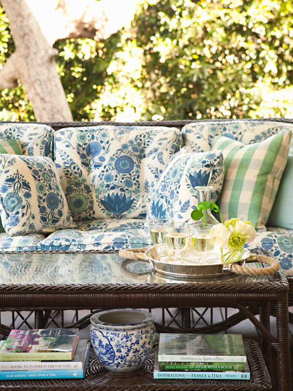
Hey Everyone.....Is it spring where you are yet??  It is trying to be spring here.  Trying is the key word!  Is there anything more sunny than the combo of Blue and Yellow.  I have always loved this combo.  There is just something about these two colours that always puts a smile on my face.  No matter what the colour of the month or year is, I always seem to come back to the classics.
Here are some great examples of this amazing classic combo:


I LOVE that dresser-such an amazing colour.  And love the hardware too.


Now....the next set of pics is from one house.  When I saw these-they truly took my breath away.  The way in which the designer has interpreted the "traditional" blue and yellow colour scheme is so fresh and modern- I just LOVE IT....enjoy;


Just look at those amazing stools!!  You can't get sunnier and happier than those.  And that Pendant over the island- AMAZING!!  You can find a similar one at Restoration Hardware.
The cabinet colour is Benjamin Moore Hazy Skies OC-48.  The Tolix Marais Stool can be purchased at DWR.

 The Counter Top is Calcutta Oro-honed.  How gorgeous is this??


The wall colour in this foyer is Benjamin Moore- Sea Star 2123-30.  It is such a great Bluey greeny colour without being overly saturated.


I suppose that I could go on and on.....Blue and Yellow is such a great combo.  It really does fit well in either a traditional or a contemporary setting...or anywhere in between.

Some great yellows for walls you may like are:  In no particular order.

Benjamin Moore-Weston Flax HC-5


Benjamin Moore-Hepplewhite Ivory HC-36


Benjamin Moore-Hawthorne Yellow HC-4


Benjamin Moore-Vellum CC-200


Benjamin Moore- Goldtone OC-112
I would have to say that Goldtone is one of my all time favourite Yellows- it is a lovely sunny yellow without being overwhelmingly yellow.  That is the thing with yellow-you have to choose cautiously or you will end up with your walls looking like Big Bird or a School Bus!

An even more subtle yellow than Goldtone would be;

Benjamin Moore-Milkyway OC-110


Now for a front door or a piece of furniture it would be fantastic to go all out.  Some examples would be

Benjamin Moore-York Harbour Yellow 2154-40


Benjamin Moore-Dijon-CC 210


Laura Ashley- Cowslip 3  LA803


Farrow & Ball-Babouche No.223


Farrow & Ball-Citron No.74

There isn't anything wrong in using these full on yellows, it is just that they will be a big "WOW" in the room- which if that is what you are looking for then by all means go for it.  These full on yellows are great as accent pieces.

That's all for now folks I really have to stop myself as I could find thousands of examples of Blue and Yellow.  I will probably revisit this amazing combo in the future.
Have a great day everyone.
Megan

Tuesday, April 23, 2013

ORANGERY-PURE GOLD!!

Hey Everyone....Hope all is well.   I came across a fabulous room on Houzz.  It is one of those rooms that has a definite wow factor to it.  I know that colour isn't for everyone but for those that do love it then this room is for you:


This amazing room was designed by S & K Interiors.  You should check out their other spaces- they are an amazing example of a melding of traditional with modern as well as an amazing use of colour.  They have made some really great spaces.  One of the things I love most about this room is the wall colour:

Farrow and Ball Orangery No.70:


It is the most amazing gold colour with a big orange undertone to it.  Or maybe to you it is a golden orange.  Either way it makes a huge statement.  Yet in the above space it looks fabulous without being overwhelming. I think the above room is such a great example of how to decorate such a space.  Even if you are not crazy aboth the wall colour one can take a lot away from the above room.
The Desiginers have done a fabulous job of using the space.  By creating 2 separate seating areas it really does help to "fill" the space.
They have also masterfully filled the fireplace wall.  This type of space can be quite a challenge to decorate around as I have stated in previous postings.  They have used a huge mirror to bounce more light. The artwork has a "quite" presence-yet it definitely helps to fill in the wall space.  I love how they used a contrasting colour in the bookshelves to highlight them-such a great shot of colour.  By hanging the art and the mirror the way in which they have, they have really provided a great focal point as well as help to anchor that wall in such a tall setting.  It is so easy to go overboard or to put too little-it is such a fine balance.  They also used trim to not only highlight that area but to add another layer of visual interest.  You all know from previous postings that I am not usually a fan of double height rooms- to me they are just wasted space, however, in this instance it really works.  I love how they did not "over work" the window treatments and used white wood blinds only.  It truly is restful for the eye and does not distract from the view that has been framed.  So many times people want to add heavy, voluminous window treatments to a space such as this.  Sometimes it is called for, other times like this room, restraint is such a good thing.
I too love the colour combo they have used in this space- The gold,blue and red colour scheme really looks fresh in this light filled space.

Here are a couple of other spaces that Orangery graces:


There is one more space that I remember from Canadian House and Home magazine.  A family changed their dining room into a craft space for the family.  I wish I could find a pic of this space.  I remember it so distinctly.....it was the first time that I ever say Orangery.  And it looked so amazing in this space.  When I find the magazine-as I am sure that I kept that pic...I will pass it along.

So if you are in the market for a full on Gold with an orange undertone then Orangery will be just the thing.
Have a great day everyone.
Megan


Friday, April 19, 2013

KNIT RECIPE 1- PLYMOUTH YARN ENCORE

Hey Everyone...... For those of you out there that knit, there are times when you would love to make an item but it is way out of your snack bracket.  What is a person to do?  Well......sometimes you save and save in order to buy that special yarn.  Or if you are like me you shop around and look for alternatives.
As you may know I love to knit...REALLY LOVE TO KNIT.  I have been knitting for 38 years now.  Goodness that makes me sound so old!  There are some amazing patterns out there both for sale and for free.  One site that I love to look at is Purl Bee.  I love the simplicity of their designs.  However, quite often they are out of my snack bracket.  I cannot afford to spend $400.00 on yarn for a wrap or $1000.00 for yarn for a blanket.  Don't get me wrong.... I love the yarn that they offer....I just can't afford it.  However, I do love their patterns.
As I posted a little while ago......I knit up the Purl Bee Hudson's Bay Blanket for a girlfriend for her wedding as a gift.  See that post here.
I came across this blanket a little while ago that they posted:


Isn't this blanket lovely.  It is so yummy!!  I love the simplicity of it.  And the yarn that it is made of looks so amazing.  The name of the yarn is Manos Del Uruguay Maxima.  It has such a lovely varigation to the colouring in the yarn. The yarn is 100% Extra Fine Merino Wool.  It is 219yds/100g ball. It is a worsted weight yarn at 4.5sts/inch.   It is hand spun and hand dyed-thus the price.... $14.95/ball....which for a hand made ball isn't too expensive really.  It certainly would make an amazing gift or  make something really special for oneself.  I know I would LOVE to knit this lovely little blanket for myself.  However, at the moment it is slightly out of my range.  So what is a girl to do?  Well..... come up with a different recipe as it were.  If one was to buy the yarn as stated the blanket would cost $104.65.
Again, a little out of my league at the moment.  So after looking online this is what I came up with;


Note: I have substituted a Navy Yarn for the Brown one originally specified.  Yarn.Com did not have a Chocolate in the Plymouth Yarn Encore yarn.  One could use as I have stated above and substitute Navy or you could sub in 0520 Charcoal if a dark gray was desired.
The yarn I chose is Plymouth Yarn Encore and now until the end of May it is on sale for $4.19/ball  That is quite a savings my friends.  The total cost would be $29.33.  It is quite a nice yarn, especially for a blanket.  It is 75%Acrylic/25%Wool.  The ball is 200yds/100g.  So if the yarn at Purl Bee is a little out of your price range then give this one a go.  It can be purchased at yarn.com.  I have bought from them in the past and they have been great to deal with.  I have had no issues myself.  They even ship to Canada for a very reasonable rate.

So if you are looking for some mindless knitting for when you are in front of the tv or are knitting down by the dock...then this project will be just for you.  I really do love a mindless project now and then.  And doing Garter Stitch-knitting every stitch fits that bill just fine.

Have a great day everyone.
Megan

Thursday, April 18, 2013

NAVY AND MINT

Hey Everyone.... Hope all is well??  I was in the store the other day and came upon this months addition of Country Living Magazine:


It was one of those moments of...... ohhhhhhh...... I like that.  I love the colours on the front of the magazine. I suppose it is the same colours that I am looking at putting in my bedroom.  Could it be Kismet??  Seeing the blackboard as the backround made me want to paint behind my bed one of the colours I spoke of yesterday::Martha Stewart Wrought Iron MSL168.  Although I do not wish to have a chalkboard behind my bed I do like the dramatic colour.  Wrought Iron has the same feel as the colour shown above.  It is a very deep inky grayed out navy- quite the description I know.  But it really is a complex colour.  At first glance one may think that it is black, however, on further inspection it definitely has a navy undertone to it.

Wrought Iron MSL168


I just love that aqua/minty dresser in front of that dark backround.  It is such a great pop of colour.

So it got me thinking about Navy and Mint:


Isn't Navy and Mint such a great combo??

Have a great day everyone.
Megan

Wednesday, April 17, 2013

NAUTICAL AND IKAT BEDROOM

Hey Everyone....I know that I had this post up for about an hour before I pulled it.  As you can see by yesterdays posting....well I just wanted to send a little love Boston's way.
Today is just a little posting about my thoughts about our bedroom.......  far too long in the making!!
I picked up some pillows from Home Sense that I couldn't resist.  I knew that I still wanted some form of Navy in the bedroom and a Nautical feel as well.  I wanted to stray from the usual Red, White and Blue.  So.... when I found these lovely pillows I knew I had a winner.


You can see why I couldn't resist the pillows.  They are by Cynthia Rowley.  I paid $24.99 a piece and they have feather inserts..so I think they were quite the bargain.  Yes I probably could have made something similar but I really loved that pattern on these.
The paint chips in order of appearance is:
Terra Rosa MSL018, Hummingbird Blue MSL135, Wrought Iron MSL168 all Martha Stewart.
Aqua Frost WV35007- Waverly Classics.

I am pretty sure that the wall colour will be the Aqua Frost and I will have the other colours as accents.

So as usual I will keep you informed as to the progress.......
Have a great day everyone.
Megan

Tuesday, April 16, 2013

BOSTON

Hey Everyone.....I want to take a moment to express my sympathies to the great people of Boston.  My heart breaks for all of you.  No one, anywhere, should have to live through what you have.  Stay strong my friends!


From a friend from the Great White North.
Megan

Monday, April 15, 2013

SORRY GUYS!

Hey Everyone.... Sorry there was no posting on Fri or much of one today.  Dealing with sick kids last week and now my youngest is sick again!!  He was very lumpy this weekend.  You know your child is sick when they don't bug their older brother- it was very quite this weekend!!  And we celebrated our eldest becoming a teenager- 13!! How is that possible??  I am now the mother of a teenager!!


He is awesome.  He is the kind of kid that parents dream of.  He is smart, caring, kind, great sense of humour and of course devilishly handsome- and has dimples to boot!!  I know I am biased.  He totally rocks.  Unfortunately, my youngest was unable to participate as he was sick all weekend with the Flu- not the stomach kind thank goodness!  Life is never dull is it??

I will be posting regular posts soon....Hope all is well in your Universe and you are all well.