Wednesday, October 2, 2013

MODERN ART DECO

Hey Everyone....I wanted to share with you a house that is OVER the TOP!!!  But it's still pretty amazing.  How would I describe this house??  Well................To me it sort of Art Deco meets Hollywood Glamour meets California mid 80's.........a mouthful for sure.  The reason I wanted to share it is that it is unlike anything I have seen before.  It is over the top, it is glamorous, it is outrageous but still controlled.  Yet there are moments of quiet.  So without further ado...Enjoy:


Now as you know I am a nautical, cottagey kinda girl.  That's my style.  But I just had to share this one with you all.  It is so out the realm of most of us out there.  For me....is it too much....well for me anyways.  However, there are some really pretty pieces and rooms in here that I can still be inspired by.  I love the kitchen...all that white.  That great farm sink and faucet.  Gorgeous cabinetry.  Stunning Murano White glass Chandeliers.  And of course the classic black and white tiled floor.  This kitchen would not be out of place in many homes.  It is loaded to the gills but it still reads as very pretty and very functional.  I will say that even though this home is very glamorous and isn't everybody's cup of tea......there is still a comfortableness about it.  All the fabrics are comfortable looking, as are all the pillows.  There is a lot of Velvets used throughout that lend a comfort to an otherwise very glamorous space.  That being said I don't think that I need quite so much furniture or an audience in my Master Bath!! And the palette is quite neutral- Black, white and Taupe.  This is a classic that never goes out of style.

This amazing home was designed by Jeff Andrews.  He is definitely all about glamour!  You should check out his other projects.  You can see that Jeff is a big fan of texture.....Grass Cloth, Velvet.....There is such a layeredness to his projects....is that a word??  Layeredness...........that is how I see it when I look at his work.  There is definite glamour....yet the style of furnishings and the type of fabrics used set a comfort level in a room that may feel off limits if other fabrics were used in it's place.  Velvet beckons one to sit and be comfortable.  And let me tell you it wears like Iron.  There is nothing delicate about that workhorse.
And since he uses tones found in Nature, nothing feels too frenetic.  The palettes he uses are very calm and soothing-even with all the glamour he tries to convey.  I think I have a new design crush!!  I feel that if I had the money to do so, I would want to try to incorporate some of his style of design. I adore the sophisticatedness  of it, yet, love the comfort as well.

Hope you enjoyed and got just a little inspiration from this amazing and over the top Residence.

Have a great day everyone.
Megan

Monday, September 30, 2013

MODERN VICTORIAN

Hey Everyone....hope all is well?  I came across a design dilemma the other day that got me thinking.......How do you meld two different era's?  The issue came up over at How About Orange.  The issue at hand is picking a Modern Rug to go with a more Victorian Style of Room.  I of course had to way in on the issue and give my two cents-for what it is worth!  I thought that the 4 rugs that were chosen were a little too busy and frenetic.  I offered up two rugs from West Elm that had a more quieter feel, yet were still Modern.  After seeing this great posting it got me thinking......... How do you meld two completely different era's and styles?

The first rule of thumb when trying to meld two different era's is that they need to be at least 2-3 era's apart.  What do I mean by that? Well it is just as it sounds.  You wouldn't really want to meld Art Deco with Art Nouveau.  They are too close in timeline.  The same would be for Victorian and say.......Art Nouveau.  Remember, it is just a guideline.  You can pretty much do what you like, the world isn't going to end if you put that great E.J. Ruhlmann chair with an Arne Jacobson chair:


I feel that they don't really compliment each other.  Even though they are amazing chairs in their own right, they don't really go together.
However....if you put that great Swan chair by Jacobson in a Victorian style of Architecture...It would look pretty sweet.

Now......Victorian is that kind of style that is very polarizing.  Either you like it or you don't.  There are those out there that are comforted by the ornateness of this style.  There are others that could NEVER live with such a style and could live only in a more clean lined environment.  To me, the "Modern Victorian" is a great hybrid, especially when it is done right.  It can be a tricky thing to meld ornate, overly feminine with the clean lines,masculine style of Modern.
Here are some "Modern Victorian's" that I just love:


I LOVE this room.  To me it is done SOOOO right.  Why does it work?  Everything in the room is era's apart.  The Modern Sofa's, Lounge Chair and Tables are more Modern, while the other Chairs, Mirror, Chandelier and Console are very Traditional.  The colour and style of the drapes is very Victorian, yet, this is the only colour in the room.  The feminine colour and style of the drapes compliment the more modern elements of the room.  The Ornate Console Table, Chandelier and Mirror compliment the more clean lines of the sofa and tables.  It is all about balance.  The rug too is a perfect choice.  They chose to use a more Modern Rug that is quite subtle.  This grounds the room and allows all other elements to be the star in the room.  This room would not be nearly as effective if the rug were overly graphic in nature.


This amazing room puts such a smile on my face!  First of all...just look at all the Victorian Architectural details!  I just love Molding!!  Why does this room work?  Do you see how the main colour of the room is white and the designer used colour in the furniture?  The use of colour is very Victorian-they loved it.  Yet here it isn't overwhelming since the room itself if pure white.  The Rug would have been way too frentic if the Sofa's had been overly patterned.  I love the juxtaposition of Mid Century Modern with Victorian.  It is one of those styles that goes so well together.  This is the perfect way to "warm" up Modern.  To me....many times Modern can leave me feeling cold.  Apart from the bold colours used in the furniture, the reason why the above room works is the juxtaposition of masculine lines of the furnishings including lighting with the more feminine lines of the actual room itself- phew.......that's a mouthful!


This next Reno is beyond amazing.....in fact I think it's Redonkulous.....and that is a good thing:


This room  to me is complete perfection.  The fixed Victorian elements of room look incredible with the more modern, clean lines of the furniture.  Just look at that ceiling.  By decorating in a more muted palette and quiet lined style, this allows the more ornate lines of the moldings and the incredible chandelier to shine in this room.  I can't even articulate how much I love this room!!


Isn't that an amazing Reno.  It has just the right amount of feminine and masculine. Everything in the rooms really compliment each other.  It is beyond gorgeous!!


If you look at the above room it is indeed lovely.  But for me the better way to meld Modern and Victorian is to use Modern furniture in a Victorian setting.  To me the femininity of the room should be in the fixed elements and the more masculine lines should be in the furnishings.......only my opinion.  I feel that it is easier to live with masculine lines in the furniture than the overly ornateness that is found in Victorian furniture.


This Room is a great example of the melding of Victorian and Modern.  Here the feminine Victorian feel comes from the fixed elements of the room- the moldings, that amazing Cole & Sons wallpaper and the Chandelier.  Although slightly more ornate than other rooms we have looked at, it still is a lovely room.


 I could really see myself in this space.  I just love all of the fixed elements and the kitchen here.  Again the fixed elements are the feminine Victorian and the masculine lines come from the "furniture" in the space.  Amazing Reno!!


For those that wish to have a more traditional Victorian style yet with a more updated modernity, then this one is for you:


For me, this style of Victorian is so much more livable than a more traditional Victorian style.  A traditional Victorian style can be very overwhelming.  Here Sarah has captured the essence of Victorian without it dripping in pattern, femininity and ornate colour.  This Reno has all the hints of Victorian but in a more restrained way.  If I were to do a more "traditional" Victorian this is how I would do it too.  It works because the fixed elements are feminine and quiet in tone.  The furnishings, although they have curves, are quiet and neutral.  All the pattern and colour comes from the rug, pillows and drapes.  Except for that amazing velvet chaise lounge.  Although it is a very deep Red Velvet.....it's lines are quiet and restrained. Don't you just want to lounge on that one??  So lovely!  And as always I love Sarah's pillows!!

So remember....to meld Victorian and Modern you have a to have a balanced mix of Masculine and Feminine.  Clean Lines and Ornateness.  It is a balancing act for sure.

So there you have it folks.  Modern Victorian.  I could have done a posting that was way longer (although this one was long enough).  I am sure that I will revisit this style in the future.

Have a great day everyone.
Megan

Friday, September 27, 2013

EASY PEAZY BREEZY COWL

Hey Everyone......Today I wanted to share with you all my latest pattern.  Here she is:


What is so great about this cowl is that it is super easy, super quick, and REVERSIBLE.  What is not to love about that?......And......I am offering the pattern on Ravlery for FREE.  Just a little freebie for everyone to enjoy.  This would make a great gift for Christmas.
I made this little lovely out of Berroco Ultra Alpaca.  It is such a nice yarn to knit with.  I have used this yarn in the past and love it.  I was so taken with the colour when I was in my LYS:  That store being Spun.  The colour is called Grapefruit and it truly evokes that colour.  I couldn't help but to buy it....it sort of lept off the shelf and right into my hands!!! I wanted to create another cowl pattern that is Reversible.  It can be a hard thing to do.  You want visual interest but at the same time you have to pick stitches when combined complement one another and are reversible.  So the Easy Peazy Breezy Cowl was born.
I hope you all enjoy making it as much as I did.  It is easy enough to make but still interesting enough to keep your attention.  Not that you have to pay attention for very long as it will take no time to make it.  I chose a size 4mm needle to knit with even though the recommended needle size on the yarn info is a 5mm.  I didn't want it to be too drapey as Alpaca can tend to be.  I wanted it to be slightly "beefier".  It still drapes plenty, yet holds its own....know what I mean??
Anyways......I hope you like it.....and as always if you have any questions or comments you can drop me a line anytime.
Have an awesome weekend everyone.
Megan

Tuesday, September 24, 2013

SCHUMACHER WALLPAPER & THE BLUES!

Hey Everyone....I came across this pic the other day and boy did it make me smile.  You may or may not have seen it, but either way......it makes me happy!!


This collection is Byzantium by Schumacher.  First of all.....that Blue.  Or should I say all those lovely blues-makes me want to squeal with Glee.  And I don't mean the show on TV!  Not crazy about the rug-love the colour NOT the texture.  I live in a Lego world my friends...would NOT be Lego friendly!  Back to the topic at hand.....Secondly....all those lovely patterns.  Thirdly......that Velvet Blue pillow in the middle of the Sofa....oh I could go on and on about this one my friends.  And of course the Ikat pillows..........


Look how amazing they are together.  It used to be years ago one would NEVER mix blues together....now it's as if one couldn't help but to mix.  By mixing blues it lends so much depth and interest.  To me it makes it feel beachy, fresh and vibrant.  I would have to say the mixing of blues is one of my favourite things...especially right now.

Here is an image also by Shumacher that mixes blues:


I just can't help but love the colour combo here.  The beautiful Aqua of the pool with the Navy of the tile band and of course the Royal of the Pillows.  So Fresh and Lovely.


Here again Schumacher has mixed a Darker Blue with Aqua...so fresh! And so graphic.

Just had a to share a little Blue with you all....
Have a great day everyone.

Megan


Monday, September 23, 2013

GRASSCLOTH LOVE

Hey Everyone....just a quick posting.  I know that Grass Cloth Wall Coverings have been in for awhile now....first of all I love Grass Cloth....secondly, I always have, it's not a "fad" for me.....and thirdly, I want some!!!

Here is a pic that put a smile on my face today....hopefully it will do the same for you:


This amazing Wallcovering is Carolina Raffia  by Thibaut.  You can see it here. It is part of the Monterey Collection.  It is such a pretty an graphic collection.  Just traditional enough yet so Now.  You know how I luv's me some Red, White and Blue.  Love the above Room- Love it!

Here are just a few more pattern's in the Monterey Collection:


Aren't they lovely??  And that room-gotta love the Grass Cloth Walls.

Have a great day everyone.

Megan

Thursday, September 19, 2013

STAR WALLPAPER

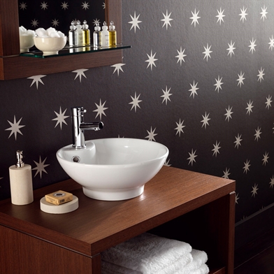
Hey Everyone......I am a big fan of wallpaper.  I know that not everyone is....however, I LOVE IT!!   There are some wallpapers that scream...LOOK AT ME.  And there are others that are more subtle yet make just as big as an impression.......  Case in point:


Yes I know I am talking about this house AGAIN!!!  I can't help it.  This hallways makes me want to go out and buy this wallpaper.  I have always loved this wallpaper...it is a classic if there ever was one.

This amazing Kitchen Space was designed by the amazing Tommy Smythe.  The use of the star wallpaper in the cabinet is subtle genius.  It adds so much without screaming at you!  Can't say enough.

So what are some options for great Star Wallpaper;


If you want Period specific Wallpaper then Bradbury & Bradbury is your go to place.  Arts and Crafts, Victorian......you name it they have it.  It is all hand made and so lovely.


Osborne and Little

Isn't this lovely?  I honestly believe that this style of motif is timeless.  And it is not so overbearing that you would get tired of it.  A true Classic.


Nautical?  Patriotic?  Country?  I say yes to all.


But of course I want the RED star wallpaper found in either room pic as seen above.  I have searched for it...can't find it....but I will.  If anyone has any info on the two wallpapers used above....please pass it along.

Have a great day everyone.

Megan