Tuesday, July 30, 2013

SNEAK PEEK THUNDER SHAWL

Hey Everyone...long time no talk.  So...... I am nearly done writing up the pattern for my new shawl.  Here is a little sneak peek at Thunder Shawl......


This Shawl was an utter joy to design and to knit up.  I highly recommend both the yarns that I used...Mirasol Hacho and St. Denis Nordique.  They are both a dk/sport weight yarn.  I loved every moment knitting with these two lovelies.  I especially loved using the Hacho.  The yarn itself was to die for...100% Merino and the colours....I loved knitting and watching the colours unfold.  LOVED IT!  And I really enjoyed adding the picot bind off to the edge.  I have always wanted to add that to the edge of a shawl.

I am hoping to have the pattern up and running real soon.

Have a great day everyone.
Megan

Friday, July 19, 2013

NEW SHAWL PATTERN SOON

Hey Everyone...hope all is well in your Universe!  Sorry for the absence as of late.  Life has just been getting in the way....kids, summer, husbands job location, knitting......  However, I will be posting a new Shawl Pattern very soon.  I just finished it up in fact.  Have to block it then take pics, write up the pattern and then post.  I truly love this pattern.  It is similar in difficulty to my Easy Peazy 2.0.   What I really love about this pattern is the yarn and the Bind Off technique.
The Bind off I used this time is a Picot Edge Bind Off.  I have always wanted to do that to a shawl.  I just love the detail it gives to the edge.
The yarn that I used was:


Isn't it just gorgeous??  It is Mirasol's Hacho.  It is the most beautiful variegated 100% Merino Wool Yarn. When I say it is gorgeous I mean it is GORGEST!!  (in the ever loving words of Rudy Huxtable).  Between the colours and the feel of it...well it is beyond awesome.  It knit up really beautifully as well.  Before I designed this particular shawl I knitted up a capelet for myself in the same yarn...more to come on that later...... I had some left over and bought 1 more...from England no less, thank you Ebay.  I then added the following yarn to make up the shawl:


This lovely little yarn is Nordique by St. Denis.  Loved this yarn.  It is 100% wool.  Now....being 100% Wool it isn't as soft as the Hacho that is 100% Merino Wool.  But it is still pretty darn lovely.
When I was designing the shawl I pulled a colour out of the Hacho to be the accent.  The result was the use of the Hacho colour Thunder Skies and St. Denis colour Aurora.  And I am beyond happy with the results.
So give me a few days and you shall see the results.
I bought the St. Denis yarn at Webs.  In general I have to know and feel the yarn that I am going to use for a project.  So..... I took a leap of faith with the St. Denis and was NOT disappointed.  I had bought the Hacho at one of my favourite haunts....Spun.  I was lucky enough to get it on sale.  However, I was going to be one ball short so I tried Webs...but they were out...so I tried Ebay and low and behold there it was.  Only took 5 days to get here too!!!  And between the 2 yarns a lovely shawl emerged...........

Have a great day everyone.
Megan

Wednesday, July 10, 2013

PAINT PALETTE

So I was looking at the Pottery Barn Catalog and the front pic struck me.  The colour combo really resonated with me......


I just love the colour combo of those plates.  I love every single one of those colours....if I was to pick colours that gave the same feeling I would pick:


Mountain Peak White 2148-70 BM

Desert Tan 2153-50 BM

Jalepano Pepper 2147-30

Rhubarb 2007-30 BM

Buckland Blue HC-151 BM

Buxton Blue HC-149

Covered Bridge CC-126

Remember....I am going by my computer.... I just wanted to convey the overall feeling of the colours.  I can't even put into words how much I love all those plates together.  I WANT them all!!!  Whom ever styled them did a fantastic job.  There is such a balance between the colours.  I just love it!!

Just wanted to spread a little colour love.....

Have a great day everyone.
Megan


Monday, July 1, 2013

RED AND WHITE PART DEUX!!

In honour of Canada Day (July 1) I wanted to share some great images of Red and White with you all.  I love the Colour Red...I truly do.  And I am also so proud to live in a country where I feel safe, I feel proud and one that is recognized world wide for just being so damn nice!!  As my Dad always said to me growing up..."it's nice to be nice".  And I have NEVER forgotten that sentiment.  It has done me well throughout my life.  Don't get me wrong, I like to have a little rant like the next gal....but overall....it takes way more energy to be negative and nasty than it does to be nice.  I don't know.....maybe in a world of Star Trek it should be OUR Prime Directive...(sorry for the geek reference).  If only more people chose to be nicer....what a nicer world this would be....Anyways, getting way off topic.....I just wanted to share some great images with you all. HAPPY CANADA DAY everyone!!


This amazing room is Benjamin Moore Poppy!  I have always loved this red.  It has such a lovely vibrancy to it without completely overwhelming the senses.  Highly recommend this one for just about anywhere you want to make a statement- of course you have to take it's undertone into account.........


Poppy 1315 BM


Again we see the use of Poppy 1315 BM.  Such a great pop of colour!


I think I am seeing a pattern here......perhaps the same house??  I love how Terrat Elms Interior Design has successfully incorporated the use of Poppy throughout the space.  It adds so much.


Looking back into the kitchen you can see just how vibrant and awesome this red is....last pic of this house....for now.


This retro "bachelorette"  space is small but mighty.  I love the pops of red.  They really do help to enhance that kitschy, retro vibe that is evident in this space.  Yes, yes there should be a vent hood.....you know how I harp on that one.  However....perhaps it is a rental.....still should have a vent though....I totally agree.  But I do love the Red here.


Gotta love a great barn restoration....Oh to dream!


Let me hang out here....please!! There is just something about a porch that just welcomes you in.......


I love Red Cabinets.  I don't quite have the nerve to do it myself but totally love it when someone has the nerve to just run with it.  If you were ever wondering..... a Galley kitchen is the most efficient when it comes to planning a kitchen.  Especially when it is configured like the one above.  Just a tip for you all......  Remember that the distance between your stove, fridge and sink when measured out should be less than 26 feet.  This makes for the best use of resources and time.


How adorable is this space.  I really do love a retro vibe!


This space is so fun and funky!! That is great wallpaper.


I would love to have a collection of Vintage Feedsack just like this.........


Amazing....simply amazing!!


I couldn't help but smile when I saw this pic.  I so wish that we had buildings like this where I live.  Just look at all of the detail.


Now I ask you......Where is my glass of vino to go with this???


I can't even put into words how this image takes me to my Red and White Happy Place!!


I would be totally remiss if I didn't put at least one knitting image in!


I of course had to put in a couple of images of my own patterns that were appropriate!!  Both patterns are available here and here.


I had to share one last image with you all.  In case you didn't know this about me....I love Tea Towels.  Can't get enough of them.  Must be the "English" in me.  I could only wish that that above pic was my own....again a girl can dream.

For those of you fellow Canadians out there....I wish you a happy and safe holiday.  And for those of you non Canadians out there......I hope you enjoyed a little Red and White.

Have an awesome day everyone.

Megan

Thursday, June 27, 2013

NAUTICAL DREAM

Hey everyone...I wanted to share with you an amazing nautical inspired interior.  I have been a huge fan of Cottage Company Interiors for years now.  And I do mean years.  Ever since I saw a little cottage that they built with an amazing dutch door I was hooked:


What I loved most about this little cottage was how perfectly compact and functional this kitchen is.  Even though it is tiny it is stylish and functional.  This very kitchen got me hooked on Apron Front Sinks.

Over the years I have kept my eye on Cottage Country Interiors.  They are the "quintessential" cottage style.For those of us that love cottage style they tick all the boxes.

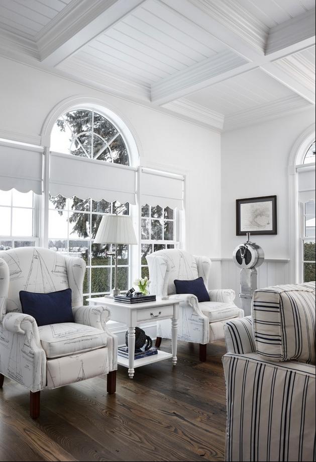
I came across an interior I hadn't seen of theirs before.  It is full of nautical style.  And it is full of White and Navy.  I LOVE IT!!


Oh that bathroom!!  If I were to duplicate it I would use the following paint colours:

Hale Navy HC-154 BM


And either of the following whites-depending on the lighting and so forth.......

Decorators White CC-20 BM

Or
Chantilly Lace 2121-70/OC-65 BM


I can't even begin to tell you how the Navy and White in this lovely home sends me to my happy place.  I don't think I will EVER tire of Navy and White.  How about you??

Have a great day everyone.

Megan

Wednesday, June 26, 2013

END GRAIN PART DEUX!

Hey Everyone....just a very quick posting today.  Remember yesterdays posting on End Grain and Face Grain?  Well, I saw another pic I wanted to share with you all:


I just had to share this with you all. Love, Love the Butcher Block top for the Island.  What I really like about this kitchen is all the textures and colours.  Although subtle...the colours work lovely together.  The orange undertone in the flooring and the Butcher Top work really nicely with the grays of the wall colour, cabinetry and the chevron tile.  Oh that Chevron Tile......Stunning!!  I love how natural they have left the wood  top.  They have applied an oil to bring out the natural richness in the wood.  This one really ticks all the boxes for me.

Have a great day everyone.

Megan

Tuesday, June 25, 2013

END GRAIN VS. FACE GRAIN

Hey Everyone, I came across an amazing kitchen the other day and it got me thinking about Butcher Block.  And more specifically End Grain and Face Grain.  What are they really?  Well..... they truly are exactly how they sound.  When cutting the wood, if you see the cut end that is End Grain.  If you see the long grained side that is Face Grain.  If you were to cut the tree in half lengthwise and see inside that is "the face".  As I said, I saw a kitchen.........


Isn't this kitchen gorgeous?  I love how the designer has incorporated elements beautifully.  I love how the butcher block has/is the same tone as the brick, as is the hardwood used.  This is a great example of someone who understands undertones.  Here orange is the undertone found in the brick, butcher block and the hardwood.  And on top of that the Designer has used a Complimentary Colour scheme to perfection.  In case you didn't know....in terms of colours  being Complimentary they are opposite on the colour wheel.  Here he has used blue and orange.  Not only is the colour in this kitchen amazing, but, the tone is as well.  The blue used is neither too bright nor too greyed down.  This kitchen is such a great example to show many elements in design-LOVE IT!!!
Now.....in terms of Butcher block, why would one want to pick one over the other??  For most of us that would use wood as a Counter Top, most would choose based on aesthetics.  When it comes to grain, most people out there have a very firm opinion on the type of grain they like.  I myself love both.  It would really have to depend on the type of wood, colour, depth of grain , etc....for me to pick either.  However, most have a definite like or dislike for either.  If you were to choose either it would be perfectly fine for a counter top for Cabinetry or an Island.  In fact my Island has a face grain wood top that we purchased from Ikea nearly 9 yrs ago!  It has held up beautifully.  And let me tell you we are NOT easy on that wood.  It gets very abused.  However, that is the beauty of wood.  It can get banged up and you either leave it or you can fix it (for the most part).
Where Butcher Block and the type of grain it is comes into play is when you are talking about it's Utility.  There are two reasons......One is that if you want a thick top say more than 1 1/2", you would most likely have to have end grain.  If you would want one that is say 4" or 5" you would definitely want Butcher Block. You can make Butcher Block just about any thickness.  Not only is it more economical, it is more stable than if you were to have a face grain piece at 3" or more.  And did I mention the cost??
Another reason is the inherent stability of End Grain.  That is why you will find it in "Butcher" shops or other places that would chop on the surface of the wood.  You can chop away on that top and it will hold up way better than if you were to whack away on a Face Grain top.
But, like I said, for those of us where aesthetics is why we are choosing a Wood Top, it really comes down to what you like.  Both will perform fine.  You may have some issues with the wood slightly splitting in a face grain, however, this should be minor.
I truly love Butcher Block Counters.  They have been around for quite some time.  However, it seems that those of us here in North America are playing catch up when it comes to this great material.  They have been very popular in Europe for years.  They are especially popular in the UK.  There is just something so lovely about Wood Counter Tops.  They are warm to the touch, hold up really well and impart a visual warmth to a space.

Examples of End Grain:


This is such a great example of how different woods will give a particular look.  This Butcher Block is made of Maple.  Can you see the almost luminescence that the wood imparts.  Maple can sometimes give off this "glow" for a lack of a better term.  It looks so amazing in this end cut block.


Look how gorgeous this Island Counter is!  I love the fact that they went with a very thick top.  You couldn't have done that with a face grain my friends.  GORGEOUS!!


I really like the edge detailing on this top.  Have you ever noticed that when you see wood used as a Counter Top it almost always has a square edge detail??  However, that isn't the case here.  They have an Ogee detailing.  That is a VERY difficult thing to execute...let me tell you!  Especially when you are talking about end grain, it can be very difficult to get a smooth curved cut.  An Ogee detailing is all about curves and carving as it were.  The wood when it is being cut to create such an edge has a tendency to "rip" or better yet the blade "bites" at the wood.  This gives the wood a very chopped or "chewed" appearance.  Someone with some skill and a VERY sharp blade created this great edge detail here.


I love it when a kitchen has multiple materials used as Counter Tops.  Here the designer has used wood in an area where people will be sitting and eating.  This is much more comfortable to sit at than sitting at a counter made of stone.  It will feel much warmer to the arms that will inevitably be leaning or resting there.  Plus it has the added bonus of being visually more interesting than using just one material.


Face Grain:


I love that Red Island!!!  Such a statement.  I too love how they stained the top to better go with the hardwood.  Those are some great legs!!


Again, mixing of materials adds so much to this space.  This space could have been much colder if not for the addition of the wood Counter.


This is such a great example of how you CAN have a cut out for an under mount sink with wood.  As long as you seal the cut edge of the sink cut out you will be fine.  Since the cut edge is now a cut end grain this will absorb water VERY readily due to the inherent properties of end grain wood.  Just seal it within an inch of it's life and you will be gold.


How amazingly uber pretty is this??  The grain of the Island is awesome.


The Island is indeed face grained wood.  This is about as thick for face grain as you can get.  Think of it as a bunch of 2x4's glued together and sanded beautifully.


Although at first glance one may think that this is end grain it is not.  I really love the stain colour used on it.  Just beautiful!!!


So there you have it.......End Grain and Face Grain.....Which one are you??
Have an awesome day everyone.

Megan